

This feature is available as an add-on for the Honeycomb Enterprise plan.
Please contact your Honeycomb account team for details.

Key features
Some key features of the Web Launchpad include:-
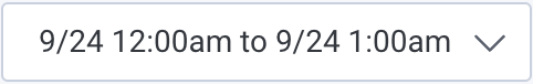
Absolute Time Range: Select a time range for the populated data.
By default, the time selector is set to a relative time range, but you can also choose an absolute time range.
-
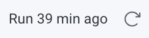
Last Refresh: Identify the last refresh time for the populated data, and refresh the data manually.
-
Filters: Filter to eliminate irrelevant data. Filter data by page, screen size, device type, session ID, browser name, and more.

-
Group By: Group data. Group by page, screen size, device type, session ID, browser name, and more.

-
Custom Groups and Filters: Create custom groups and filters based on the properties available in your dataset.
Access this feature through the filter or group by menus near the bottom of each dropdown.

The big numbers
As you explore the Web Launchpad, you will notice some prominent numbers:- Total Events: The number of events that occurred over the selected time range.
- Total Page Views: The number of page loads throughout the selected time range.
- Total Errors: The number of errors over the selected time range.

Core Web Vitals
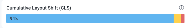
Core Web Vitals (CMV) are metrics that help you assess your website’s user experience. They provide insight into how enjoyable your website is for visitors, and because search engines use these metrics to determine which websites to prioritize in search results, they play a critical role in website visibility in web searches. The Web Launchpad presents these metrics as progress bar charts, each divided into segments according to performance levels.- Blue bars represent a “Good” rating, indicating optimal performance.
- Yellow bars suggest a “Needs Improvement” rating, signaling that certain areas can be improved or optimized.
- Red bars represent a “Poor” rating, highlighting areas requiring more immediate attention.
Largest Contentful Paint (LCP)
The Largest Contentful Paint (LCP) metric measures how quickly the largest content on a web page loads. A lower LCP score is better because it indicates a shorter wait time for your users. The Web Launchpad displays a progress bar chart split into segments for different LCP time thresholds:- LCP events that load in under 2.5 seconds earn a “Good” rating.
- LCP events that fall between 2.5 and 4 seconds are marked as “Needs Improvement”.
- LCP events that take longer than 4 seconds result in a “Poor” rating.

Cumulative Layout Shift (CLS)
The Cumulative Layout Shift (CLS) metric assesses your web page’s stability. It quantifies how often the user experiences content shift on a web page. A lower CLS score reflects a more stable experience for your users. The CLS progress bar chart is split into segments for each score threshold:- CLS values below 0.1 earn a “Good” rating.
- CLS values between 0.1 and 0.25 receive a “Needs Improvement” rating.
- CLS values above 0.25 are considered “Poor”.
Interaction to Next Paint (INP)
The Interaction to Next Paint (INP) metric evaluates a web page’s responsiveness to user actions, focusing on the response latency of click, tab, and keyboard interactions. A lower INP score signifies a more seamless user experience. The INP progress bar chart is split into three segments for each score threshold:- INP values faster than 200 milliseconds earn a “Good” rating.
- INP values between 200 and 500 milliseconds receive a “Needs Improvement” rating.
- INP values slower than 500 milliseconds result in a “Poor” rating.

Core Web Vitals P75
In addition to progress bar charts, the Web Launchpad provides line charts for more granular views of the Core Web Vitals metrics. These charts represent the 75th percentile, which means that at any given point on the chart, 75% of users are experiencing better performance than the value from the y-axis. With these charts, you can get better insight into how your web application performs for the majority of your users. Within each P75 chart, you can:- compare the performance metrics of different elements over the selected period, where each element has its own line and color.
- examine numbers representing the highest and most recent P75 value across all the elements within that chart.
- switch to a table view for each chart by using the table button.
Largest Contentful Paint P75
The Largest Contentful Paint P75 chart shows how long a web page’s largest content will load for 75% of your users. The y-axis represents the P75 LCP value in milliseconds, while the x-axis represents specific time stamps within the selected time range.
Cumulative Layout Shift P75
The Cumulative Layout Shift (CLS) P75 chart shows the stability of your elements for 75% of your users. On this chart, the y-axis represents the P75 value for CLS, while the x-axis represents specific time stamps within the selected time range.
Interaction to Next Paint P75
The Interaction to Next Paint (INP) P75 chart shows the response latency between user interactions for 75% of your users. On this chart, the y-axis represents the P75 INP value in milliseconds, while the x-axis represents specific time stamps within the selected time range.
Charts, tables, and more
The Web Launchpad offers deeper insight into your web application through additional charts and tables beyond the Core Web Vitals. Each card initially displays a graph or a table, but you can use buttons to switch between both views. All charts have an x-axis representing time stamps over the selected period. You can click a point on a chart, a row on a table, or a card’s title to investigate and analyze your data further.Total events by type
Use this chart to identify the events that occur most frequently throughout the selected time range.- Each line and color on the chart depicts a different event.
- The y-axis represents the number of occurrences.
- The table view provides information about the total number of events that occur throughout the selected time range.

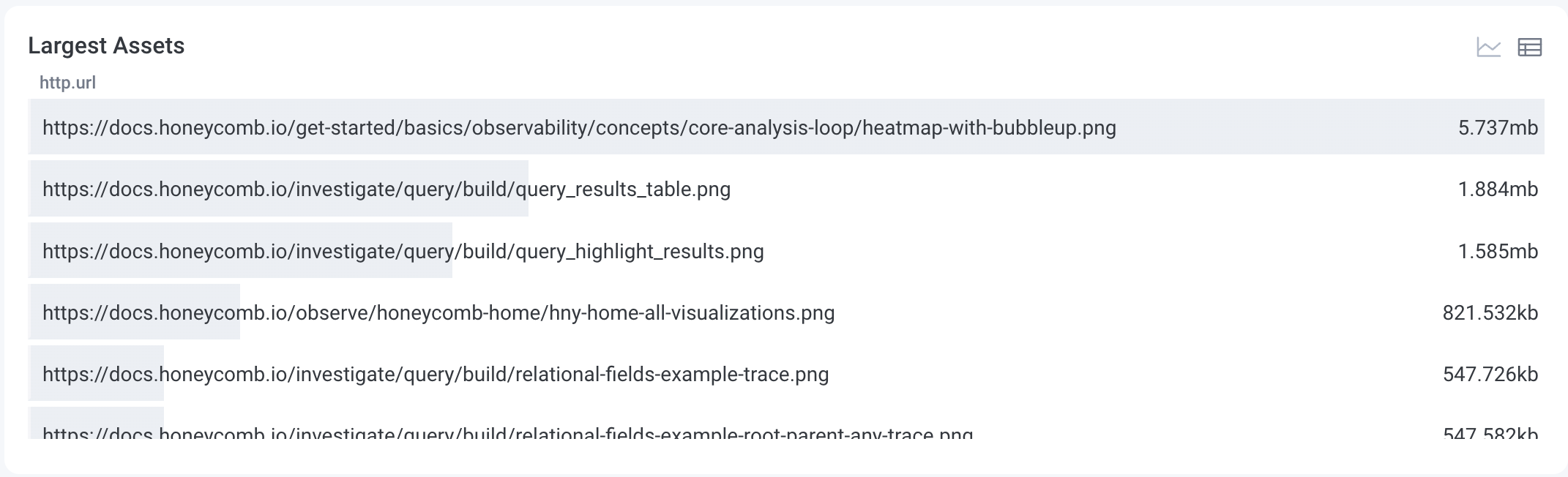
Largest _assets
Use this chart to examine the largest resource requests ranked by the average size of their response content.- The chart view depicts the resource requests differentiated by lines and colors, which shows the average size of their response content across different time stamps within the time range.
- The y-axis represents the asset size in bytes.
Top five endpoints by request count
Use this chart to identify the endpoints that get the most traffic by examining request count.- Each line and color on the chart depicts a different endpoint.
- The y-axis represents the number of requests.
- The table view provides information about the total number of requests for the top five endpoints over the selected time range.

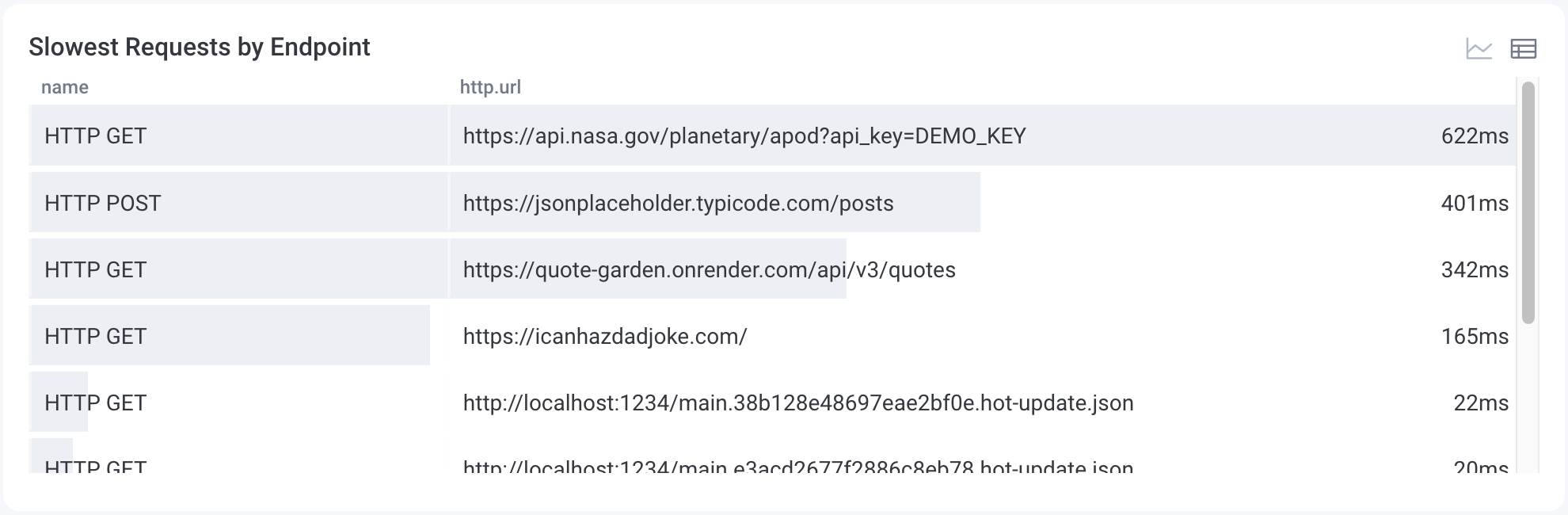
Slowest requests by endpoint
Use this table to examine the ranking of the slowest endpoints based on the 75th percentile of request durations.- The chart view depicts the slowest endpoints over time, differentiated by lines and colors.
- The y-axis represents the response time in milliseconds.
Top landing pages by session count
Use this chart to identify the most visited landing pages ranked by session count, which indicates pages that are more popular among your users.- Each line and color on the chart depicts a different landing page.
- The y-axis represents the number of visits, differentiated by sessions.
- The table view provides information about the total number of visits to each landing page throughout the selected time range.

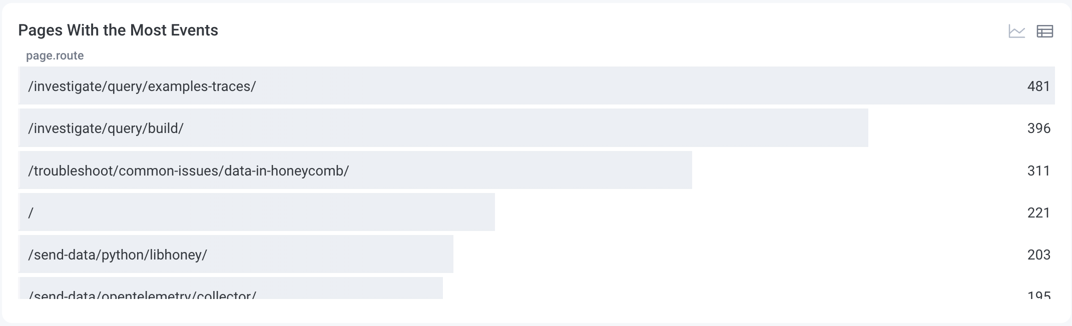
Pages with the most events
Use this table to examine the ranking of the pages with the highest number of events and the highlighted most active pages. Switching to the chart view will show you the most active pages within the selected time range.- Each line and color on the chart represents a page.
- The y-axis represents the number of events.
Enabling a Launchpad
To enable a Launchpad:- Select Manage Data () from the navigation menu, and choose Datasets.
- Select the Dataset for which you want to enable a frontend/mobile Launchpad.
- Locate the Frontend Dataset section, and select Mark as frontend dataset.
-
In the modal, select the correct dataset type:
- Web Dataset: Contains telemetry from your web application. These are typically browser-based spans that represent frontend performance, user interactions, and custom events captured using Honeycomb’s Web SDK and/or OpenTelemetry’s JavaScript SDK.
- Android Dataset: Contains telemetry from your Android mobile application. It includes spans from Honeycomb’s Android SDK and/or OpenTelemetry’s Android SDK, helping you track user behavior, screen performance, and application events across Android devices.
- iOS Dataset: Contains telemetry from your iOS mobile application. It includes spans generated by Honeycomb’s Swift SDK and/or OpenTelemetry’s Swift SDK, capturing user sessions, screen views, and performance data from devices running iOS.
- React Native Dataset: Contains telemetry from your React Native mobile application. It includes spans generated by Honeycomb’s React Native SDK, as well as telemetry from Honeycomb’s Swift SDK and Honeycomb’s Android SDK, capturing user sessions, screen views, and performance data from devices running your application.
- Select Mark as Frontend Dataset.