

This feature is available as an add-on for the Honeycomb Enterprise plan.
Please contact your Honeycomb account team for details.

Key features
Some key features of the React Native Launchpad include:- Time Range Selection: Choose between relative and absolute time ranges to focus your analysis on specific time periods.
- Manual Data Refresh: Identify the last refresh time for the populated data and refresh your data manually.
- Filtering Options: Focus on relevant data by filtering on page, screen size, device type, session ID, browser name, and more.
- Grouping: Organize data by common dimensions like page, screen size, device type, session ID, browser name, and more.
- Custom Groups and Filters: Create and save custom groups and filters based on your dataset’s properties. Access this feature through the Filter by or Group by menus in each dropdown.
The big numbers
As you explore the React Native Launchpad, you’ll notice some prominent numbers that provide a snapshot of your application’s performance over the selected time range:- Total Unique Sessions: Count of distinct sessions within the selected time frame, which helps you gauge overall usage.
- Total Distinct Users: Count of the unique users who interacted with your application during the selected time frame, which helps you gauge user reach and engagement.
- Total Exceptions: Count of the number of exceptions that occurred within the selected time frame, which lets you monitor application stability.

Universal charts and tables
Charts and tables in the React Native Launchpad display your application’s performance data over the selected time frame. By default, each card shows either a chart or table, but you can switch between both views. For charts, the x-axis contains timestamps across the selected time frame. Select a point on a chart, a row in a table, or a card’s title to explore specific data points.Sessions over time
Understand user engagement trends by observing session counts over time. Each bar on the chart represents the number of sessions during a specific time interval. The y-axis represents the number of sessions.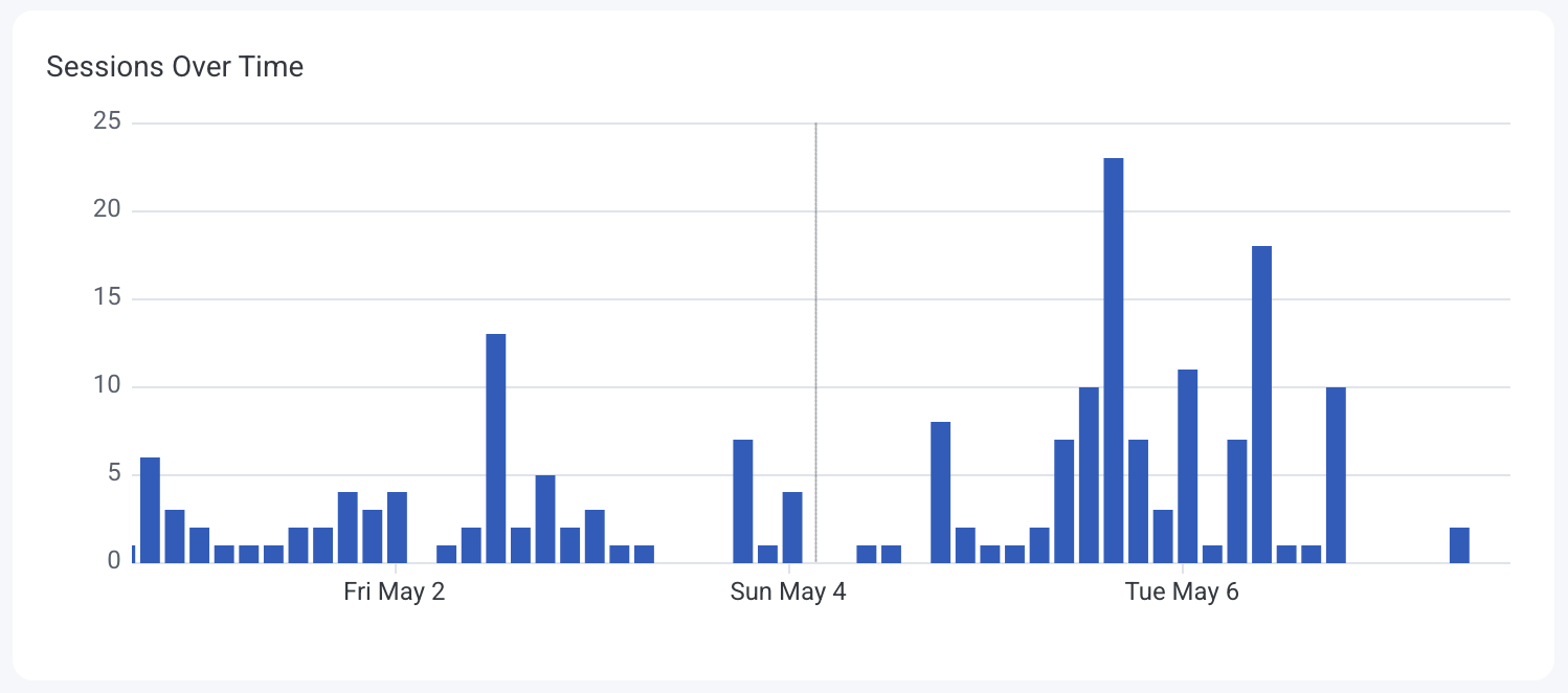
Sessions by version
Identify how different application versions are performing in terms of user sessions. Bars on the chart are color-coded by application version, showing session distribution. The y-axis represents the number of sessions. The table view ranks application versions by session count.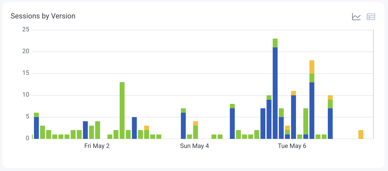
Distinct users
Monitor the number of unique users interacting with your application over time. The line graph displays distinct user counts per time interval. The y-axis represents the number of unique users.
Distinct devices
Track the variety of devices accessing your application, which can inform testing and optimization efforts. Each colored line on the chart represents a different device type or model. The y-axis represents the number of occurrences.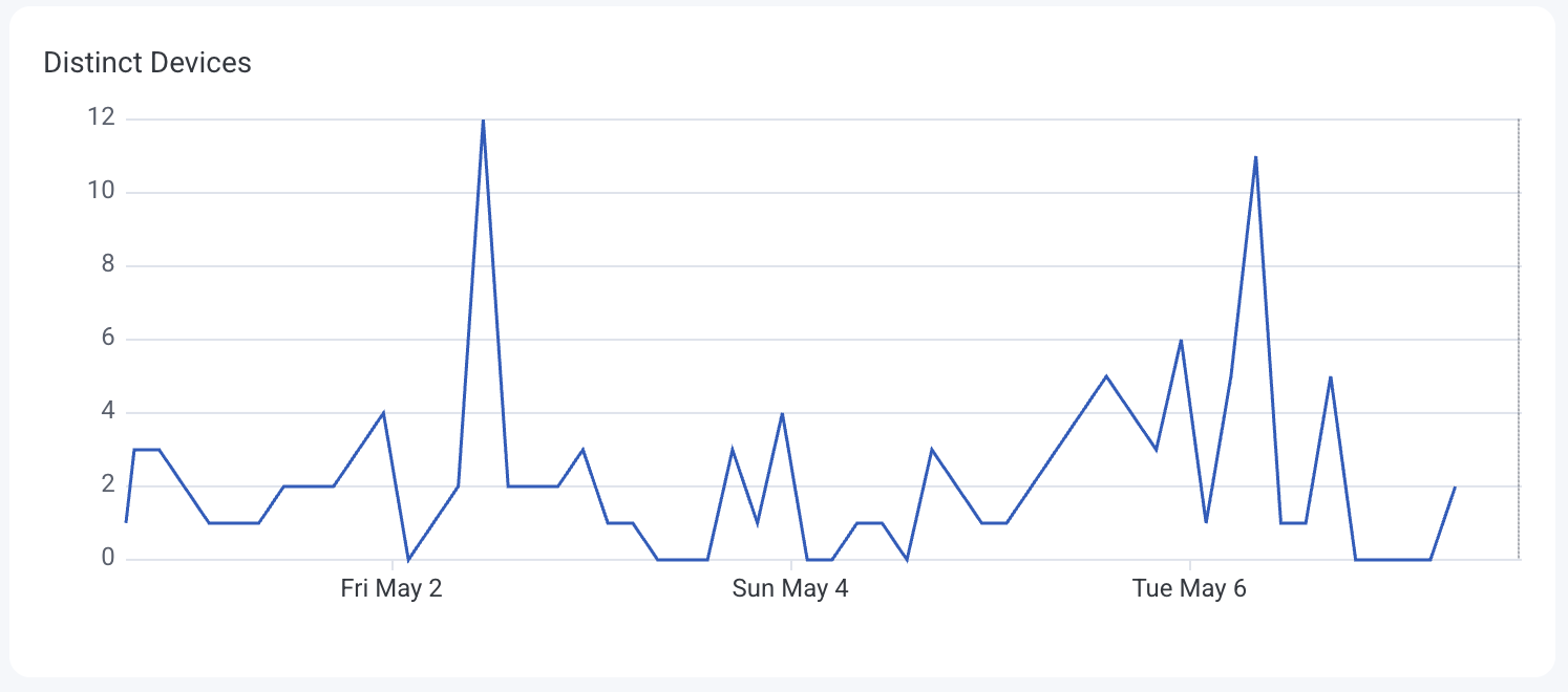
Top visited screens
Identify the most frequently accessed screens to understand user navigation patterns. Each colored line on the chart represents a different screen, showing the frequency of user visits. The table view ranks screens by visit count.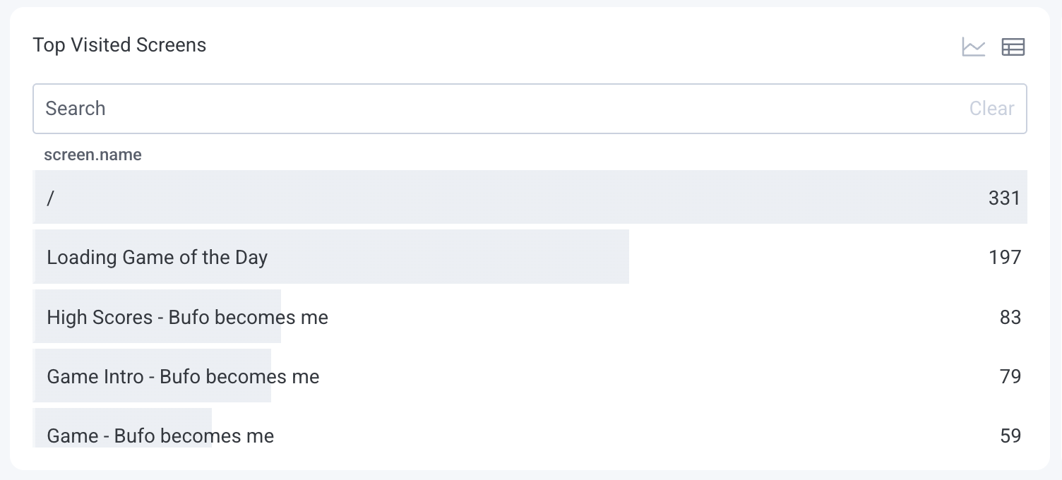
Total events by type
Examine the distribution of different event types to monitor user interactions. Each colored line on the chart represents a different event type, showing trends of event types over time. The table view lists event types and their total occurrences.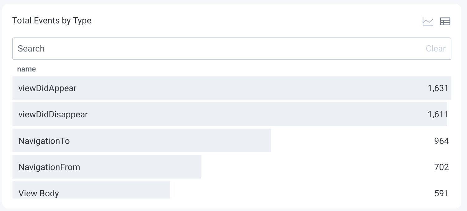
Event loop latency
Counts of slow event loops. Slow event loops may indicate performance issues.
Average event loop latency
Average count of slow event loops. Slow event loops may indicate performance issues.
React Native startup time
Heatmap of application startup times in milliseconds grouped by operating system.React Native startup time P95
Line chart of 95th percentile application startup times in milliseconds grouped by operating system.Sessions with the most events
Highlight sessions with high activity levels, which may indicate power users or potential issues. The table view ranks the top 100 sessions by event count.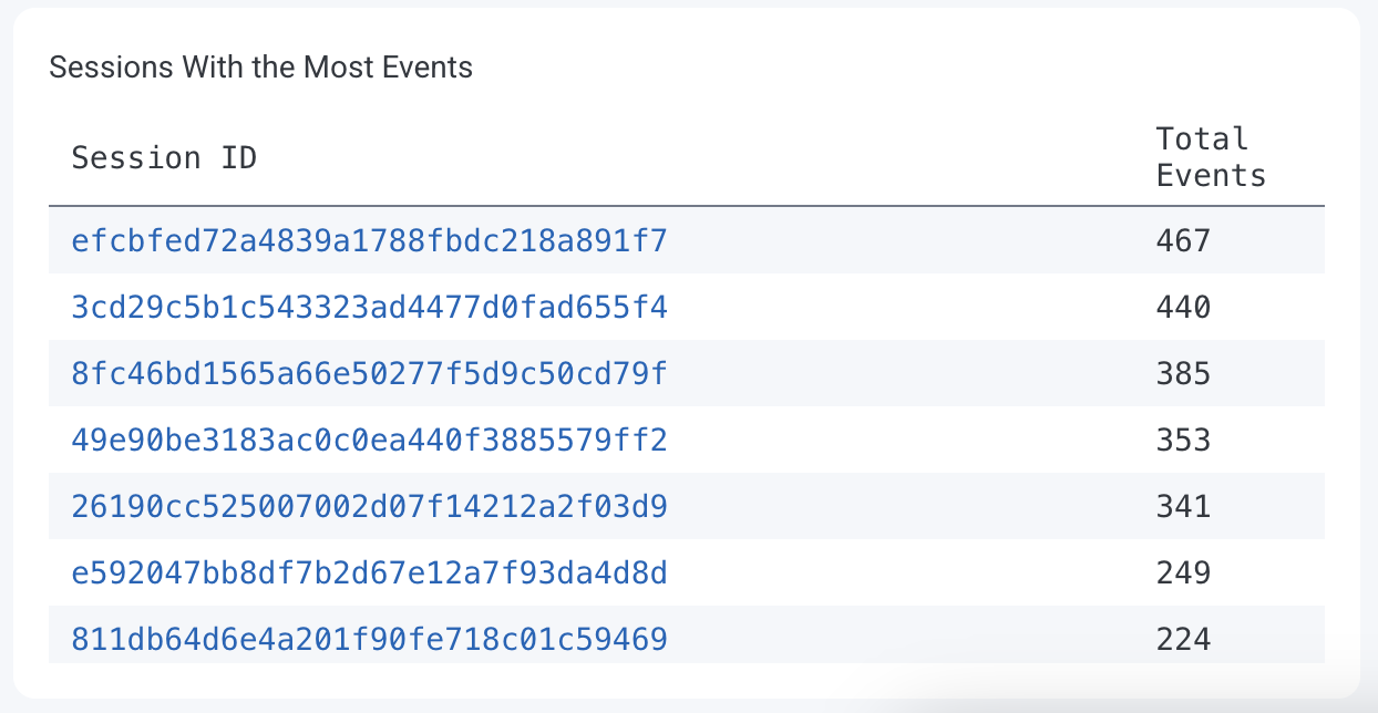
iOS-specific charts and tables
Some charts and tables in the React Native Launchpad appear only for iOS devices, highlighting metrics like startup performance, delays, and unresponsive screens specific to iPhones and iPads.Total startup times over 1.5s
Identify startup times exceeding 1.5 seconds, which may indicate performance bottlenecks. Each colored line on the chart represents a different screen, showing the frequency of slow startups. The y-axis represents the number of occurrences.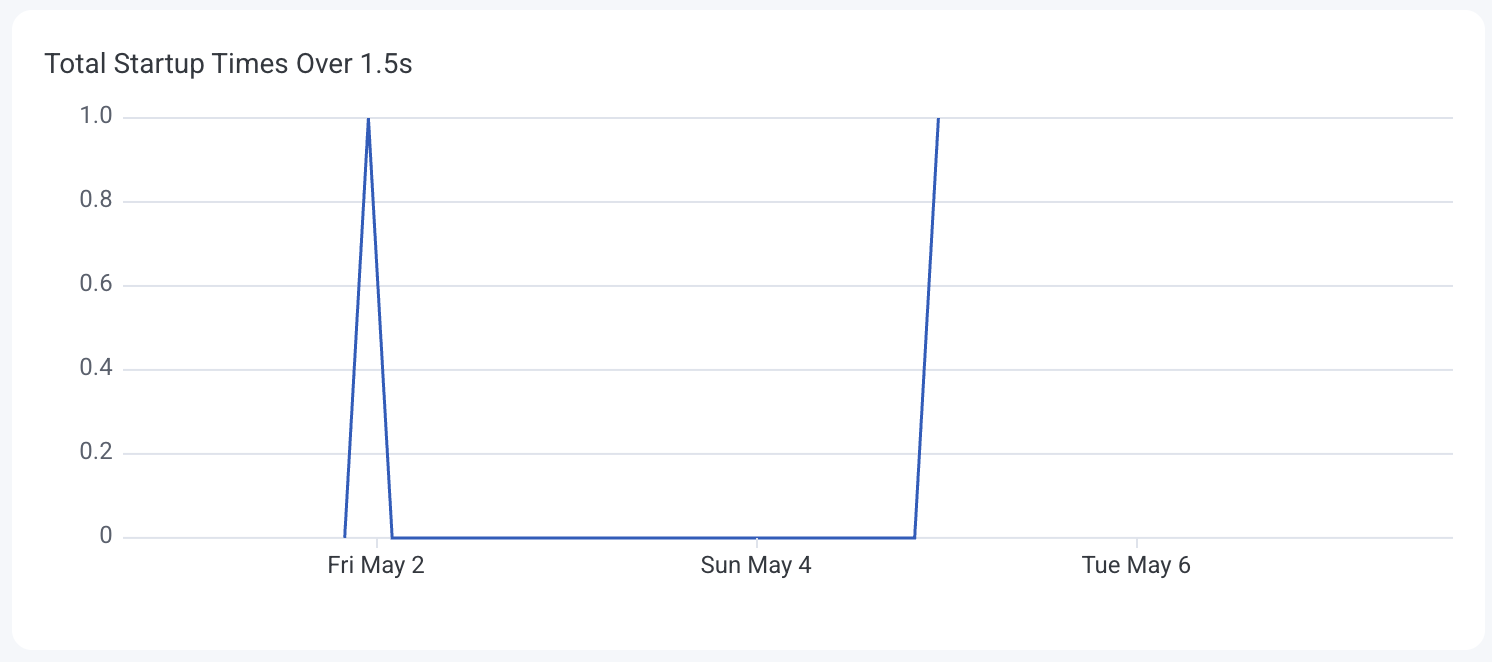
App cold startup time
Analyze the distribution of cold startup times to assess initial load performance. Colors on the heatmap indicate the frequency of startup durations. The y-axis represents the startup time in seconds.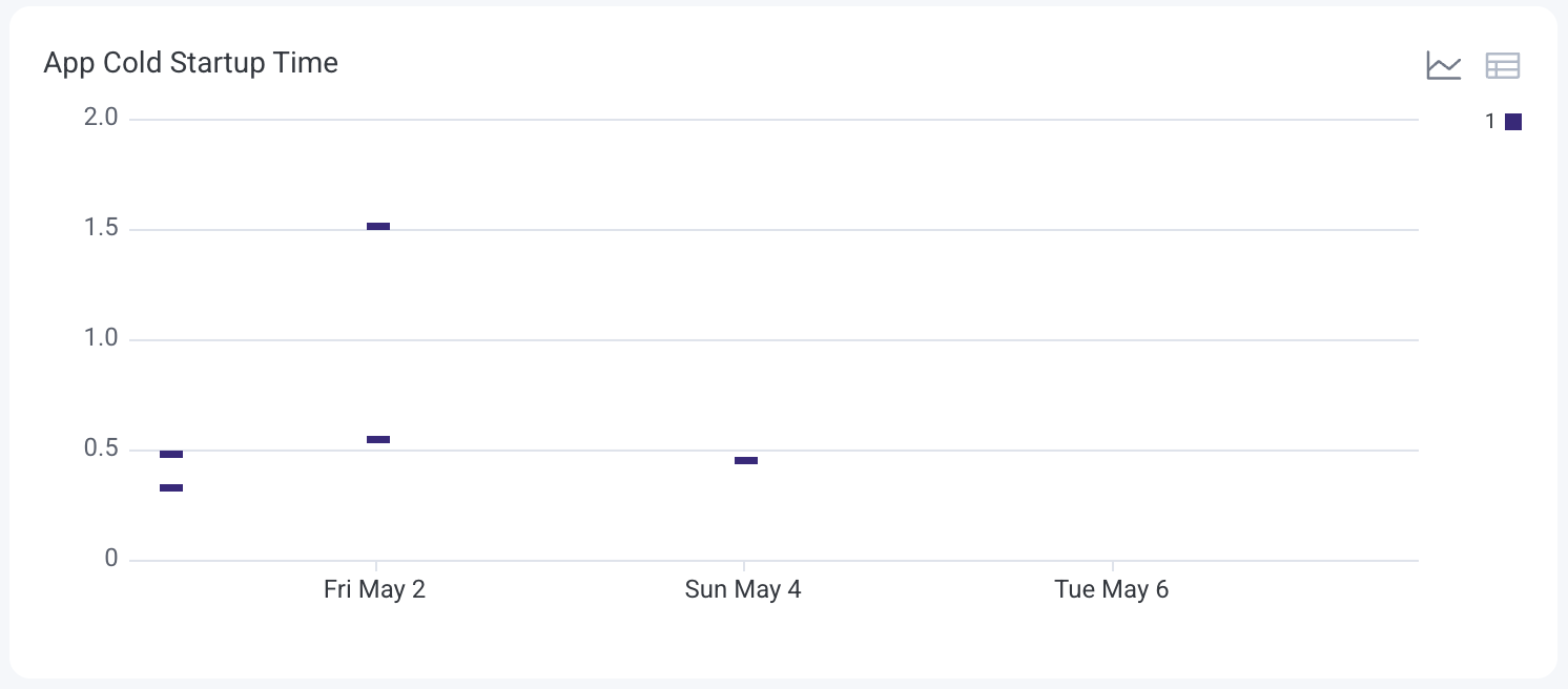
Hang time
Detect screens where users experience delays or unresponsiveness. The table view displays screen names and their average hang durations.Android-specific charts and tables
Some charts and tables in the React Native Launchpad appear only for Android devices, showing metrics like app startup times, crashes, ANRs, and UI rendering performance specific to Android phones and tablets.App startup time
See how long it takes your application to launch under different conditions so you can target and reduce delays that impact user experience. Each colored line on the chart represents a different startup type:- Cold Start: Application is launched from scratch.
- Warm Start: Application is relaunched after being in memory but not in the foreground.
- Hot Start: Application is quickly resumed from the background.

Total app starts
Track how often your application starts and which types of launches—cold, warm, or hot—occur most frequently. Each colored line on the chart represents a different startup type:- Cold Start: Application is launched from scratch.
- Warm Start: Application is relaunched after being in memory but not in the foreground.
- Hot Start: Application is quickly resumed from the background.

App crashes
Monitor how often your application crashes over time to identify regressions or problem versions. Each colored line on the chart represents a different version of your application. The y-axis represents the number of application crashes.
App not responding count
Track how often your application becomes unresponsive (ANR: Application Not Responding), broken down by application version. Each colored line on the chart represents a different application version. The y-axis represents the number of non-responsive events (ANRs). The table view ranks versions by ANR counts to highlight which releases have stability issues.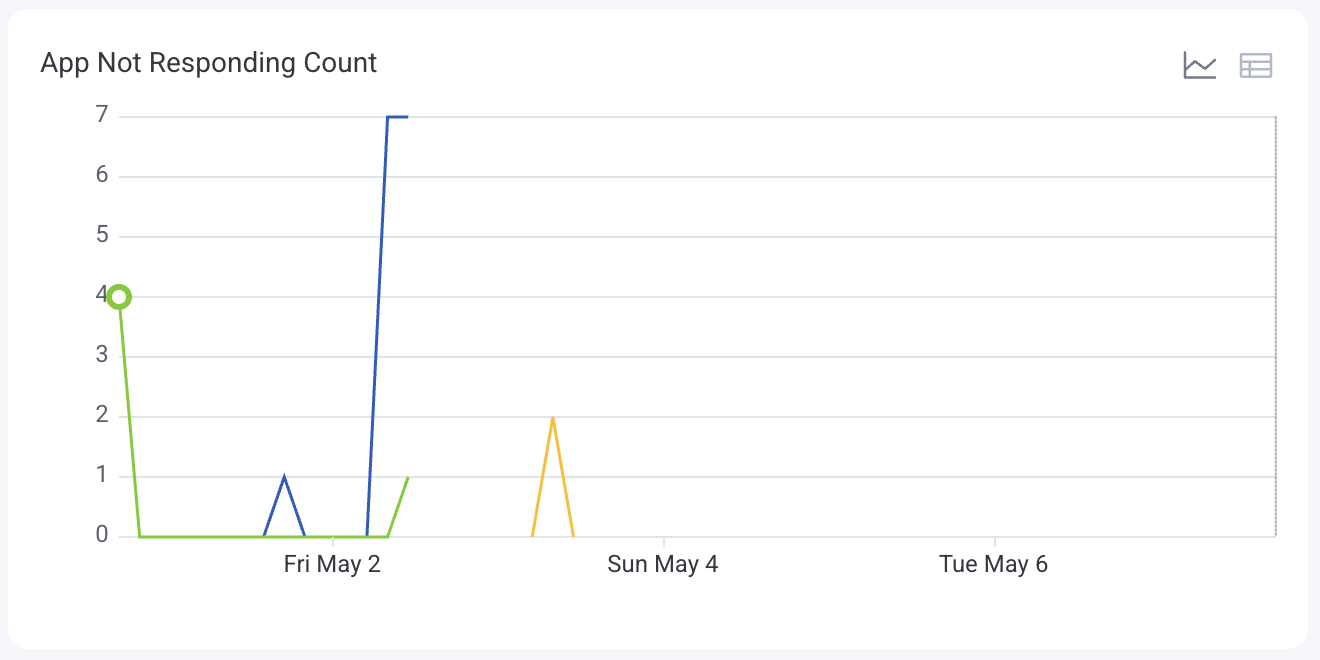
Slow and frozen renders
Detect when and where the application’s UI rendering is lagging, broken down into slow and frozen frames. Each colored line on the chart represents a type of render delay:- Slow: Frames that take longer than expected to render.
- Frozen: Frames that stall entirely or render after a major delay.
