

- How do resource limits compare to container resource use?
- How does application performance vary with container resource limits?
- Are application errors happening on specific nodes or across the fleet?
Before You Begin
Before beginning this guide, you should have:- Created a running Kubernetes cluster.
- Deployed an application to Kubernetes.
- Completed the Kubernetes Quick Start.
Explore Your Data
In Honeycomb, you can slice and dice your data by Kubernetes attributes from your Home view, or create Boards to save relevant queries and visualizations. Either way, you will want to leverage Honeycomb’s features to create Triggers and investigate outliers using BubbleUp and Correlations.Slice and Dice Your Data
Once you have Kubernetes data in Honeycomb, navigate to the Home view and select your Kubernetes dataset to begin exploring your data. At a minimum, you will see event data, which you can group by various Kubernetes attributes. If you have instrumented your code, you will also see trace data.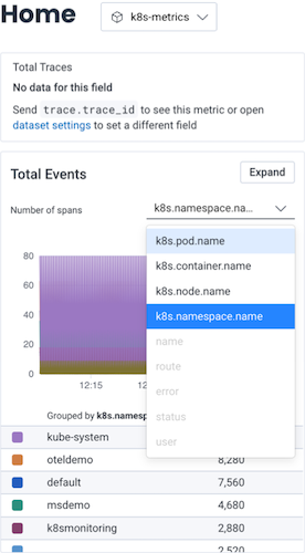
Create a Board
For quick reference over time, you should create a Board that you can customize to show Kubernetes-specific items of interest. When creating your Board, we recommend that you use one of our customized Board Templates for Kubernetes data, which will get you started with queries and visualizations of particular interest to Kubernetes users. You can locate Board Templates by selecting Explore Templates from the Home view. Our Kubernetes Board Templates include:- Kubernetes Pod Metrics
- Kubernetes Node Metrics
- Kubernetes Workload Health
Kubernetes Pod Metrics: Queries and visualizations that help you investigate pod performance and resource usage within Kubernetes clusters.
For example, you could use the Kubernetes Pod Metrics Board Template to determine if a pod uses too many resources.
Queries include:
Create Triggers
Once you have created a Board, you will likely want to configure some Triggers, so you can receive notifications when your data in Honeycomb crosses defined thresholds. Some examples of triggers that may be of interest to Kubernetes users include:- CPU Use: Pods or nodes that are reaching set CPU limits
- Memory Use: Pods experiencing OOMKilled or nodes that are reaching a certain memory usage limit
- Unhealthy pods: Pods that are experiencing a problematic status in Kubernetes Events, such as a reason of
BackOff,Failed,Err, orUnhealthy
- On your Board, locate a Query from which you want to create a Trigger.
- Select the query to open it in the Query Builder display.
- Select the three-dot overflow menu, located to the left of Run Query, and select Make Trigger.
- Configure the trigger by defining trigger details, an alert threshold, and your notification preferences.
Investigate Outliers
Follow our guided Kubernetes sandbox scenario to see how you can simplify debugging by using the core analysis loop—Honeycomb BubbleUp, Correlations, and rich queryable data—to link application behavior to underlying infrastructure.Examples
Let’s look at some examples to learn how to use Honeycomb to investigate some common issues.Trace an Application Issue to Infrastructure
The OpenTelemetry Kubernetes Attributes Processor adds Kubernetes context to your telemetry, allowing for correlation with an application’s traces, metrics, and logs. With this data now on our spans, let’s investigate some slow traces and identify the cause of them.Find Slow Traces
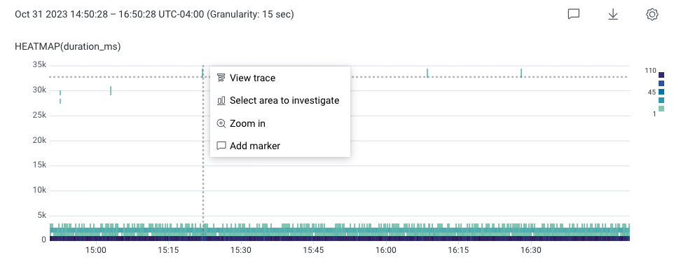
To find slow traces:-
In Query Builder, enter SELECT
HEATMAP(duration_ms). - Select Run Query. This creates a heatmap below the Query Builder. The slowest traces appear towards the top of the heatmap.
- In the heatmap, select a slow request towards the top of the chart. In this example, it appears as a teal square with a high duration.
-
In the menu that appears, select View trace.
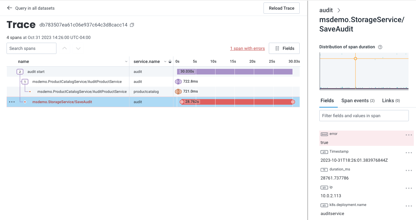
Identify the Cause
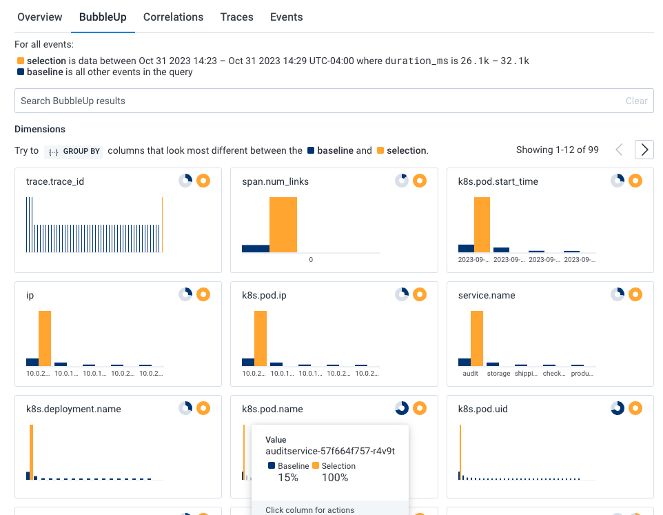
To investigate further, return to the previous query and use BubbleUp:- In the top left of the Trace Waterfall view, select the back arrow next to “Query in all datasets”. The previous Query Results page with the heatmap appears.
- In the heatmap, draw a box around the slow trace data to define the selection. A menu appears.
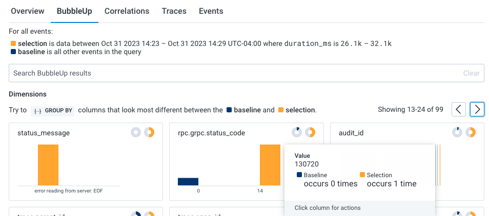
- Select BubbleUp Outliers. The BubbleUp charts appear below the heatmap. BubbleUp creates charts to show differences between the selected slow requests and all other requests returned for the time window.
k8s.pod.name) looks to be a significant outlier and that audit job (audit_id) 130720 is failing.
Find Correlations
Now, let’s see if there are any correlations between our previously identified application issue and our infrastructure. Within the query results, select the Correlations tab below the heatmap. The dropdown windows allows us to use a pre-existing Board with saved queries to correlate data with our Query Results. In our example, our Correlations board is Kubernetes Pod Metrics, which is available as a Board Template for your own use. The Correlations results show two indicators: Spikes in pod memory, and CPU consumption.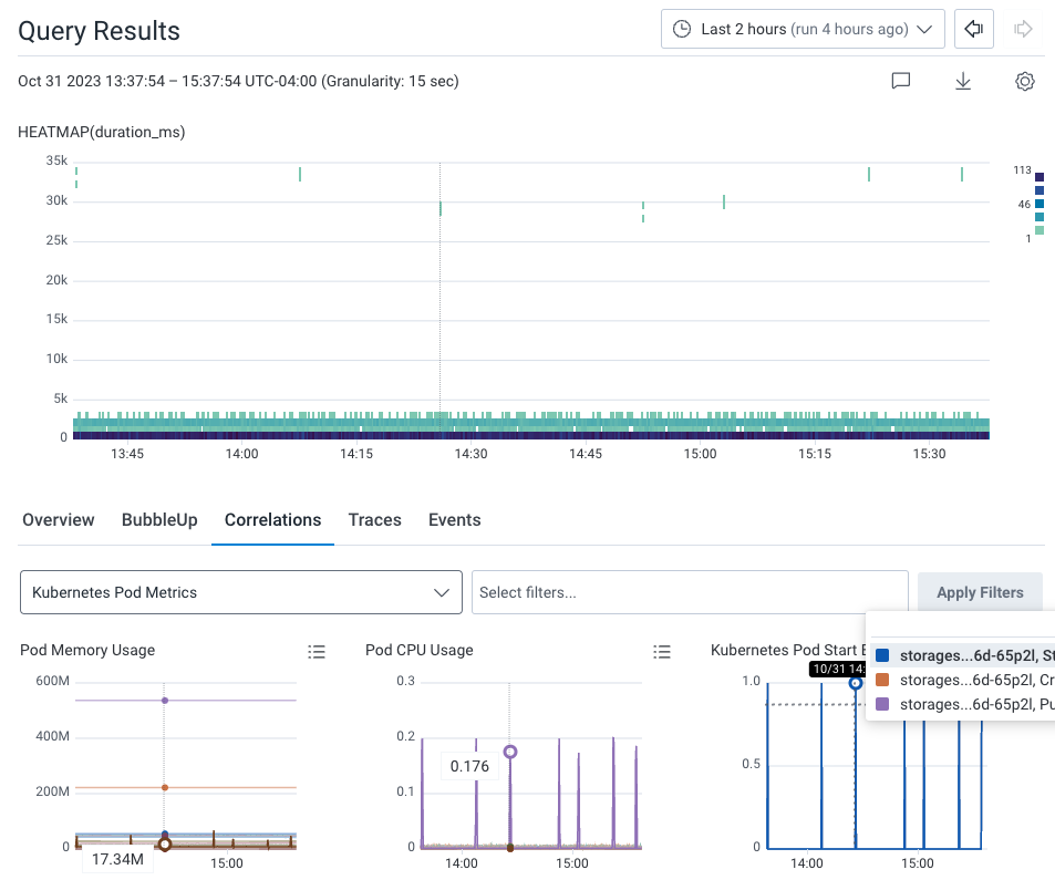
130720, which leads to the application issues we originally noticed.
Pinpoint Users Affected by an Infrastructure Issue
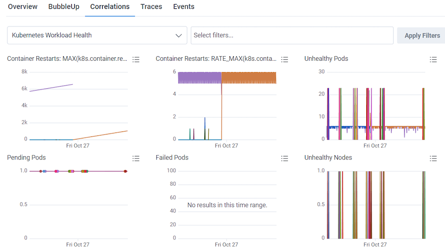
You can use the Kubernetes Workload Health Board to monitor and investigate infrastructure issues, and in conjunction with Query Builder, identify affected users. (Kubernetes Workload Health Board is available as a Board Template, which you can use and apply to your data.) In our example, the Unhealthy Nodes Query in our Kubernetes Workload Health Board is showing unhealthy nodes appearing off and on between the 23rd and 27th of October.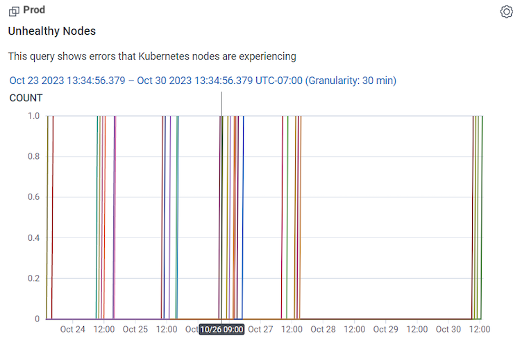
-
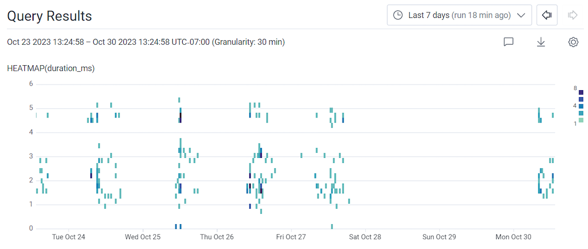
Run a query with:
- Use the time picker to adjust the time window to the Last 7 days.
- Select Run Query.
- Select the Correlations tab below the heatmap.
- Select the dropdown window that displays the selected data source.
- Choose the Kubernetes Workload Health board from the available options.
-
Select the Overview tab to the left of the Correlations tab.
The query being used includes GROUP BY
user.id, which allows you to group results by that field and see them listed in the Overview tab’s summary table. Hovering over eachuser.id’s row adjusts the above heatmap display of slow traces, so another correlation between a specific affected user and slow traces can be determined. -
Try adding additional fields to the existing query, such as user information like
user.emailto the GROUP BY clause. The goal is to give more readable and potentially actionable information about the affected users.