Once your Kubernetes data is in Honeycomb, you can use it to analyze the performance of your Kubernetes applications in production. For example, you can trace application issues to infrastructure causes or pinpoint the users affected by an identified infrastructure issue.
This guide will walk you through the steps required to answer questions like:
Before beginning this guide, you should have:
In Honeycomb, you can slice and dice your data by Kubernetes attributes from your Home view, or create Boards to save relevant queries and visualizations. Either way, you will want to leverage Honeycomb’s features to create Triggers and detect anomalies using BubbleUp and Correlations.
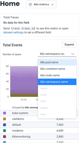
Once you have Kubernetes data in Honeycomb, navigate to the Home view and select your Kubernetes dataset to begin exploring your data.
At a minimum, you will see event data, which you can group by various Kubernetes attributes. If you have instrumented your code, you will also see trace data.
For quick reference over time, you should create a Board that you can customize to show Kubernetes-specific items of interest.
When creating your Board, we recommend that you use one of our customized Board Templates for Kubernetes data, which will get you started with queries and visualizations of particular interest to Kubernetes users. You can locate Board Templates by selecting Explore Templates from the Home view.
Our Kubernetes Board Templates include:
Kubernetes Pod Metrics: Queries and visualizations that help you investigate pod performance and resource usage within Kubernetes clusters. For example, you could use the Kubernetes Pod Metrics Board Template to determine if a pod uses too many resources. Queries include:
| Query Name | Query Description | Required Fields |
|---|---|---|
| Pod CPU Usage | Shows the amount of CPU used by each pod in the cluster. CPU is reported as the average core usage measured in cpu units. One cpu, in Kubernetes, is equivalent to 1 vCPU/Core for cloud providers, and 1 hyper-thread on bare-metal Intel processors. |
|
| Pod Memory Usage | Shows the amount of memory being used by each Kubernetes pod. |
|
| Pod Uptime Smokestacks | As pod uptime ever-increases, this query uses the smokestack method, which applies a LOG10 to the Pod Uptime metric, and newly started or restarted pods appear more significantly than pods that have been running a long time, which move into a straight line eventually. |
|
| Unhealthy Pods | Shows trouble that pods may be experiencing during their operating lifecycle. Many of these events are present during start-up and get resolved so the presence of a count isn’t necessarily bad. |
|
| Pod CPU Utilization vs. Limit | When a CPU Limit is present in a pod configuration, this query shows how much CPU that each pod uses as a percentage against that limit. |
|
| Pod CPU Utilization vs. Request | When a CPU Request is present in a pod configuration, this query shows how much CPU that each pod uses as a percentage against that request value. |
|
| Pod Memory Utilization vs. Limit | When a Memory Limit is present in a pod configuration, this query shows how much memory that each pod uses as a percentage against that limit value. |
|
| Pod Memory Utilization vs. Request | When a Memory Request is present in a pod configuration, this query shows how much memory that each pod uses as a percentage against that request value. |
|
| Pod Network IO Rates | Displays Network IO RATE_MAX for Transmit and Receive network traffic (in bytes) as a stacked graph, and gives the overall network rate and the individual rate for each node. |
|
| Pods With Low Filesystem Availability | Shows any pods where filesystem availability is below 5 GB. |
|
| Pod Filesystem Usage | Shows the amount of filesystem usage per Kubernetes pod, displayed in a stack graph to show total filesystem usage of all pods. |
|
| Pods Per Namespace | Shows the number of pods currently running in each Kubernetes namespace. |
|
| Pods Per Node | Shows the number of pods currently running in each Kubernetes Node. |
|
| Pod Network Errors | Shows network errors in receive and transmit, grouped by pod. |
|
| Pods Per Deployment | Shows the number of pods currently deployed in different Kubernetes deployments. |
|
Kubernetes Node Metrics: Queries and visualizations that help you investigate node performance and resource usage within Kubernetes clusters. For example, you could use the Kubernetes Node Metrics Board Template to monitor if your nodes are functioning as expected. Queries include:
| Query Name | Query Description | Required Fields |
|---|---|---|
| Node CPU Usage | Shows the amount of CPU used on each node in the cluster. CPU is reported as the average core usage measured in cpu units. One cpu, in Kubernetes, is equivalent to 1 vCPU/Core for cloud providers, and 1 hyper-thread on bare-metal Intel processors. |
|
| Node Memory Utilization | Shows percent of memory used on each Kubernetes node. |
|
| Node Network IO Rates | Displays Network IO RATE_MAX for Transmit and Receive network traffic as a stacked graph, and gives overall network rate and the individual rate for each node. |
|
| Unhealthy Nodes | Shows errors that Kubernetes nodes are experiencing. |
|
| Node Filesystem Utilization | Shows percent of filesystem used on each node. |
|
| Node Uptime Smokestack | As node uptime ever-increases, this query uses the smokestack method, which applies a LOG10 to the Node Uptime metric, and newly started or restarted nodes appear more significantly than nodes that have been running a long time, which move into a straight line eventually. |
|
| Node Network Errors | Shows network transmit and receive errors for each node. |
|
| Pods and Containers per Node | Shows the number of pods and the number of containers per node as stacked graphs, and also shows total number of pods and containers across the environment. |
|
Kubernetes Workload Health: Queries and visualizations that help you investigate Kubernetes-related application problems. For example, you could use the Kubernetes Workload Health Board Template to monitor health at a glance and connect application problems to infra issues.
This Board Template is more about statuses than numbers, such as unhealthy reasons, unscheduled DaemonSets, or numbers of restarts. For the queries on this Board Template, you generally want to see empty results and zeroes as healthy indicators. Queries include:
| Query Name | Query Description | Required Fields |
|---|---|---|
| Container Restarts | Shows the total number of restarts per pod, and the rate of restarts of pods where the restart count is greater than zero. |
|
| Unhealthy Pods | Shows trouble that pods may be experiencing during their operating lifecycle. Many of these events are present during start-up and get resolved so the presence of a count isn’t necessarily bad. |
|
| Pending Pods | Shows pods in a “Pending” state. |
|
| Failed Pods | Shows pods in a “Failed” or “Unknown” state. |
|
| Unhealthy Nodes | Shows errors that Kubernetes nodes are experiencing. |
|
| Unhealthy Volumes | Shows volume creation and attachment failures. |
|
| Unscheduled Daemonset Pods | Tracks cases where a pod in a daemonset is not currently running on every node in the cluster as it should be. |
k8s.namespace.name |
| Stateful Set Pod Readiness | Tracks any stateful sets where pods are in an non-ready state that should be in a ready state. |
|
| Deployment Pod Status | Shows Deployments where Pods have not fully deployed. Numbers greater than zero show pods in a deployment that are not yet “ready”. |
|
| Job Failures | Tracks the number of failed pods in Kubernetes jobs. |
|
| Active Cron Jobs | Tracks the number of active pods in each Kubernetes cron job. |
|
Once you have created a Board, you will likely want to configure some Triggers, so you can receive notifications when your data in Honeycomb crosses defined thresholds. Some examples of triggers that may be of interest to Kubernetes users include:
BackOff, Failed, Err, or UnhealthyTo create a Trigger:
Follow our guided Kubernetes sandbox scenario to see how you can simplify debugging by using the core analysis loop–Honeycomb BubbleUp, Correlations, and rich queryable data–to link application behavior to underlying infrastructure.
Let’s look at some examples to learn how to use Honeycomb to investigate some common issues.
The OpenTelemetry Kubernetes Attributes Processor adds Kubernetes context to your telemetry, allowing for correlation with an application’s traces, metrics, and logs. With this data now on our spans, let’s investigate some slow traces and identify the cause of them.
To find slow traces:
HEATMAP(duration_ms).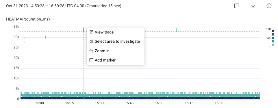
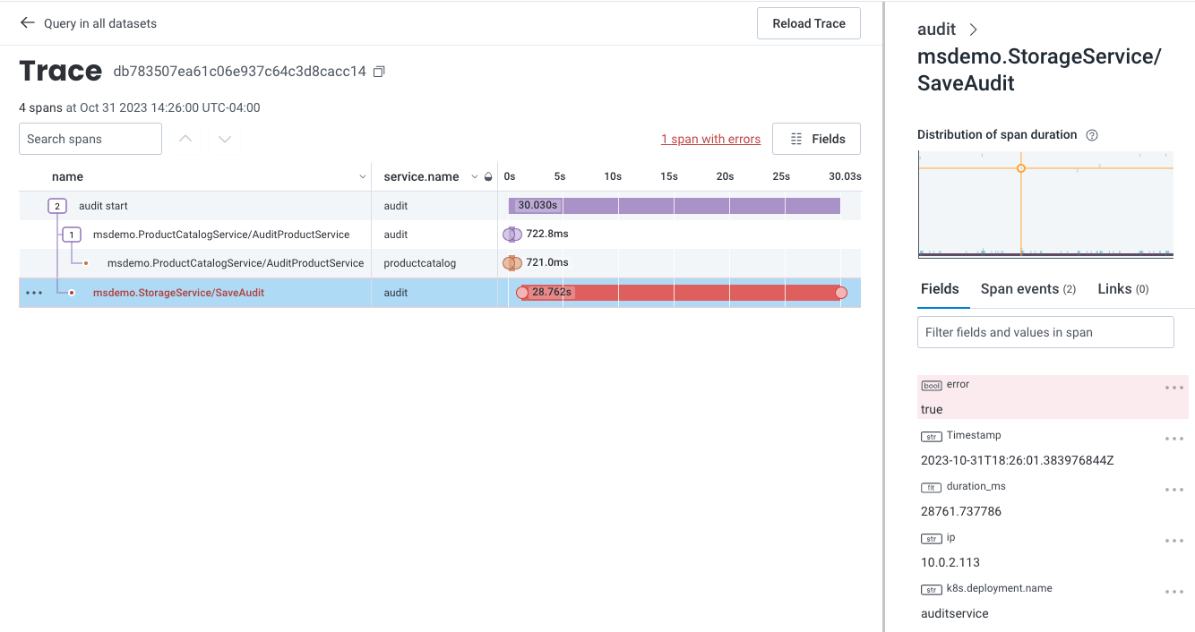
The trace’s detailed Trace Waterfall view appears next.
In this example, the span is very slow when communicating between the audit and storage services.
In addition, a span, displayed in red, contains an error.
Select the errored span and use the Trace Sidebar to view the errored span’s fields and attributes.
This information can provide some clues, but using BubbleUp would be faster.
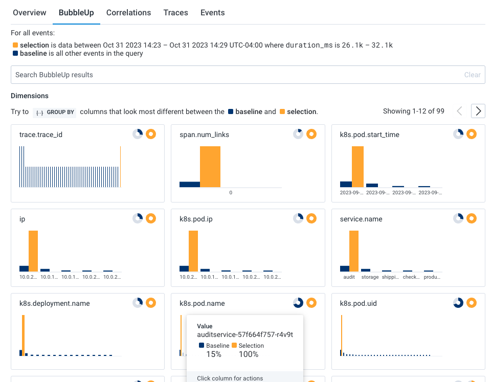
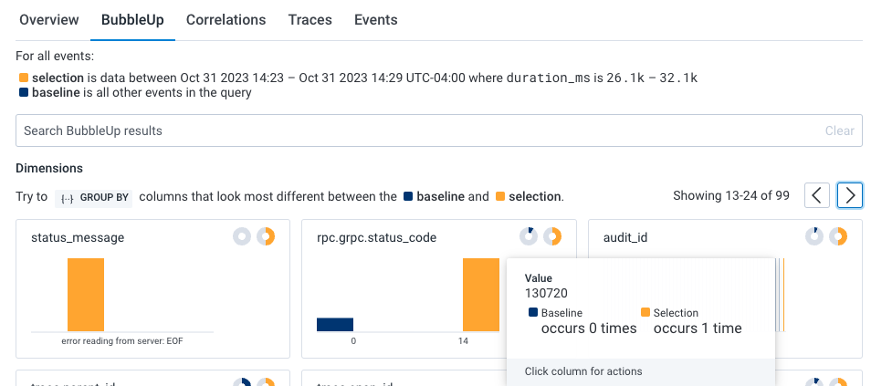
To investigate further, return to the previous query and use BubbleUp:
In our example BubbleUp results, one pod (k8s.pod.name) looks to be a significant outlier and that audit job (audit_id) 130720 is failing.
Now, let’s see if there are any correlations between our previously identified application issue and our infrastructure. Within the query results, select the Correlations tab below the heatmap. The dropdown windows allows us to use a pre-existing Board with saved queries to correlate data with our Query Results.
In our example, our Correlations board is Kubernetes Pod Metrics, which is available as a Board Template for your own use. The Correlations results show two indicators: Spikes in pod memory, and CPU consumption.
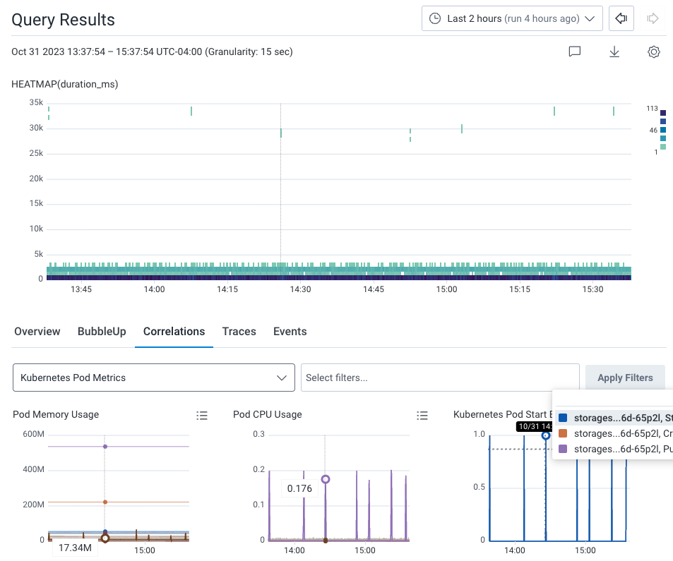
Hover over the spikes in the Kubernetes Pod Start Events Correlation chart. A line appears on all charts in the display to indicate the same point in time. The hovering reveals that the Storage pod spikes at the same time as the slow requests on the heatmap. Each spike has a Started event, as seen in the Kubernetes Pod Start Events chart, the last chart on the right. This means that Kubernetes is restarting the Storage service’s container.
We can conclude that the Storage service does not have enough resources to process and store audit job 130720, which leads to the application issues we originally noticed.
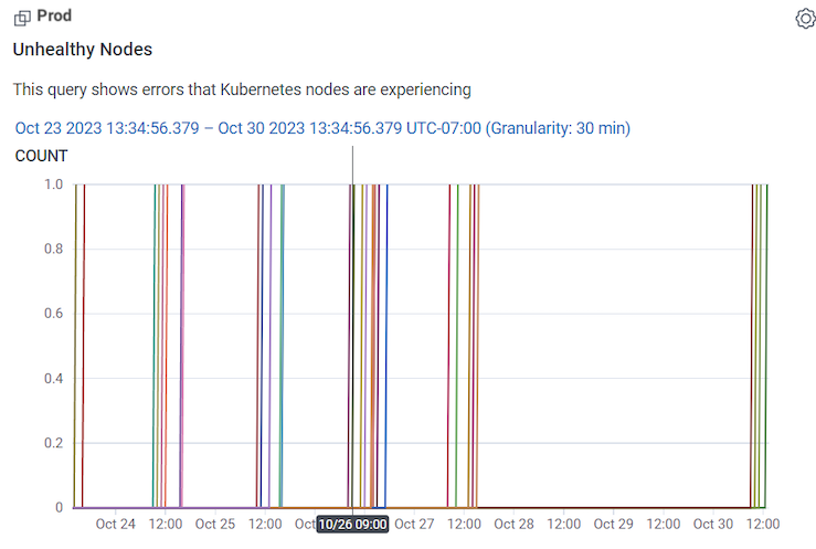
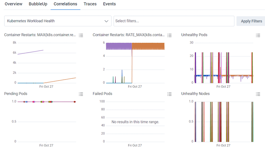
You can use the Kubernetes Workload Health Board to monitor and investigate infrastructure issues, and in conjunction with Query Builder, identify affected users. (Kubernetes Workload Health Board is available as a Board Template, which you can use and apply to your data.)
In our example, the Unhealthy Nodes Query in our Kubernetes Workload Health Board is showing unhealthy nodes appearing off and on between the 23rd and 27th of October.
To investigate, go to Query Builder to see what the application performance looks like for users during this time range. In Query Builder:
Run a query with:
| VISUALIZE | WHERE | GROUP BY |
|---|---|---|
| HEATMAP(duration_ms) | user.id exists | user.id |
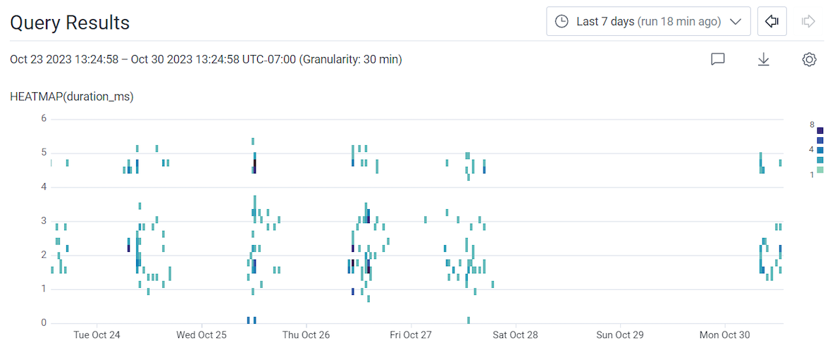
Use the time picker to adjust the time window to the Last 7 days.
Select Run Query.
In our example’s query results, it looks like there are occasional spikes in slow requests, similar to the spikes in unhealthy nodes previously noticed on the Kubernetes Workload Health board.
To confirm this:
In our example’s Correlations display, the slow requests from our query and spikes in unhealthy nodes from the Unhealthy Nodes chart align.
Clumps of pending pods are also seen in the Pending Pods chart at this same time too.
To learn more about the users affected:
Select the Overview tab to the left of the Correlations tab.
The query being used includes GROUP BY user.id, which allows you to group results by that field and see them listed in the Overview tab’s summary table.
Hovering over each user.id’s row adjusts the above heatmap display of slow traces, so another correlation between a specific affected user and slow traces can be determined.
Try adding additional fields to the existing query, such as user information like user.email to the GROUP BY clause.
The goal is to give more readable and potentially actionable information about the affected users.