

Debugging From First Principles
Once you have gathered telemetry data as events, achieving observability requires that you are capable of analyzing that data in powerful and objective ways. You should have to know very little before debugging an issue. You should be able to systematically and scientifically take one step after another, and methodically follow clues to find an answer, even when you are unfamiliar with the system. In short, you should be able to debug your applications from first principles. A first principle is a basic assumption about a system that was not deduced from another assumption. While intuitively jumping straight to the answer is wonderful, it becomes increasingly impractical as complexity rises and the number of possible answers skyrockets. Proper science requires you to avoid assuming anything. You must start by questioning what has been proven and what you are absolutely sure is true. Then, you must form a hypothesis and validate or invalidate it based on observations about the system. Debugging from first principles is a methodology you can follow to understand a system scientifically and is a core capability of observability.Using the Core Analysis Loop
The core analysis loop is the process of using your telemetry to form hypotheses and to validate or invalidate them with data, thereby systematically arriving at the answer to a complex problem. It puts debugging from first principles into practice through the use of a methodical, repeatable, verifiable process. Debugging from first principles begins when you are made aware that something is wrong. You could have received an alert or a customer complaint: you know that something is slow, but you do not know what is wrong. At this point, you can begin the stages of the core analysis loop: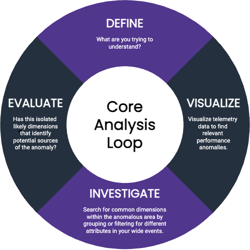
- Define: What are you trying to understand? Start with what prompted your investigation: what did the customer or alert tell you?
- Visualize: Visualize telemetry data to find relevant performance anomalies. Verify that what you know so far is true: do you see a notable change in performance happening somewhere in the system? Data visualizations can help you identify changes of behavior—you’ll see a change in a curve somewhere on the graph.
-
Investigate: Search for common dimensions within the anomalous area by grouping or filtering for different attributes in your wide events.
Search for dimensions that might drive the change in performance. To do this, you might:
- Examine sample rows from the area that shows the change: are there any outliers in the columns that might give you a clue?
- Slice those rows across various dimensions looking for patterns: do any of those views highlight distinct behavior across one or more dimensions?
Try an experimental GROUP BY on commonly useful fields, like
status_code. - Filter for particular dimensions or values within those rows to better expose potential outliers.
- Evaluate: Have you isolated likely dimensions that identify potential sources of the anomaly? Do you now know enough about what might be occurring? If so, you’re done! If not, filter your view to isolate this area of performance as your next starting point, then return to step 3.
Automating the Core Analysis Loop
When uncovering interesting dimensions, you can perform the core analysis loop manually, but a good observability tool should automate as much of the investigation for you as possible. Rather than manually searching across rows and columns to coax out patterns, an automated approach would be to retrieve the values of all dimensions, both inside the isolated area (the anomaly) and outside the area (the system baseline), diff them, and then sort by the difference. Very quickly, this lets you see a list of things that are different in your investigation’s areas of concern as compared to everything else. For example, you might isolate a spike in request latency and, when automating the core analysis loop, get back a sorted list of dimensions and how often they appear within this area. You might see the following:request.endpointwith valuebatchis in 100% of requests in the isolated area, but in only 20% of the baseline area.handler_routewith value/1/markers/is in 100% of requests in the isolated area, but only 10% of the baseline area.request.header.user_agentis populated in 97% of requests in the isolated area, but 100% of the baseline area.
Example: Investigate an Outlier Using BubbleUp
Honeycomb automates the core analysis loop with the BubbleUp feature. With Honeycomb, you start by visualizing a heatmap to isolate a particular area of performance you care about. Select a spike in a line chart or drag to select an unusual area on your heatmap, and choose BubbleUp Outliers. BubbleUp computes the values of all dimensions both inside the box (the anomaly you care about and want to explain) and outside the box (the baseline), and then compares the two and sorts the resulting view by percent of differences. Let’s take a look at a heatmap that shows an anomaly and use BubbleUp to investigate it. In this real-world example, we’re looking at an application with high-dimensionality instrumentation that BubbleUp can compute and compare. We have already visualized a heatmap of event performance, seen an anomalous shape on our heatmap, and dragged to draw a box around the anomalous shape and open up BubbleUp.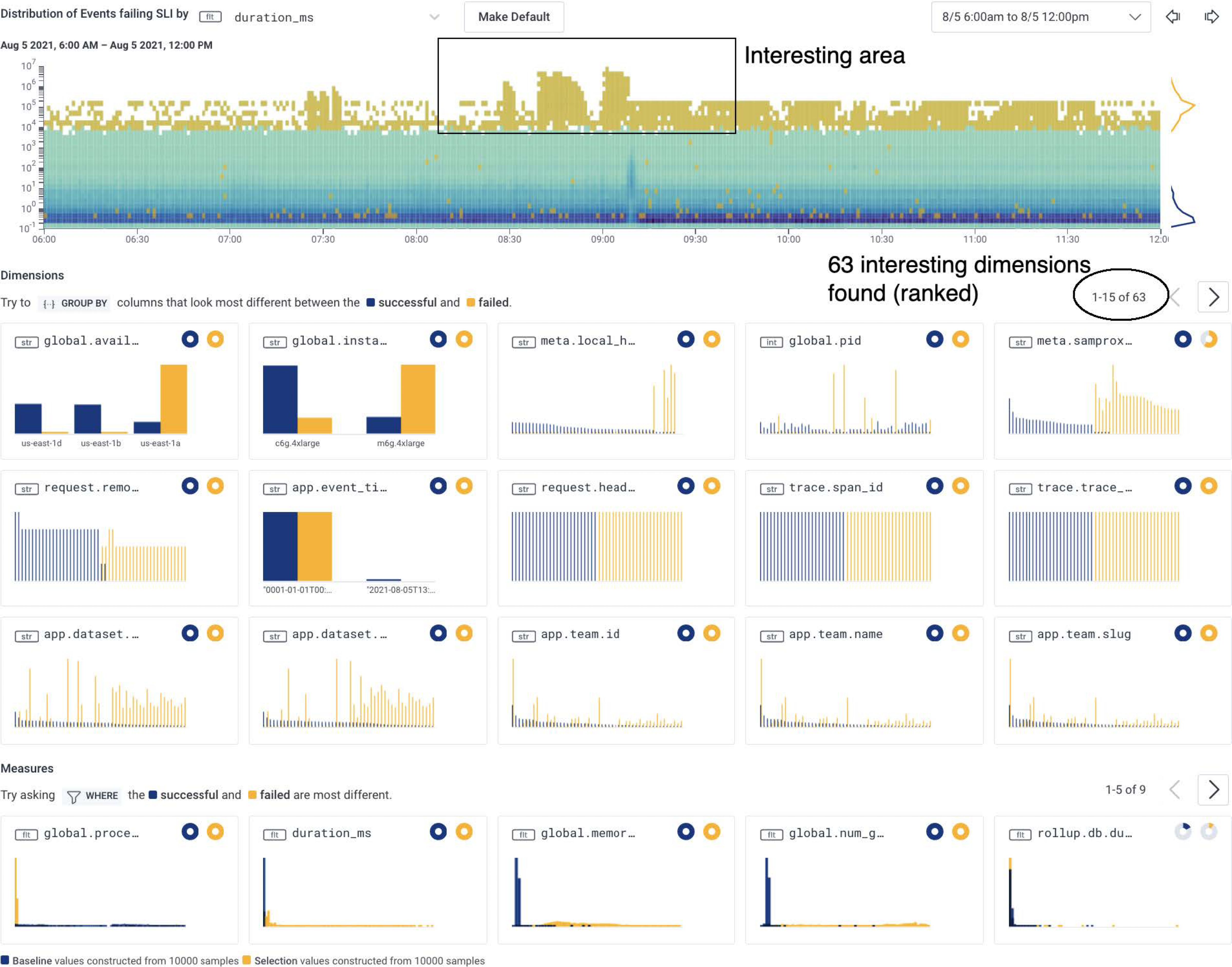
global.availability_zone with a value of us-east-1a and a field named global.instance with a value of m6g.4xlarge.
Other surfaced dimensions have differences that tend to be less stark, indicating that they are likely not as relevant to this investigation.
When we hover over the histograms, we get further details.
For example, we can see that global.availability_zone appears as us-east-1a in 98% of anomalous events in the selected area and only in 17% of baseline events.
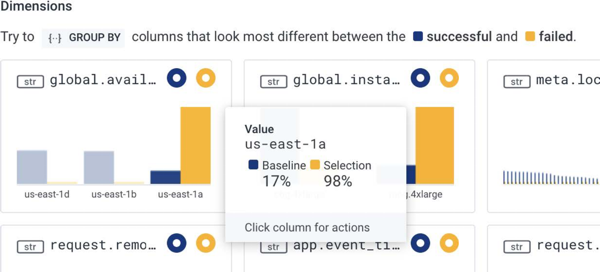
- slow-performing events are mostly originating from one particular availability zone (AZ) from our cloud infrastructure provider
- one particular virtual machine instance type appears to be more affected than others
Not all issues are as immediately obvious as this underlying infrastructure issue.
Often you may need to look at other surfaced clues to triage code-related issues.
The core analysis loop remains the same, and you may need to slice and dice across dimensions until one clear signal emerges, similar to the preceding example.
If this example had instead been a code-related issue, we might have decided to reach out to the users who reported issues or figured out the path they followed through the UI to see those errors, and then fixed the interface or the underlying system.