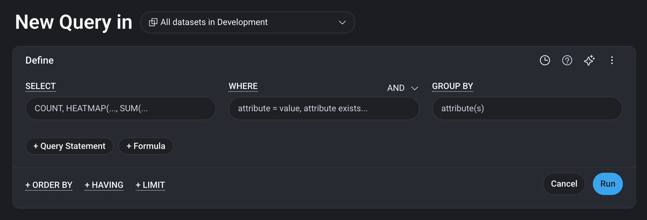
A crisper, easier-to-scan interface
Every screen now does more of the work of guiding your eye, so you spend less time searching and more time investigating. Inputs, buttons, cards, menus, and modals have softer, rounder corners and stand out clearly from the page and from each other. Scan any screen, and the control you need is easy to spot without hunting for it.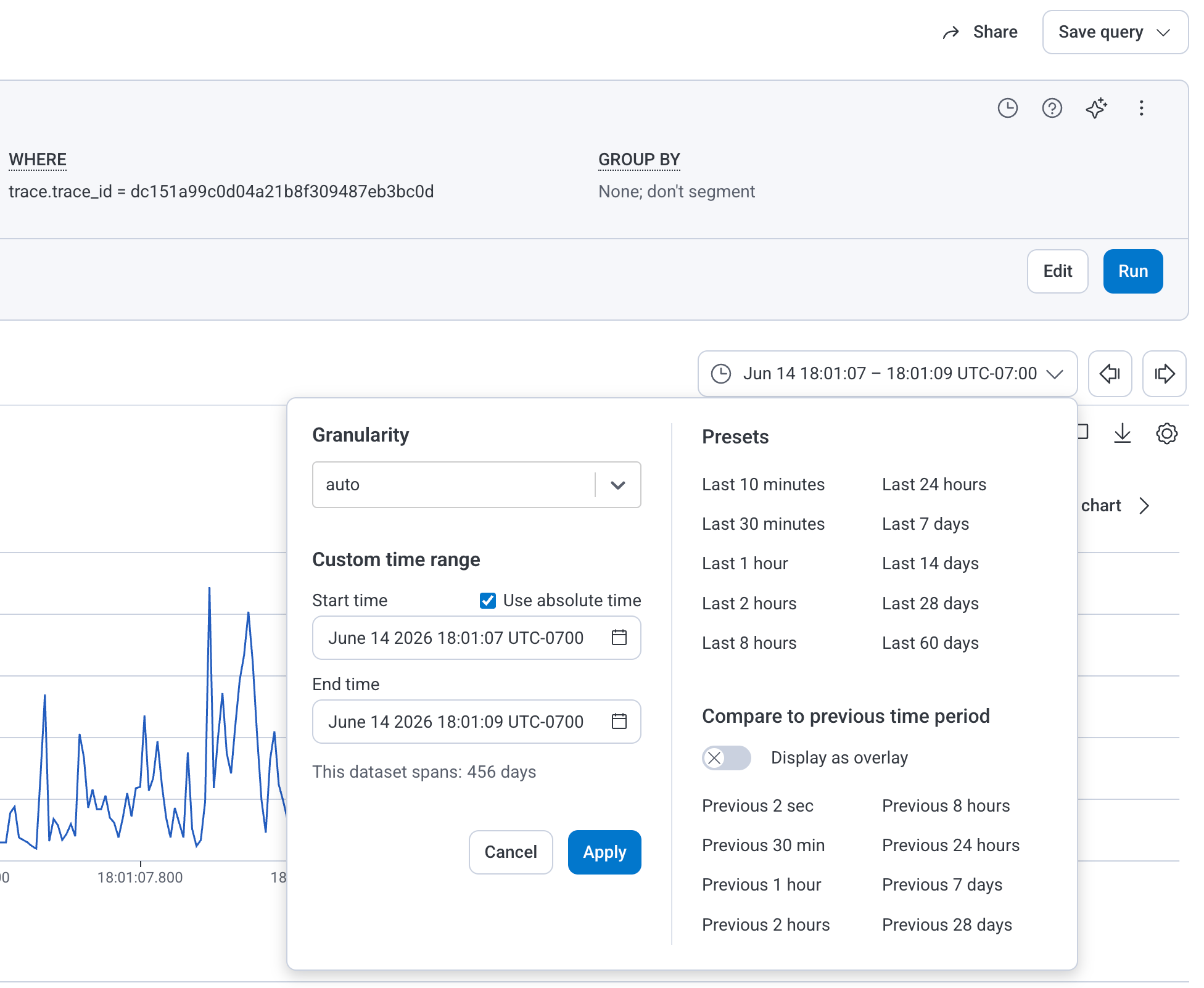
Before
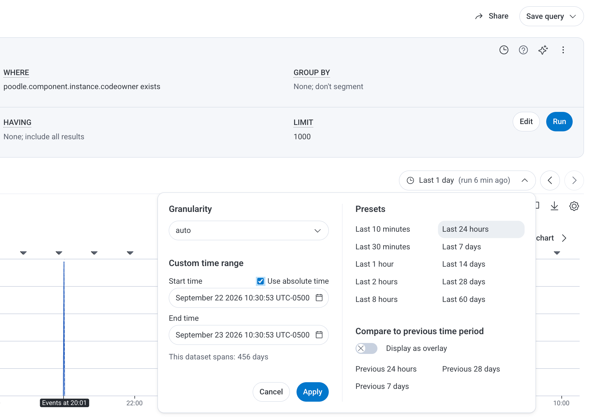
After
Canvas in the navigation menu
Canvas is grouped with the other investigative tools, so your next investigation is always one glance away. Select Canvas () from the navigation menu, where it now appears between Query and Boards.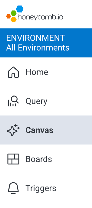
Heatmaps that highlight rare events
The events that happen least often are frequently the ones worth investigating, and heatmaps put them front and center. An updated color scale keeps low-count buckets and outliers visible instead of letting them fade into the background. Use the chart’s legend to match each color to its event count.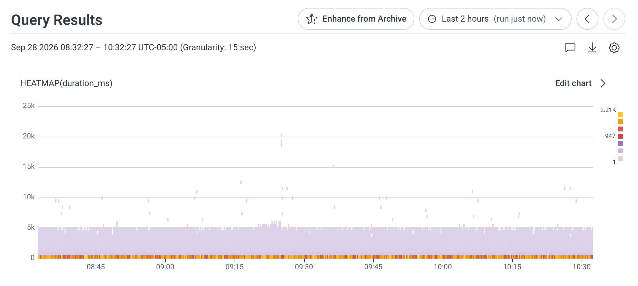
Query Builder in dark mode
Dark mode fans, this one is for you. In dark mode, the Query Builder appears as a distinct panel against the page background, so you can see exactly what you are building without straining.