In Query Results, any VISUALIZE chart(s) displays first. Below, a series of tabs for further analysis appears, including:
The Overview tab displays a summary table based on your query. If your query includes a GROUP BY clause, then the summary reflects a summary of grouped fields.
The Anomalies tab activates after you select an area in a chart or heatmap. Honeycomb’s BubbleUp feature compares your selection to all other results, or the baseline. Each comparison is represented as a chart.
A dataset or environment has many fields. BubbleUp represents each field with a chart.
The charts divide into two groups:
Each chart categorizes the data into two groups:
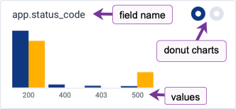
The title of the chart is the name of the field.
In the upper right corner, the two donut charts display a ratio of how often the field is found in the data. A field and its values may not be populated in a dataset or environment.
Hover over the title and donut charts to display a tooltip with the full field name and a percentage of how often the field appears in the Selection (yellow) and Baseline (blue).
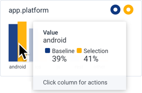
The bar chart displays each value in bar form, which represents its frequency in the Selection or in the Baseline. The height of each bar is proportional to the number of times the value occurs in the results of the query. The bar chart displays a maximum of seventy-five values, a subset of both Selection and Baseline values.
Hover over the bar for a value, to display a tooltip with its full value name and a percentage of how often the value appears in the Selection and Baseline.
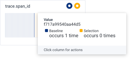
A field may contain largely unique values.
These are sometimes referred to as nominal data.
The tooltips for nominal columns show the exact number of occurrences instead of a percentage in the Selection or the Baseline.
For example, events that capture a span in a trace maintain a unique ID for the span in the trace.span_id column.
Click on a value, or a pair of bars, to display an action menu to take further actions. For charts in the Dimensions section, this actions menu appears:
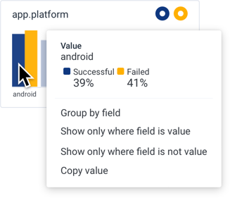
<field> = <value> and re-runs the query.<field> != <value> and re-runs the query.For charts in the Measures section, this actions menu appears:
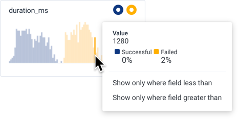
<field> < <value> and re-runs the query.<field> > <value> and re-runs the query.The Correlations tab consists of a dropdown window that displays the selected data source, a Filter search box, and up to the first six saved queries from the selected data source.
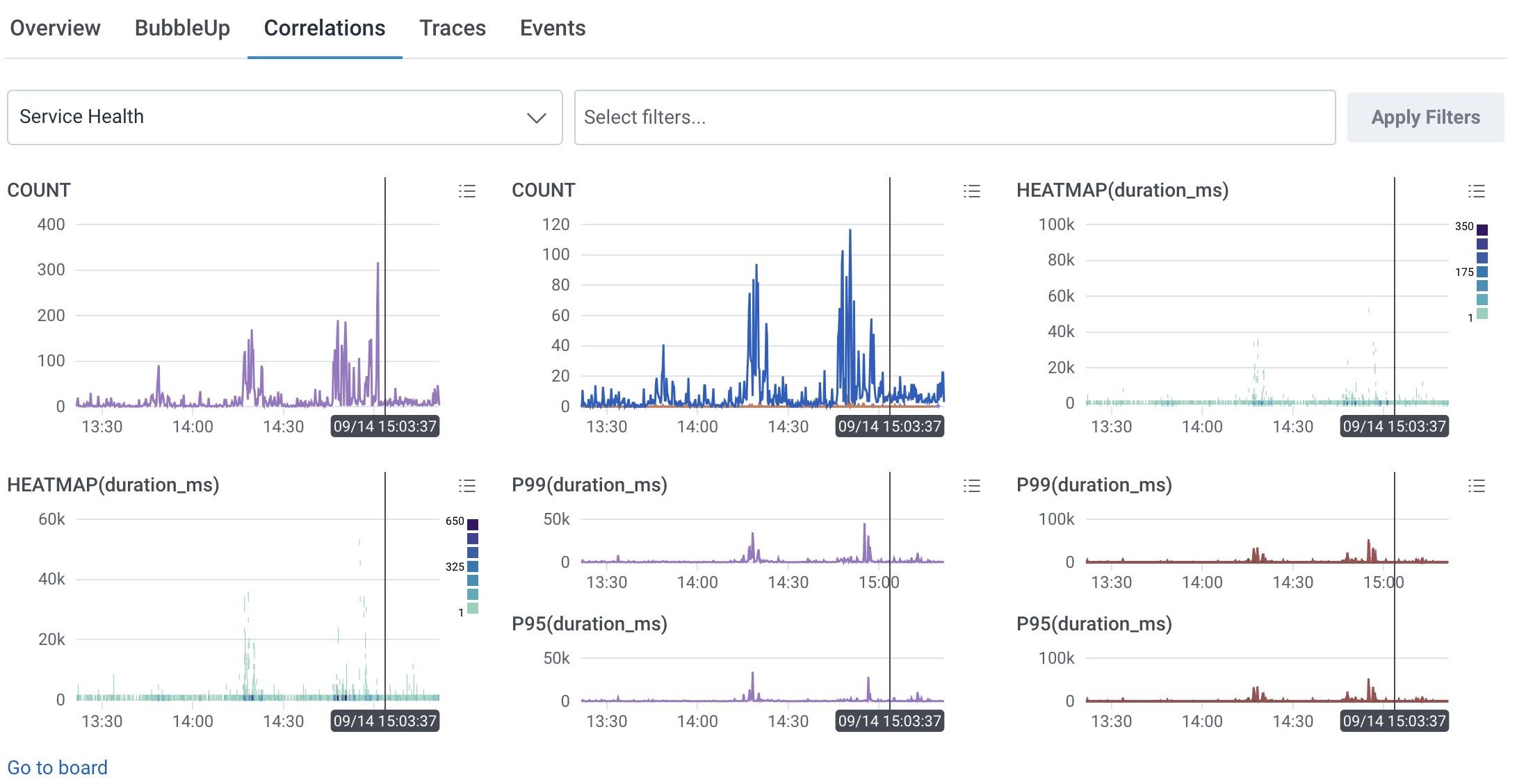
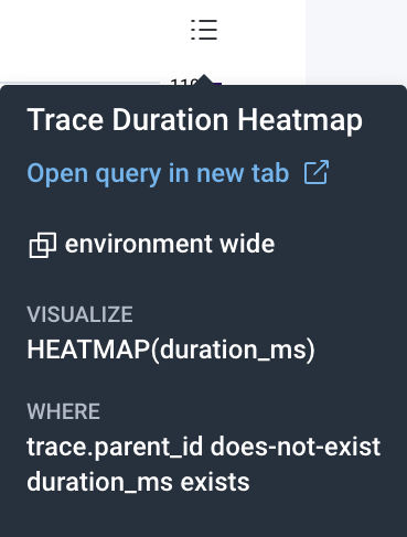
Each query contains one or more chart visualization(s) and a Show Query Details icon (![]() ).
Hover over the Show Query Details icon (
).
Hover over the Show Query Details icon (![]() ) to reveal the query’s name and composition, and an option to open the query in a new tab. Selecting anywhere in the expanded query details opens the query in a new tab.
) to reveal the query’s name and composition, and an option to open the query in a new tab. Selecting anywhere in the expanded query details opens the query in a new tab.
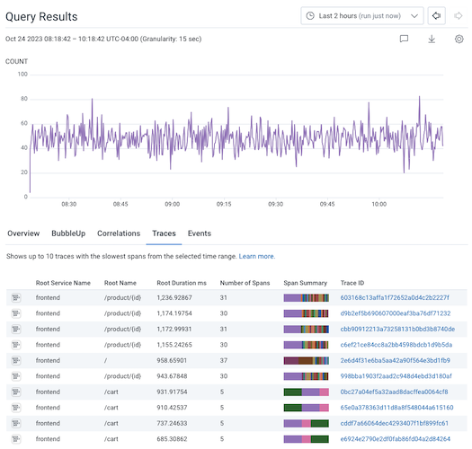
The Traces tab displays up to 10 traces with the slowest spans that match your query’s filters.
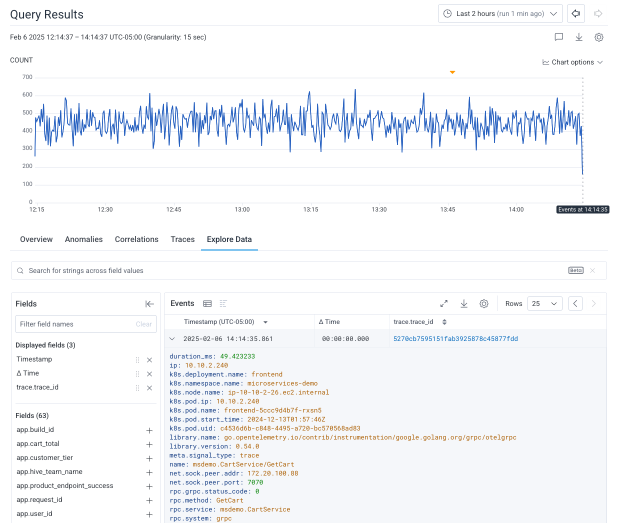
The Explore Data tab shows the raw data from the current query, which ignores the query’s aggregates, any GROUP BY fields, and any ORDER BY fields.
Your data starts with the most recent events that occurred from the timestamp of the point you selected. At any time, you can choose to display your data either as a table display or as a log lines display.
Each column represents a field from your dataset. Each row represents an event with associated values. Expanding a row displays all of the event’s fields and their corresponding values.
Each line represents an event, along with the values associated with the fields from your dataset. Expanding a line displays all of the event’s fields and their corresponding values.
Where applicable, events are color-coded to match their corresponding standard severity level:
errorwarninfodebugunspecified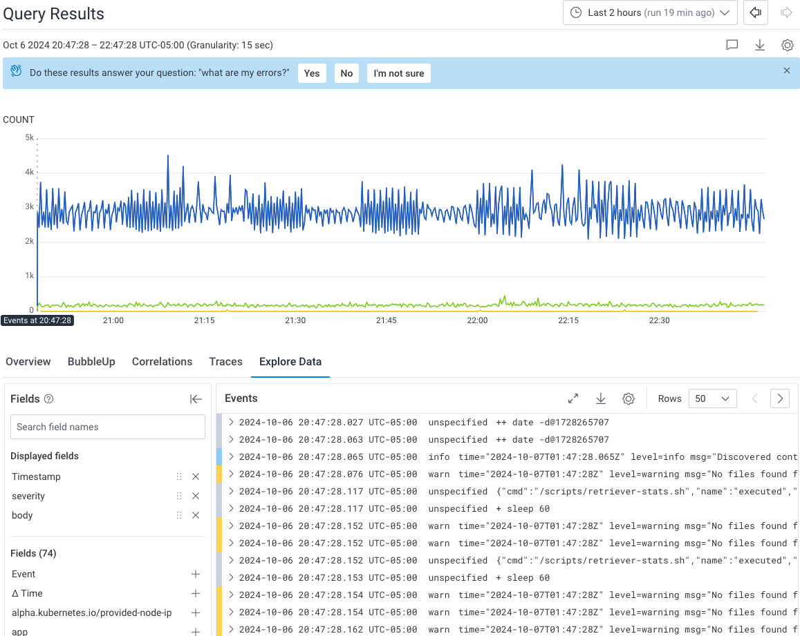
To wrap long log lines, press [w] on your keyboard or select Line wrap log lines from the display settings.
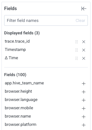
On the left side of the Explore Data tab, the fields list displays fields with data for this query. This list does not show all fields in the dataset. If a field is not visible, then spans in the query results have no data for that field.
Use the Field Search box to search for a particular field name within the fields list.
To expand the list and view all fields, scroll down the fields list and select Load More below the Displayed Fields list.
To control which fields are visible in the table, select the Add icon (![]() ) to the right of each field in the list of fields.
) to the right of each field in the list of fields.
Only the selected fields appears in the Explore Data table. A summary at the top of the fields list displays all selected fields under the Displayed fields section.
To reorder fields in the table, select the Drag icon (![]() ) and drag each field to the desired position.
) and drag each field to the desired position.
To download your data:
.csv text file..json text file.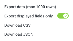
The Explore Data search feature is in beta.
Your feedback can help us improve this feature! Share feedback in Pollinators or through your account team.
Enter a string in the search bar to highlight occurrences of your search term within the query results.
Honeycomb will search each field for your search term, display the total number of matches found, and highlight matches in both your query results and the fields list. For every field that matches your search term, Honeycomb may highlight:
logs, Honeycomb would highlight the field value honeycomb-logs in the table display, regardless of field name.logs, Honeycomb would highlight the field name logs_ingest_sli, regardless of field value.logs, Honeycomb would highlight the field name app.dataset.name in the fields list if the field had a value of honeycomb-logs.Scenario:
You run a simple COUNT query that returns all events that were captured in the last two hours.
You want to search through the returned events to find occurrences of the term error.
Solution:
Enter your search term, error, in the search bar, and execute your search.
Honeycomb highlights the word error anywhere it is found in your query results, and displays the total number of matches found.
If matches are found, Honeycomb will highlight:
error, in the table displayerror, in the fields listerror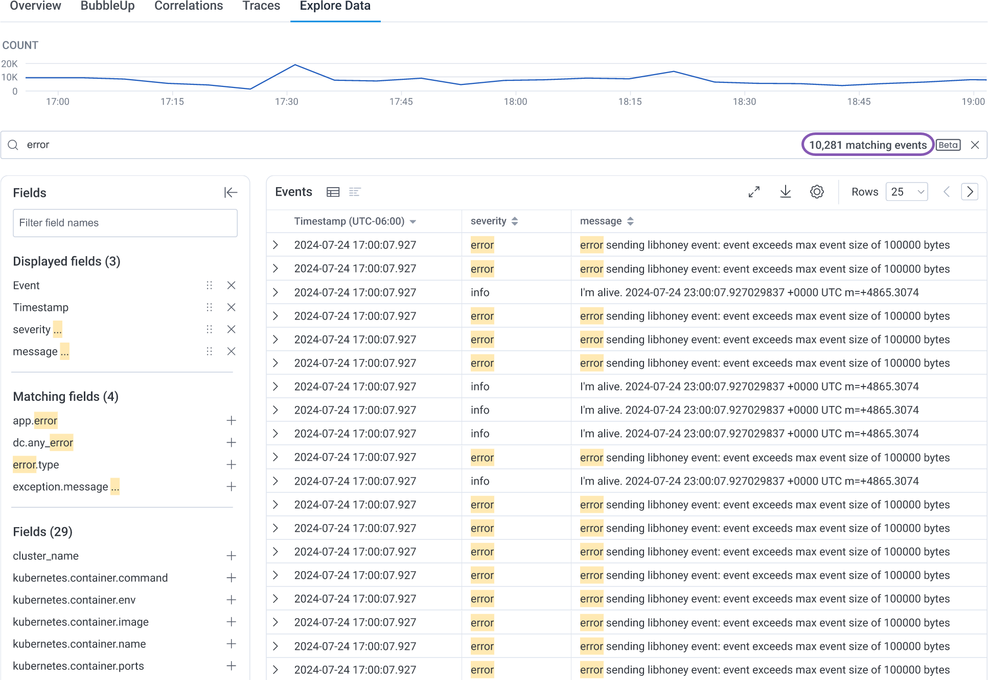
The Explore Data search function:
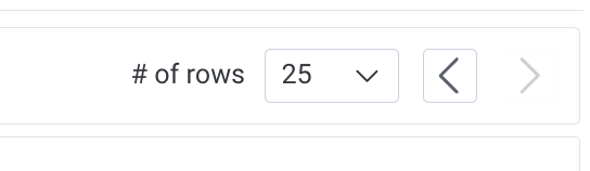
To page through your data, use the arrow buttons located above and to the right of the Explore Data tab data table. To adjust the number of events displayed per page, use the dropdown window next to the arrow buttons.
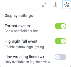
To customize event formatting, select the Display settings icon ( ) in the top-right corner of the Events table, and then select the target toggle:
When you select a field within an expanded event, this action menu appears:
<field> exists and re-runs the query.<field> does-not-exist and re-runs the query.<field> = <value> and re-runs the query.<field> != <value> and re-runs the query.<field> and re-runs the query.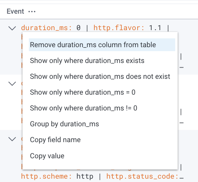
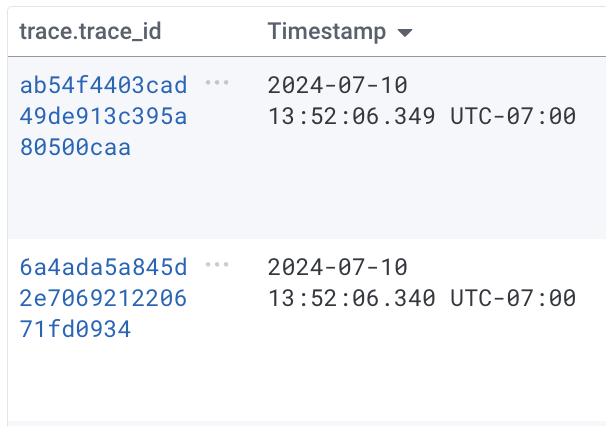
If your dataset is a tracing dataset, then the trace.trace_id column displays trace ID fields as hyperlinks. Select any trace ID hyperlink to display the trace waterfall view, which contains the span represented by that row.