Overview
The Overview view displays a summary table based on your query. If your query includes a GROUP BY clause, then the summary reflects a summary of grouped fields.BubbleUp
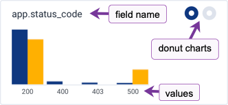
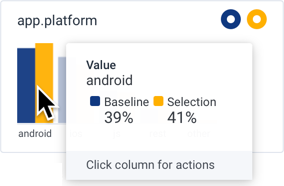
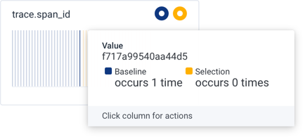
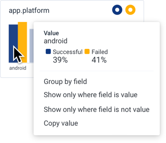
The BubbleUp view activates after you select an area in a chart or heatmap. Honeycomb’s BubbleUp feature compares your selection to all other results, or the baseline. Each comparison is represented as a chart. A dataset or environment has many fields. BubbleUp represents each field with a chart. The charts divide into two groups:- Dimensions contain fields with categorical or ordinal values
- Measures contain fields with numeric values
- Selection, rendered in yellow on the right side of a value, contains the points in the area selected in the heatmap.
- Baseline, rendered in blue on the left side of a value, contains all the points outside of the area selected.
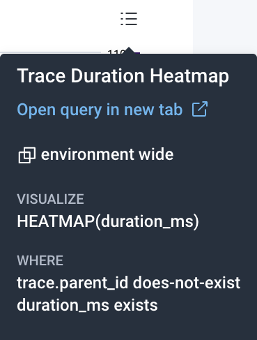
trace.span_id column.
<field> clause and re-runs the query. Select Results to view a summary of grouped fields below the heatmap.
Show only where field is value
: Adds a WHERE clause to filter with <field> = <value> and re-runs the query.
Show only where field is not value
: Adds a WHERE clause to filter with <field> != <value> and re-runs the query.
Copy field name
: Copies the field name to your OS clipboard.
For charts in the Measures section, this actions menu appears:
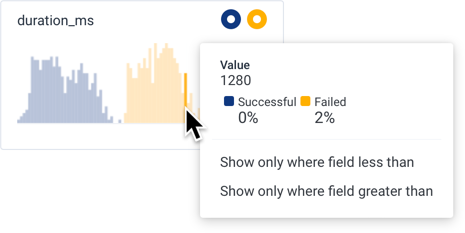
<field> < <value> and re-runs the query.
Show only where field greater than
: Adds a WHERE clause to filter with <field> > <value> and re-runs the query.
Correlations
The Correlations view consists of a dropdown window that displays the selected data source, a Filter search box, and up to the first six saved queries from the selected data source.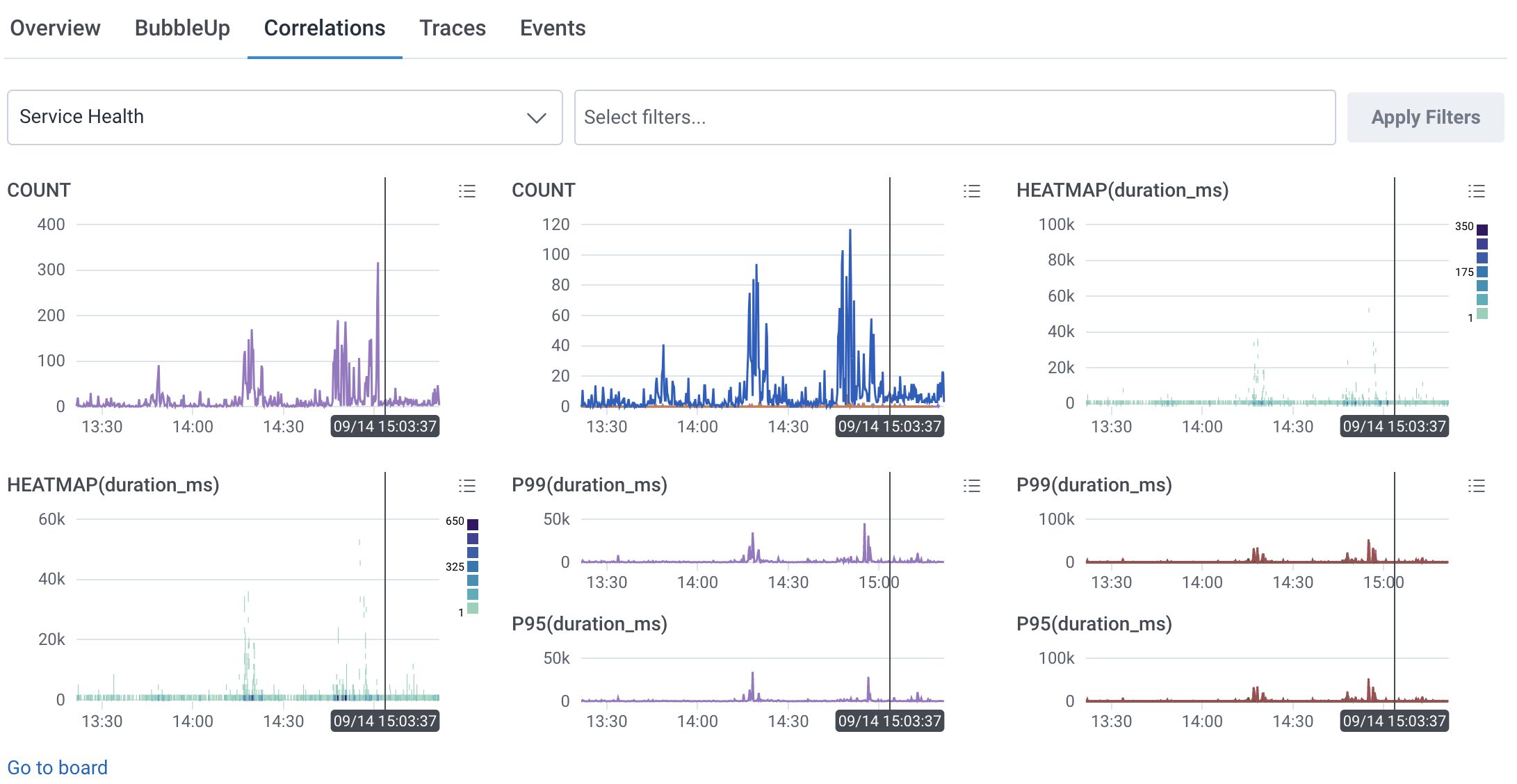
Traces
The Traces view displays up to 10 traces with the slowest spans that match your query’s filters.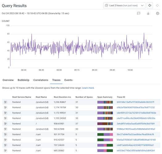
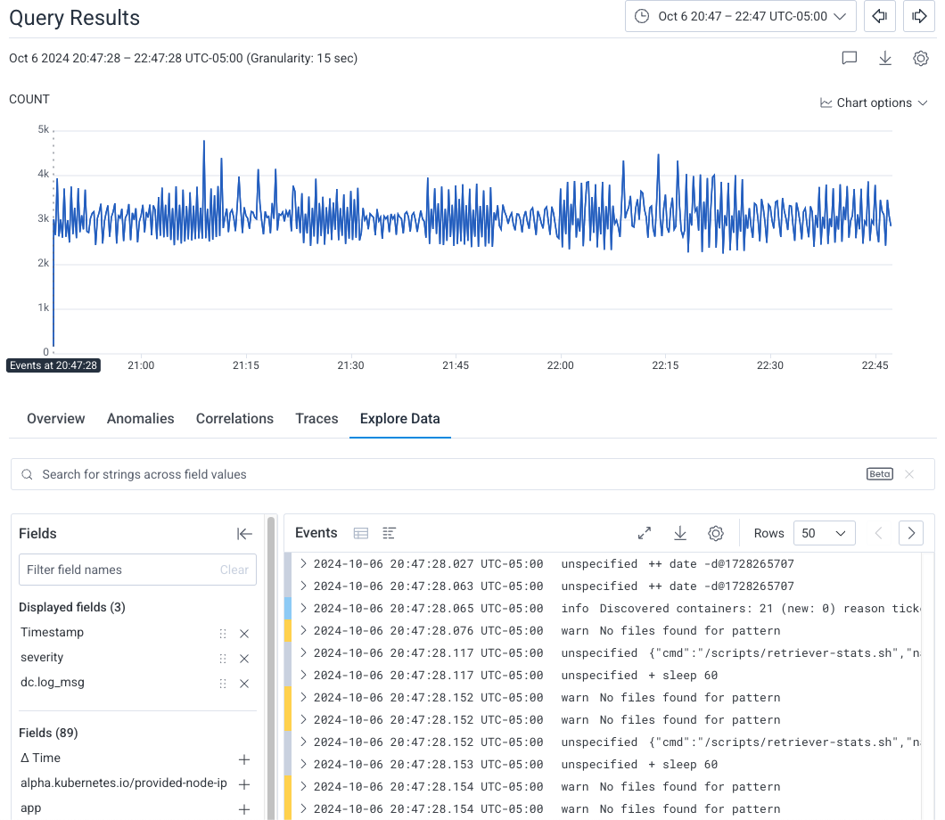
Explore Data
The Explore Data view shows the raw data from the current query, which ignores the query’s aggregates, any GROUP BY fields, and any ORDER BY fields.Events View
Your data starts with the most recent events that occurred from the timestamp of the point you selected. At any time, you can choose to display your data either as a table display or as a log lines display.Table Display
Each column represents a field from your dataset. Each row represents an event with associated values. Expanding a row displays all of the event’s fields and their corresponding values.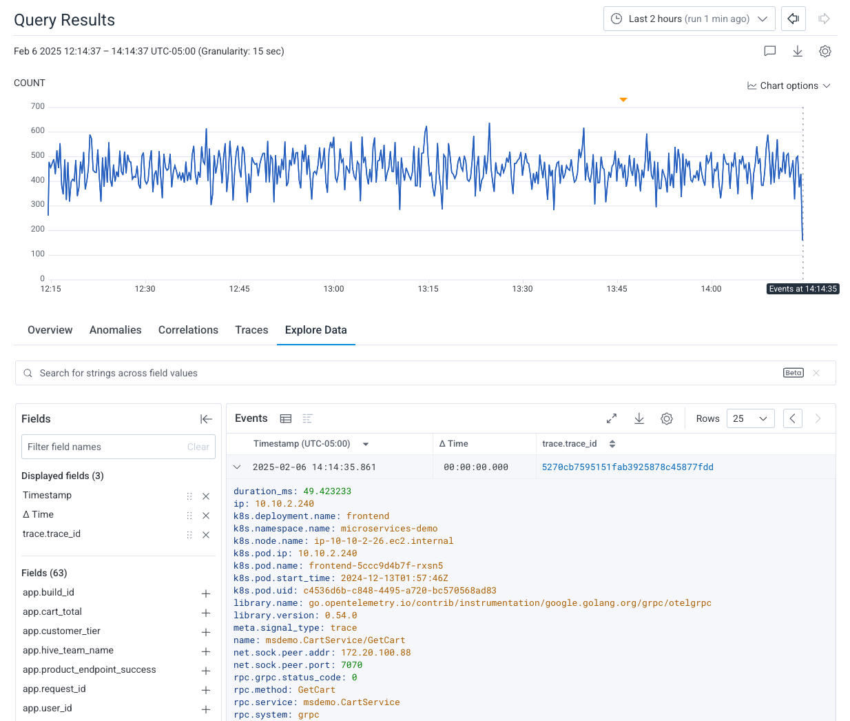
Log Lines Display
Each line represents an event, along with the values associated with the fields from your dataset. Expanding a line displays all of the event’s fields and their corresponding values. Where applicable, events are color-coded to match their corresponding standard severity level:- Red:
error - Yellow:
warn - Light blue:
info - Dark blue:
debug - Light gray:
unspecified - Dark gray: No severity set
Color-coding relies on a source field being mapped to the Logs: Severity dataset field when you map your data.
In addition, if you are using non-standard severities, use Calculated Fields to parse your severity values into Honeycomb standard severity values.
w] on your keyboard or select Line wrap log lines from the display settings.
Fields List
On the left side of the Explore Data view, the fields list displays fields with data for this query. This list does not show all fields in the dataset. If a field is not visible, then spans in the query results have no data for that field. Use the Field Search box to search for a particular field name within the fields list. To expand the list and view all fields, scroll down the fields list and select Load More below the Displayed Fields list.Filter Fields
To control which fields are visible in the table, select the Add icon () to the right of each field in the list of fields. Only the selected fields appears in the Explore Data table. A summary at the top of the fields list displays all selected fields under the Displayed fields section. To reorder fields in the table, select the Drag icon () and drag each field to the desired position.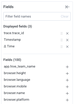
Download Your Data
To download your data:- In the Events view, locate and select the Download options icon ().
- In the Export data modal, choose the fields to include in your download. Use the Export displayed fields only toggle to export all event fields [off] or export only fields displayed in the Events view [on].
- Choose the file format that you would like to download:
- CSV: Download Events data in comma-separated values format in a
.csvtext file. - JSON Download Events data in JSON format in a
.jsontext file.
- CSV: Download Events data in comma-separated values format in a
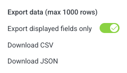
You can download a maximum of 1000 rows.
Search Within Results
The Explore Data search feature is in beta.Your feedback can help us improve this feature!
Share feedback in Pollinators or through your account team.
- a field value that matches, in the table display. For example, given the search term
logs, Honeycomb would highlight the field valuehoneycomb-logsin the table display, regardless of field name. - a field name that matches, in the fields list. For example, given the search term
logs, Honeycomb would highlight the field namelogs_ingest_sli, regardless of field value. - a field name, in the fields list, that has a corresponding field value that matches. For example, given the search term
logs, Honeycomb would highlight the field nameapp.dataset.namein the fields list if the field had a value ofhoneycomb-logs.
Limitations
The Explore Data search function:- Accepts only string arguments
- Excludes calculated field field names and values
Page Through Results
To page through your data, use the arrow buttons located above and to the right of the Explore Data view data table. To adjust the number of events displayed per page, use the dropdown window next to the arrow buttons.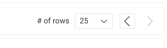
Customize Event Formatting
To customize event formatting, select the Display settings icon () in the top-right corner of the Events table, and then select the target toggle: Format events : Displays all fields in a line [off] or one field per line [on]. Highlight full event : Displays all field names and values in expanded events in black [off] or enables syntax highlighting [on]. Line wrap log lines : In the log lines display, allows text to extend beyond the visible area [off] or wraps text to the next line [on].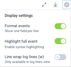
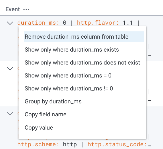
Interact with Expanded Events
When you select a field within an expanded event, this action menu appears: Remove column from table : Removes field from displayed fields in Explore Data view. Show only where field exists : Adds a WHERE clause to filter with<field> exists and re-runs the query.
Show only where field does not exist
: Adds a WHERE clause to filter with <field> does-not-exist and re-runs the query.
Show only where field is value
: Adds a WHERE clause to filter with <field> = <value> and re-runs the query.
Show only where field is not value
: Adds a WHERE clause to filter with <field> != <value> and re-runs the query.
Group by field
: Adds a GROUP BY clause with <field> and re-runs the query.
Copy field name
: Copies the field name to your OS clipboard.
Copy value
: Copies the value name to your OS clipboard.
View Tracing Details
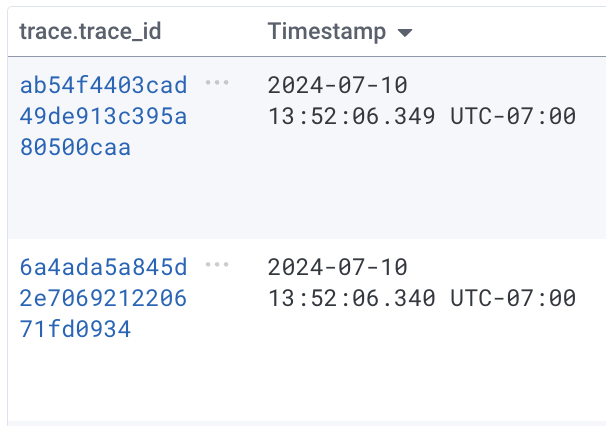
If your dataset is a tracing dataset, then thetrace.trace_id column displays trace ID fields as hyperlinks.
Select any trace ID hyperlink to display the trace waterfall view, which contains the span represented by that row.