

Using correlations
To see metrics or board correlations:- Run a query.
- Select the Correlations tab below your query results.
- Switch between Metrics or Boards correlations using the toggle buttons in the top-right.
Metrics correlations
When you run an events-based query, Honeycomb automatically enables the Correlations > Metrics view beneath your query results. When you open this view, Honeycomb triggers a parallel query against your metrics dataset, using the same time window and any compatible filters from your main events query (when the fields exist in both datasets’ schemas). You get a contextual, correlated view of your metrics data shown in familiar Honeycomb visualizations. The metrics query runs independently, so you can interact with it further. Choose which metrics to access, add filters or groupings, or explore the underlying query directly.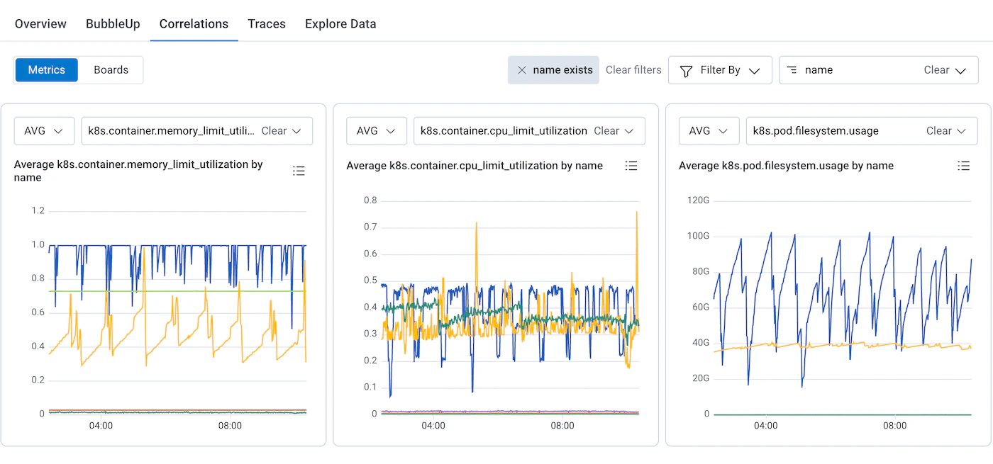
Using metrics correlations
To see metrics correlations:-
Run an events query.
For example, query your
user-eventsdataset for error rates or response times. - Select Correlations > Metrics below your query results.
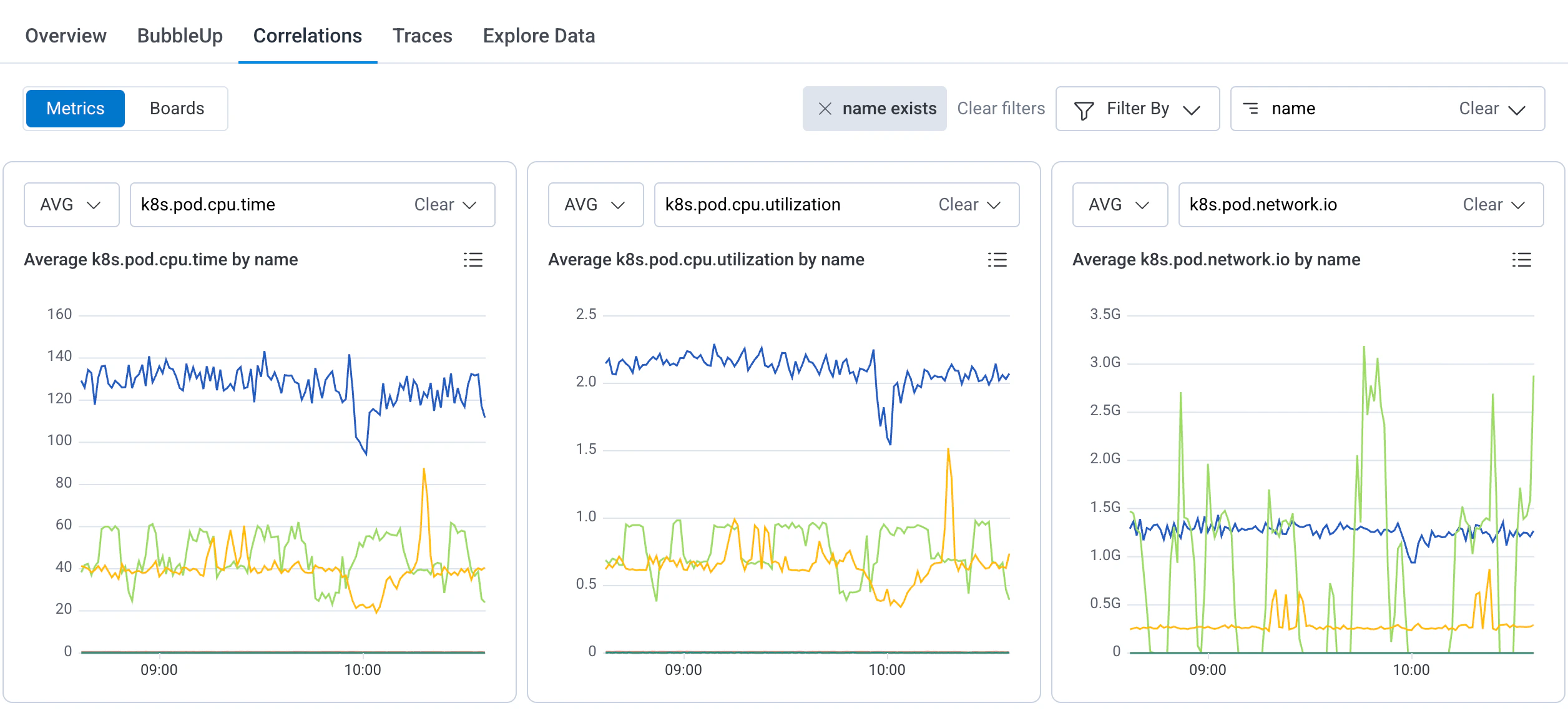
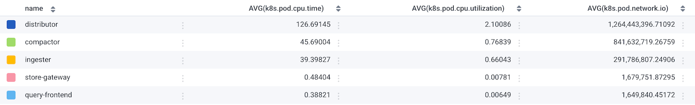
- Hover over data points to see metric values and group details.
- Adjust metric and aggregation selections using the dropdowns above each chart.
- Add filters or groupings in the Metrics view to refine what appears.
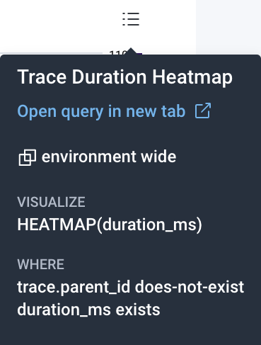
- Select the chart context menu to open the underlying metrics query in a new view.
Span metrics
When viewing an individual span in a trace, the Span metrics panel gives you a correlated view of infrastructure metrics and span duration data for that specific span, without leaving the trace waterfall view. This is useful for understanding whether a slow or error-prone span is related to underlying resource pressure. For example, aSELECT checkout.discounts database span taking 165ms might correlate with a spike in node CPU or memory usage on the host that served that request.
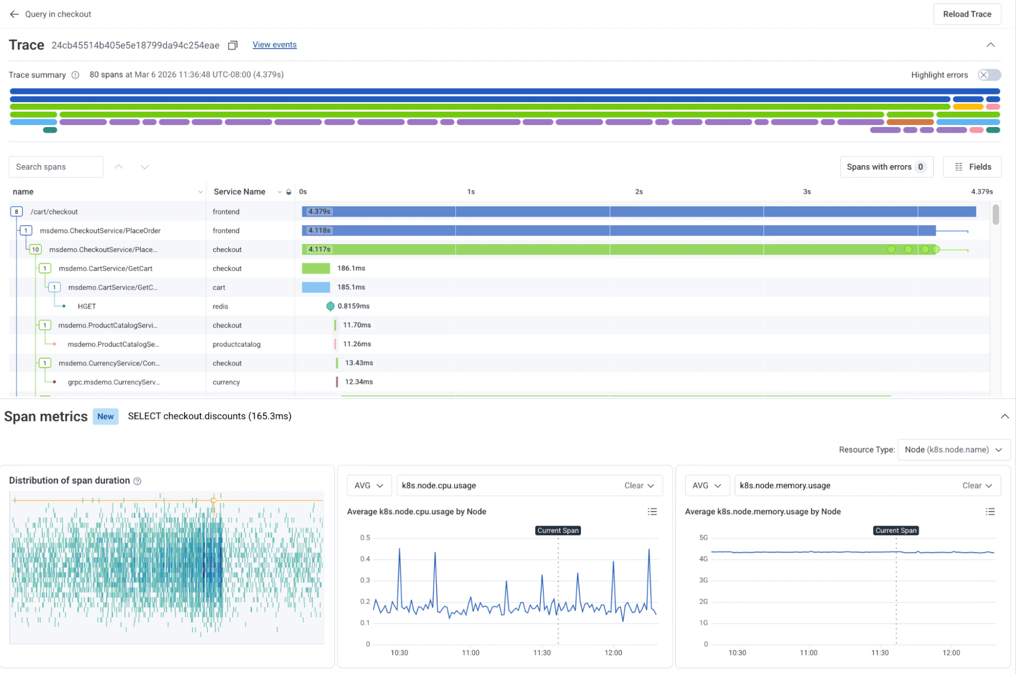
How span metrics work
When you select a span in the trace waterfall, Honeycomb automatically queries your metrics dataset using the same time window as the trace and any resource attributes from the span (such ask8s.node.name) that match fields in your metrics schema.
The Span metrics panel appears below the trace waterfall and displays:
- Distribution of span duration: A scatter plot of all durations for spans matching the same operation, giving you a sense of whether the current span is typical or an outlier.
- Infrastructure metric charts: Up to two time series charts for correlated metrics (for example,
k8s.node.cpu.usageandk8s.node.memory.usage), grouped by a resource dimension such as Node.
Resource type selector
Use the Resource Type dropdown in the top-right of the Span metrics panel to change the resource dimension used to group and filter the metric charts. For example, switching from Node (k8s.node.name) to another resource type updates the charts to reflect metrics by that dimension.
Board correlations
The Board correlations view consists of a dropdown window that displays the selected data source, a Filter search box, and up to the first six saved queries from the selected Board data source.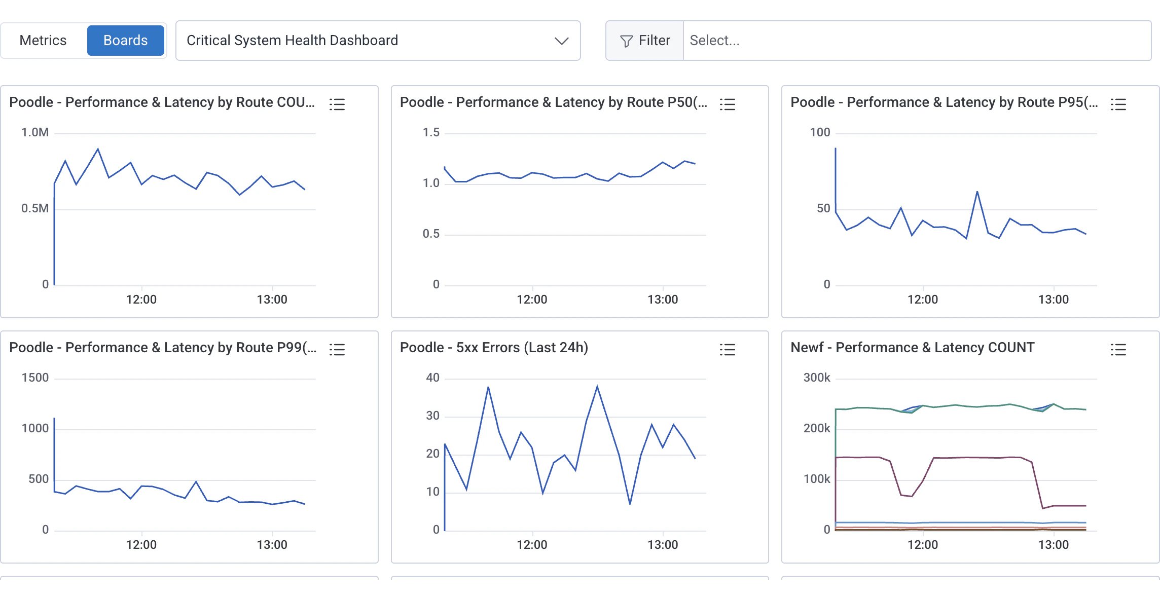
Change Data Source
To change the view based on a different board, select the dropdown window and choose from a Board or a Suggested Metrics view. (Suggested Metrics views only populate if the fields in your dataset match a predetermined list.) You must create the Board beforehand in order to use it in this interface. To set a default Board view in Correlations, navigate to the Default Correlations Board setting in Dataset Settings.Filter Correlations Display
Use a filter when searching for specific results. To filter, use the Select Filters… search box to enter one or more filter parameters. Suggested parameter fields appear, based on your data. Select Apply Filters to apply the parameter(s) to all the displayed queries on your board. When you apply filters, the displayed queries also update to include a WHERE clause with the filter parameter(s). For example, if you have a board called “Errors Overview”, which looks at all the errors occurring in your system, you can apply a filter to look at errors occurring in the frontend service that you own. In this case, a filter ofservice.name=frontend applies that parameter on top of every existing query on the board to output service-specific results.
If a filter parameter does not exist as a field within a chart, then the chart displays a “No results in this time range” message.
To remove a filter, use the icon () next to each filter.