

- the cause of a slow API (example scenario)
- which service caused a slowdown or error
- issues across distributed systems
Access BubbleUp
Choose your method of accessing BubbleUp:- Heatmap
- Chart
- Results
-
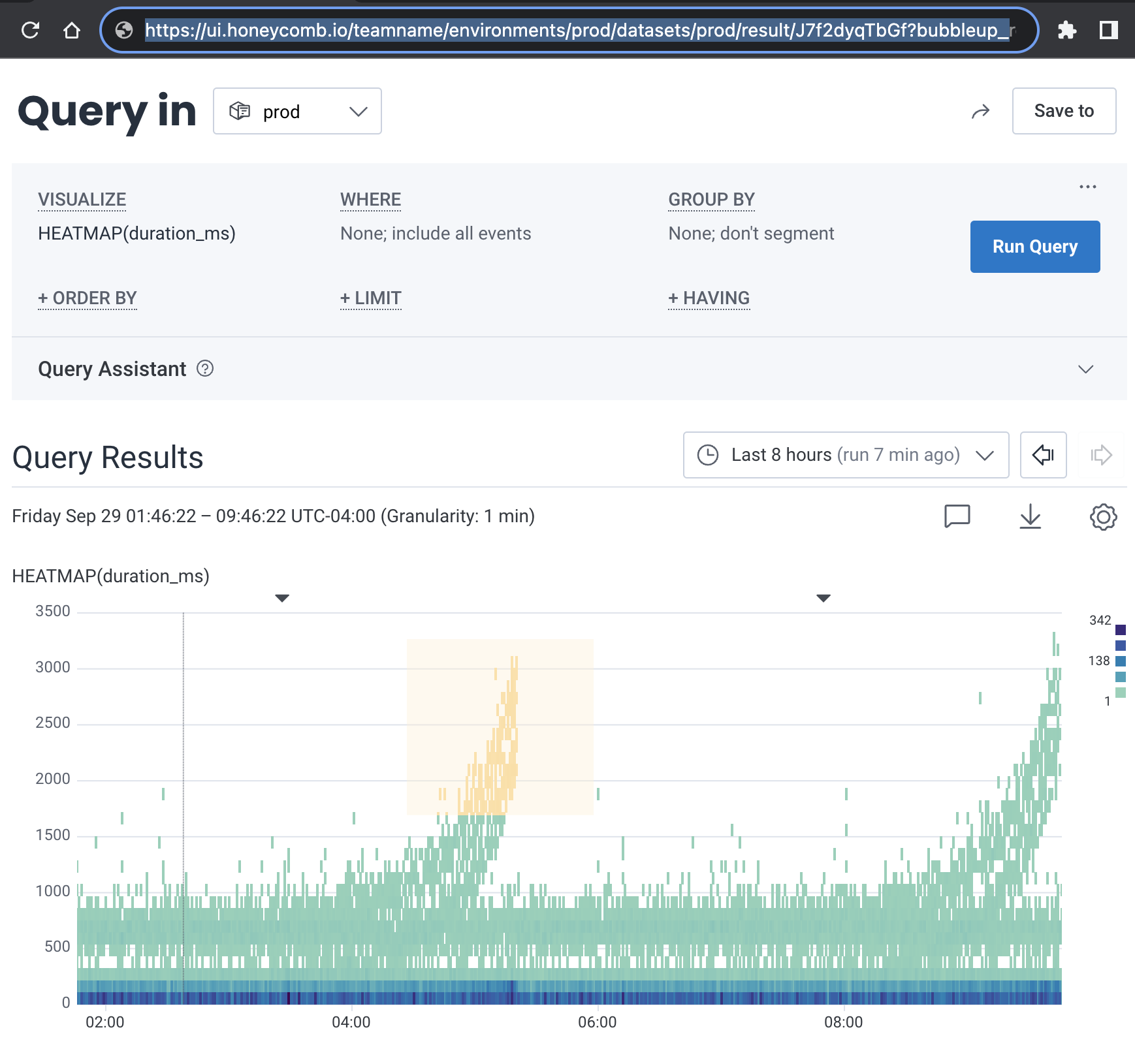
In Query Builder, SELECT a Heatmap with
HEATMAP(<variable>). -
Select Run Query.
This creates a heatmap below the Query Builder.
- Identify data that stands apart from other data. BubbleUp works based on a selection you make in a heatmap.
-
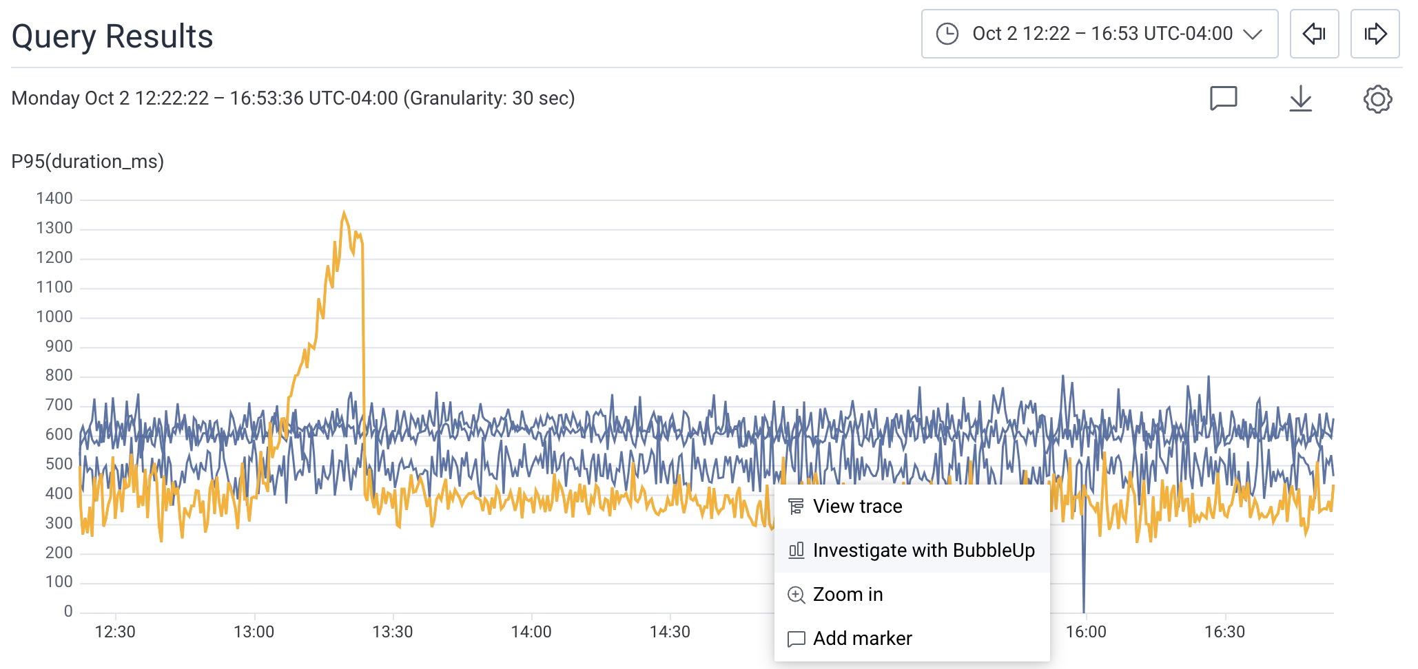
In the heatmap, draw a box around the data to define the selection.
A menu appears.

- Choose BubbleUp Outliers
- View the BubbleUp charts below the heatmap. This creates a comparison between the selection and the area not selected, or the baseline. These comparisons are represented as charts.
BubbleUp Insights
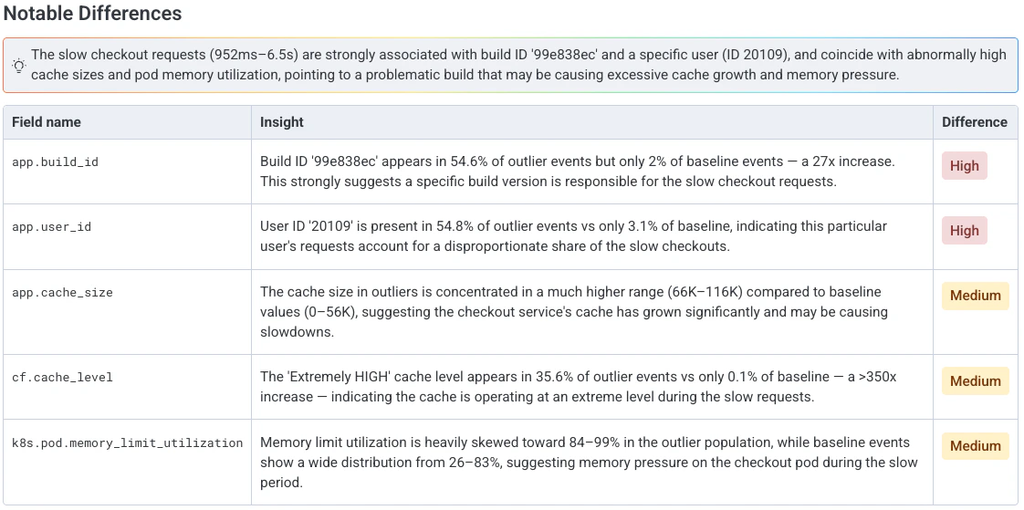
If your team has Honeycomb Intelligence enabled, BubbleUp highlights the most notable differences between your selection and the baseline above the BubbleUp Charts. These highlights include:- A plain-language summary of the patterns that most distinguish your selection from the baseline.
- A ranked table of fields, where each row shows the field name, an insight that describes how that field’s values differ between selection and baseline, and a severity rating that reflects the strength of the signal.
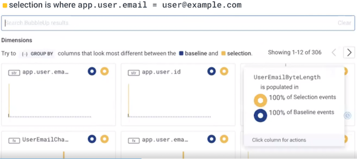
Interacting with BubbleUp Charts
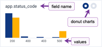
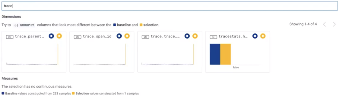
A dataset or environment has many fields. BubbleUp represents each field with a chart. The charts divide into two groups:- Dimensions contain fields with categorical or ordinal values
- Measures contain fields with numeric values
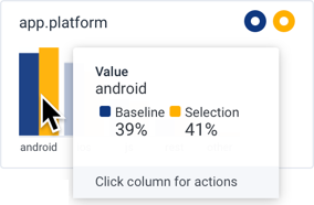
- Selection, rendered in yellow on the right side of a value, contains the points in the area selected in the heatmap.
- Baseline, rendered in blue on the left side of a value, contains all the points outside of the area selected.
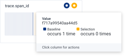
trace.span_id column.
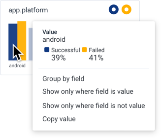
<field> clause and re-runs the query. Select Results to view a summary of grouped fields below the heatmap.
Show only where field is value
: Adds a WHERE clause to filter with <field> = <value> and re-runs the query.
Show only where field is not value
: Adds a WHERE clause to filter with <field> != <value> and re-runs the query.
Copy field name
: Copies the field name to your OS clipboard.
For charts in the Measures section, this actions menu appears:
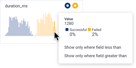
<field> < <value> and re-runs the query.
Show only where field greater than
: Adds a WHERE clause to filter with <field> > <value> and re-runs the query.
BubbleUp Permalinks
Use BubbleUp Permalinks to share BubbleUp results with others.- Create a BubbleUp result.
- Copy the URL link in your web browser.
-
Share the URL with other users to view the same BubbleUp result.
BubbleUp Filter
Filter your BubbleUp results with keywords to find specific fields and their charts faster.- Create a BubbleUp result.
- Locate the BubbleUp Filter search box above the BubbleUp Charts.
- Enter a keyword into the search box.
- The BubbleUp Charts dynamically update to show charts that contains relevant field names.
BubbleUp Example Scenario: Slow API
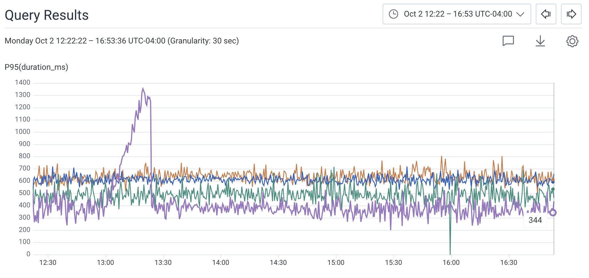
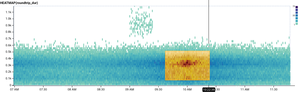
An operations team responsible for API performance receives an alert that their system is handling some requests slowly. With Honeycomb, the investigating user generates a HEATMAP visualization that shows the statistical distribution ofduration_ms of an application’s requests over the selected time period.
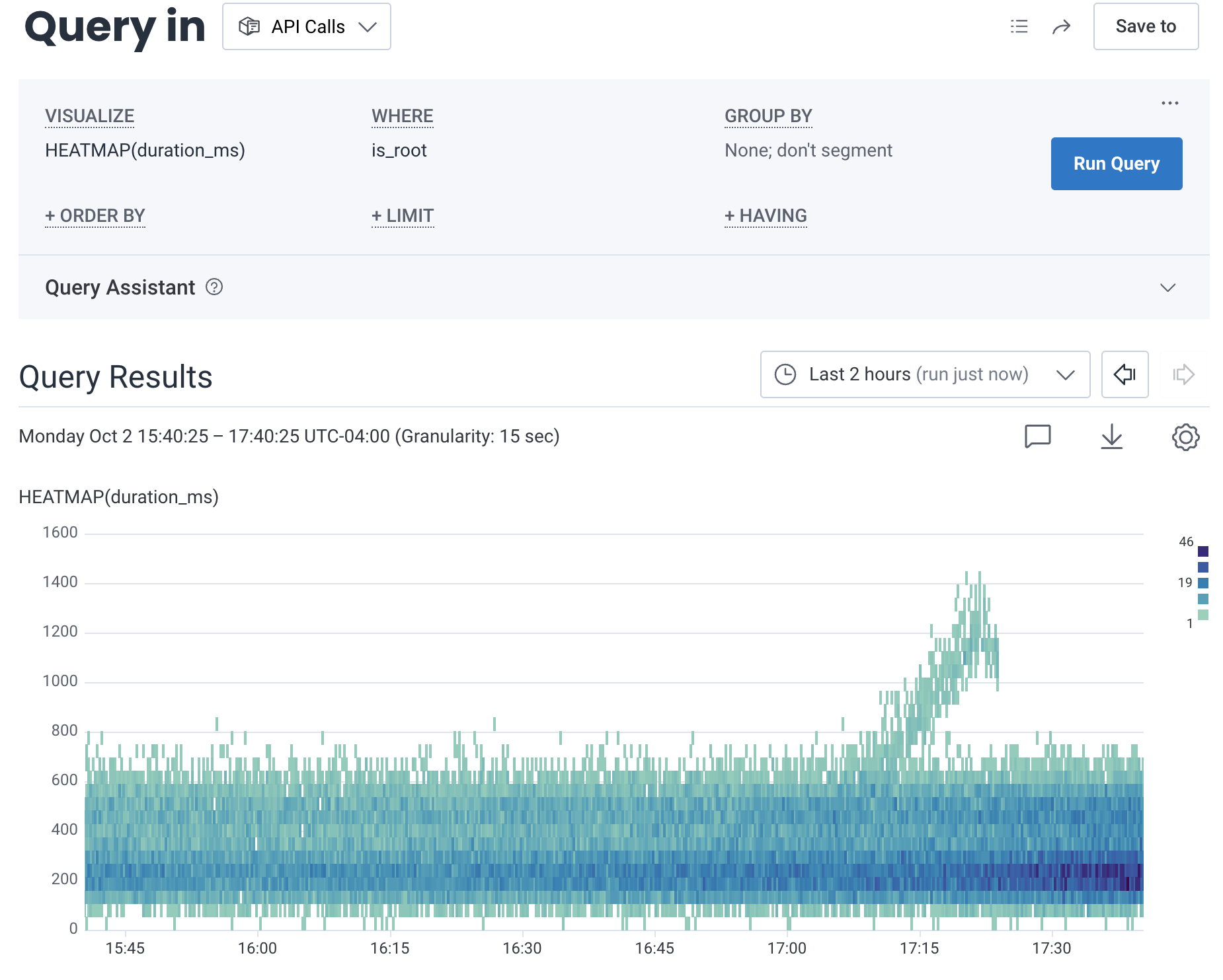
duration_ms.
With BubbleUp, the user draws a box on the heatmap to define the selection.
The selection, depicted below, defines an area ranging two hours on the x-axis and from near 800ms to 1400ms on the y-axis.

app.platform and app.build_id have fairly similar proportions.
The bars for each value are very close in height.
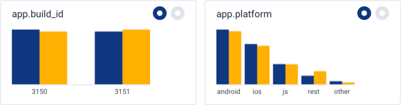
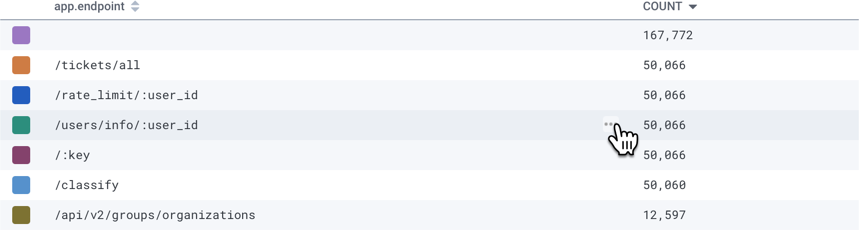
app.user_id, app.endpoint, and name have very different proportions.
The bars for some of the values in these fields have drastically different heights compared to the bars for the other values in these fields.
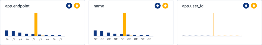
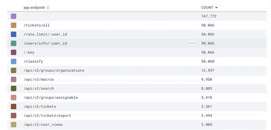
app.endpoint chart.
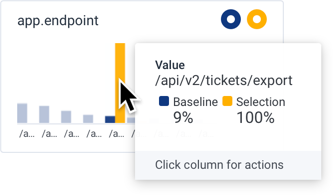
/api/v2/tickets/export endpoint is responsible for the slow requests.
From this information, the team explores the endpoint’s implementation and its external dependencies for issues during that time frame.
The user formulates new queries to explore the external instrumentation.
Tips and Tricks
-
Define a selection of data that is separate from the remaining data.
BubbleUp works best when the data in the selection contrasts the data in the baseline.
It is far more difficult to tell how a dataset is different when the selection is inside the main cluster of data, as in the following screenshot:
- Define a smaller time range to find data separated from the baseline. Bigger time ranges may display greater variance across the data. An isolated time range helps reduce unrelated variation in your data that accumulate over time.
- Add a filter, or WHERE clause to your query to explore the selected data further. A field’s action menu quickly provides these filters. Other times, it can be valuable to pursue a breakdown to understand better how fields vary from each other.