> ## Documentation Index
> Fetch the complete documentation index at: https://docs.honeycomb.io/llms.txt
> Use this file to discover all available pages before exploring further.
# Customize Results
> Adjust graph display, annotate query results with markers to flag deployments or incidents, and download your data for use outside of Honeycomb.
export const HnyIcon = ({alias, path, size = 16, iconColor}) => {
const iconMap = {
"home": "house.svg",
"marker": "caretFilledDown.svg",
"show-marker-options": "chatTextLeft.svg",
"download": "arrowLineDown.svg",
"trace-waterfall": "trace.svg",
"show-query-details": "listDashes.svg",
"table": "table.svg",
"log-lines": "logLines.svg",
"chart": "chartLine.svg",
"show-settings": "gear.svg",
"add": "plus.svg",
"remove": "delete.svg",
"persist": "caretDown.svg",
"close": "close.svg",
"copy": "copy.svg",
"zoom-in": "magnifyingGlassPlus.svg",
"zoom-out": "magnifyingGlassMinus.svg",
"color-assignment": "drop.svg",
"drag": "dots-six-vertical.svg",
"drawer": "drawer.svg",
"show-actions": "dotsThree.svg",
"edit": "pencil.svg",
"delete": "trash.svg",
"move": "arrowsOutCardinal.svg",
"show-legend": "circleInfo.svg",
"usage-ok": "usageGood.svg",
"usage-warning": "usageWarning.svg",
"usage-danger": "usageDanger.svg",
"open-query-builder": "query.svg",
"home-menu": "house.svg",
"query-menu": "query.svg",
"boards-menu": "board.svg",
"triggers-menu": "bell.svg",
"slos-menu": "handshake.svg",
"service-map-menu": "serviceMap.svg",
"history-menu": "clockCounterClockwise.svg",
"manage-data-menu": "cube.svg",
"usage-menu": "usageGood.svg",
"canvas-menu": "sparkle.svg",
"anomalies-menu": "anomalies.svg",
"show-details": "dotsThreeVertical.svg",
"resize-handle": "board-panel-resize-handle.png",
"standard-dataset": "cube.svg",
"trace-dataset": "cubeChat.svg",
"all-datasets": "linkedSquares.svg",
"share": "arrowBentRight.svg",
"run-in-query-builder": "arrowSquareUpRight.svg",
"link": "link.svg",
"text": "text.svg",
"receive": "arrowLineDown.svg",
"process": "lightning.svg",
"sample": "drop.svg",
"send": "arrowLineUp.svg",
"submit": "arrowUp.svg",
"canvas-menu": "sparkle.svg",
"canvas": "sparkle.svg",
"chat-about-this-page": "sparkle.svg",
"private": "lockKey.svg",
"shared": "people.svg",
"expand": "caretDown.svg",
"previous": "caretLeft.svg",
"next": "caretRight.svg",
"expand-chat": "caretLeft.svg",
"minimize-chat": "caretRight.svg",
"open-in-canvas": "arrowSquareUpRight.svg"
};
const iconBasePath = "/_assets/icons/";
const iconPath = path || (alias ? `${iconBasePath}${iconMap[alias]}` : undefined);
return ;
};
Honeycomb has several types of graph options to explore your query results in multiple ways.
Customize your display and how you interact with your data by using:
* [Markers](#markers) to identify points in time
* the [Markers Settings menu](#markers-settings-menu) to control marker display.
* the [Download Query Results menu](#download-query-results-menu) to download the query results.
* the [Display Settings menu](#display-settings-menu) to customize your query results display.
## Markers
**Markers** signal interesting occurrences within the context of your queries.
Use Markers to identify points in time, such as:
* Deploys
* Incidents
* Activated/resolved Triggers
* On/Off feature flags
Markers can apply to an entire environment or a specific dataset.
Create an environment marker when the range of time is relevant across multiple datasets and Services, such as a deployment marker.
Create a dataset marker when the range of time is relevant to the specific dataset or Service.
Honeycomb Classic does not support Environment markers.
Learn more about [Honeycomb versus Honeycomb Classic](/troubleshoot/product-lifecycle/recommended-migrations/#migrate-from-honeycomb-classic-to-honeycomb-environments).
To create a marker from the UI:
1. In your query results, move your cursor over the graph to your desired time point.
2. Select your desired time point, which causes the graph menu options to appear.
3. Select **Add marker**. The **Add a Marker** modal appears.
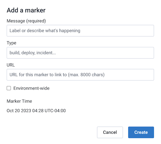 4. Enter the following information:
1. A Message for your marker, such as "Deploy #299" or "Abnormal Spike in Products Page Traffic".
2. A Type for the marker, such as "deploy" or "trigger".
After creation, the type appears as a preface to the marker's message when viewing the marker details.
3. The URL field is optional, but provides a great way for more context about the marker.
4. Select the "Environment-wide" checkbox to apply this marker to **all** datasets in your environment.
[Honeycomb Classic](/troubleshoot/product-lifecycle/recommended-migrations/#migrate-from-honeycomb-classic-to-honeycomb-environments) users must migrate first to use this Environment-wide feature.
5. When finished, select **Create** to add your marker to the graph.
To add markers via a command line tool or further manage existing markers, use either `curl` or `honeymarker`, a lightweight marker management tool that provides a CRUD command line interface.
Refer to our [Markers CLI documentation](/investigate/query/customize-results/marker-cli-reference/) for more information.
### View Markers in the UI
Once created, markers appear on any queries that run within the same time period as the marker(s).
Each marker type can appear in its own color.
To change marker color, configure dataset markers in [Dataset Settings](/reference/honeycomb-ui/manage-data/datasets/dataset-settings/) or environment markers in [Environment Settings](/reference/honeycomb-ui/environment/environment-settings/).
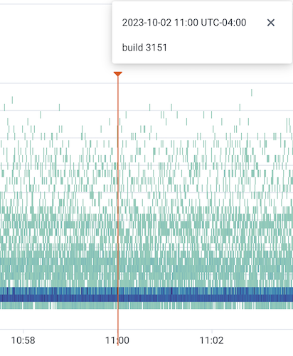
Hover over the Marker icon () to view a marker's details.
A solid vertical line appears and a window displays the marker's name, description, and if applicable, a selectable URL.
To persist the marker's vertical line and information window, select the Persist icon ().
To close the persisted display, use the Close icon () that appears in the window after selection.
4. Enter the following information:
1. A Message for your marker, such as "Deploy #299" or "Abnormal Spike in Products Page Traffic".
2. A Type for the marker, such as "deploy" or "trigger".
After creation, the type appears as a preface to the marker's message when viewing the marker details.
3. The URL field is optional, but provides a great way for more context about the marker.
4. Select the "Environment-wide" checkbox to apply this marker to **all** datasets in your environment.
[Honeycomb Classic](/troubleshoot/product-lifecycle/recommended-migrations/#migrate-from-honeycomb-classic-to-honeycomb-environments) users must migrate first to use this Environment-wide feature.
5. When finished, select **Create** to add your marker to the graph.
To add markers via a command line tool or further manage existing markers, use either `curl` or `honeymarker`, a lightweight marker management tool that provides a CRUD command line interface.
Refer to our [Markers CLI documentation](/investigate/query/customize-results/marker-cli-reference/) for more information.
### View Markers in the UI
Once created, markers appear on any queries that run within the same time period as the marker(s).
Each marker type can appear in its own color.
To change marker color, configure dataset markers in [Dataset Settings](/reference/honeycomb-ui/manage-data/datasets/dataset-settings/) or environment markers in [Environment Settings](/reference/honeycomb-ui/environment/environment-settings/).
Hover over the Marker icon () to view a marker's details.
A solid vertical line appears and a window displays the marker's name, description, and if applicable, a selectable URL.
To persist the marker's vertical line and information window, select the Persist icon ().
To close the persisted display, use the Close icon () that appears in the window after selection.
 ## Access Graph Settings
The **Marker Options** (), **Download Query Results** (), and **Display Settings** ()menu icons appear after a query runs in [Query Builder](/investigate/query/build/).
These three icons appear directly below the time picker and the Query Builder interface.
Select each icon to open its menu options.
## Access Graph Settings
The **Marker Options** (), **Download Query Results** (), and **Display Settings** ()menu icons appear after a query runs in [Query Builder](/investigate/query/build/).
These three icons appear directly below the time picker and the Query Builder interface.
Select each icon to open its menu options.
 ## Markers Settings Menu
Control how [Markers](/configure/environments/manage-markers/) display on the query results, either by filtering or changing the markers' appearance.
By default, Honeycomb shows environment markers in environment-wide queries and dataset markers in dataset queries.
### Hide or Show Markers
Hide or show markers in the results display either by using the Graph Settings menu or the `m` keyboard shortcut.
### Filter Markers
To access **Filter Markers**, either:
1. Press `l` on your keyboard
2. Select the Marker Options icon () below the time picker in your query results, and select **Filter Markers**.
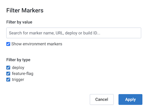
The Filter Markers modal appears.
Use to modify what markers appear based on:
1. their value
2. whether or not markers of the opposite type (environment/dataset) are allowed
3. their marker type
Select **Submit** to update the display of markers.
## Markers Settings Menu
Control how [Markers](/configure/environments/manage-markers/) display on the query results, either by filtering or changing the markers' appearance.
By default, Honeycomb shows environment markers in environment-wide queries and dataset markers in dataset queries.
### Hide or Show Markers
Hide or show markers in the results display either by using the Graph Settings menu or the `m` keyboard shortcut.
### Filter Markers
To access **Filter Markers**, either:
1. Press `l` on your keyboard
2. Select the Marker Options icon () below the time picker in your query results, and select **Filter Markers**.
The Filter Markers modal appears.
Use to modify what markers appear based on:
1. their value
2. whether or not markers of the opposite type (environment/dataset) are allowed
3. their marker type
Select **Submit** to update the display of markers.
 ## Download Query Results Menu
These download options remain static in the menu.
### Download CSV
Use **Download CSV** to download the query results in `.csv` format.
We may process or alter the data returned in the CSV to prevent CSV injection vulnerabilities. For more information, contact Support via [support.honeycomb.io](https://support.honeycomb.io/) or email at [support@honeycomb.io](mailto:support@honeycomb.io).
### Download JSON
Use **Download JSON** to download the query results in JSON format.
## Display Settings Menu
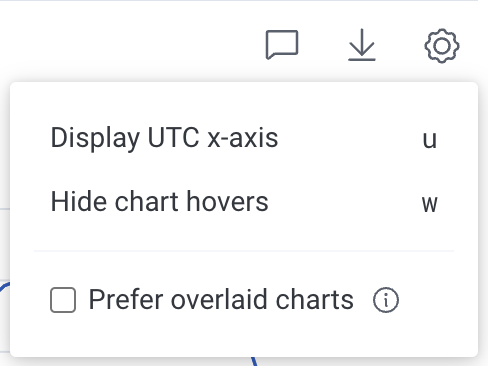
These Display Settings menu options control the appearance of all your charts.
Select an option to apply it to all charts.
The selected option in the menu then updates all charts.
## Download Query Results Menu
These download options remain static in the menu.
### Download CSV
Use **Download CSV** to download the query results in `.csv` format.
We may process or alter the data returned in the CSV to prevent CSV injection vulnerabilities. For more information, contact Support via [support.honeycomb.io](https://support.honeycomb.io/) or email at [support@honeycomb.io](mailto:support@honeycomb.io).
### Download JSON
Use **Download JSON** to download the query results in JSON format.
## Display Settings Menu
These Display Settings menu options control the appearance of all your charts.
Select an option to apply it to all charts.
The selected option in the menu then updates all charts.
 ### Prefer Overlaid Charts
Honeycomb renders a separate chart for every **SELECT** clause in your query by default.
Checking **Prefer Overlaid Charts** combines any selected `AVG`, `MIN`, `MAX`, and `PERCENTILE` clauses into a single chart.
### Prefer Overlaid Charts
Honeycomb renders a separate chart for every **SELECT** clause in your query by default.
Checking **Prefer Overlaid Charts** combines any selected `AVG`, `MIN`, `MAX`, and `PERCENTILE` clauses into a single chart.
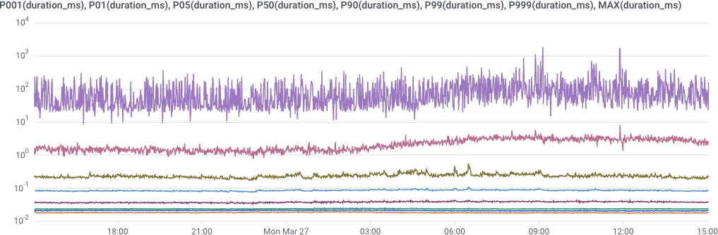 Supported [operations](/investigate/query/build/#select-operations) include:
* `AVG`
* `MAX`
* `MIN`
* `P001`
* `P01`
* `P05`
* `P10`
* `P20`
* `P25`
* `P50`
* `P75`
* `P80`
* `P90`
* `P95`
* `P99`
* `P999`
Charts will not overlay for queries that have a **GROUP BY** clause.
Unsupported [operations](/investigate/query/build/#select-operations) include:
* `CONCURRENCY`
* `COUNT`
* `COUNT_DISTINCT`
* `GROUP BY` (removes overlays)
* `HEATMAP`
* `RATE`
* `SUM`
### Display UTC Time X-Axis or Localtime X-Axis
**UTC Time**
: Displays the x-axis in [Coordinated Universal Time](https://en.wikipedia.org/wiki/Coordinated_Universal_Time), the time at 0° longitude.
UTC is sometimes referred to as Greenwich Mean Time (GMT).
UTC does not observe Daylight Savings Time.
**Local Time**
: Displays the x-axis in your browser's local time.
### Hide or Show Graph Hovers
Graph Hovers appear in the results display when hovering over a graph.
Hide or show Graph Hovers either by using the Graph Settings menu or the `o` keyboard shortcut.
For example, use this setting to remove any obstruction to the overall graph display, or to optimize for screenshot purposes.
## Modify Chart Menu
The chart settings menu controls the appearance of individual charts.
Select an option to apply it to the corresponding chart.
The selected option in the menu then updates the chart.
Supported [operations](/investigate/query/build/#select-operations) include:
* `AVG`
* `MAX`
* `MIN`
* `P001`
* `P01`
* `P05`
* `P10`
* `P20`
* `P25`
* `P50`
* `P75`
* `P80`
* `P90`
* `P95`
* `P99`
* `P999`
Charts will not overlay for queries that have a **GROUP BY** clause.
Unsupported [operations](/investigate/query/build/#select-operations) include:
* `CONCURRENCY`
* `COUNT`
* `COUNT_DISTINCT`
* `GROUP BY` (removes overlays)
* `HEATMAP`
* `RATE`
* `SUM`
### Display UTC Time X-Axis or Localtime X-Axis
**UTC Time**
: Displays the x-axis in [Coordinated Universal Time](https://en.wikipedia.org/wiki/Coordinated_Universal_Time), the time at 0° longitude.
UTC is sometimes referred to as Greenwich Mean Time (GMT).
UTC does not observe Daylight Savings Time.
**Local Time**
: Displays the x-axis in your browser's local time.
### Hide or Show Graph Hovers
Graph Hovers appear in the results display when hovering over a graph.
Hide or show Graph Hovers either by using the Graph Settings menu or the `o` keyboard shortcut.
For example, use this setting to remove any obstruction to the overall graph display, or to optimize for screenshot purposes.
## Modify Chart Menu
The chart settings menu controls the appearance of individual charts.
Select an option to apply it to the corresponding chart.
The selected option in the menu then updates the chart.
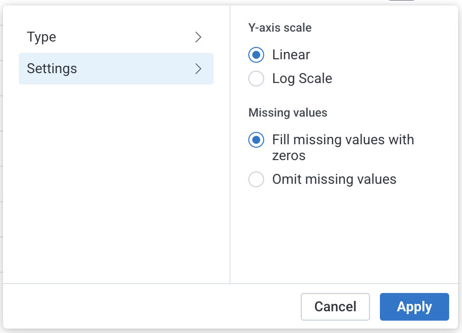 ### Chart Types
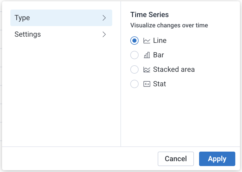
Select a chart type to update the corresponding chart.
The following charts are available:
**Line Graph**
: \[default] Displays each group as a line of values over time.
Read the value at a particular time directly from the y-axis on the left side of the graph.
**Bar Chart (Time Series)**
: Displays each group as bars of values over time.
Read the value at a particular time directly from the y-axis on the left side of the graph.
**Stacked Graph**
: Displays groups as stacked colored areas under their line graphs.
Each shows a group’s relative contribution to the total.
The y-axis reflects the sum of all groups.
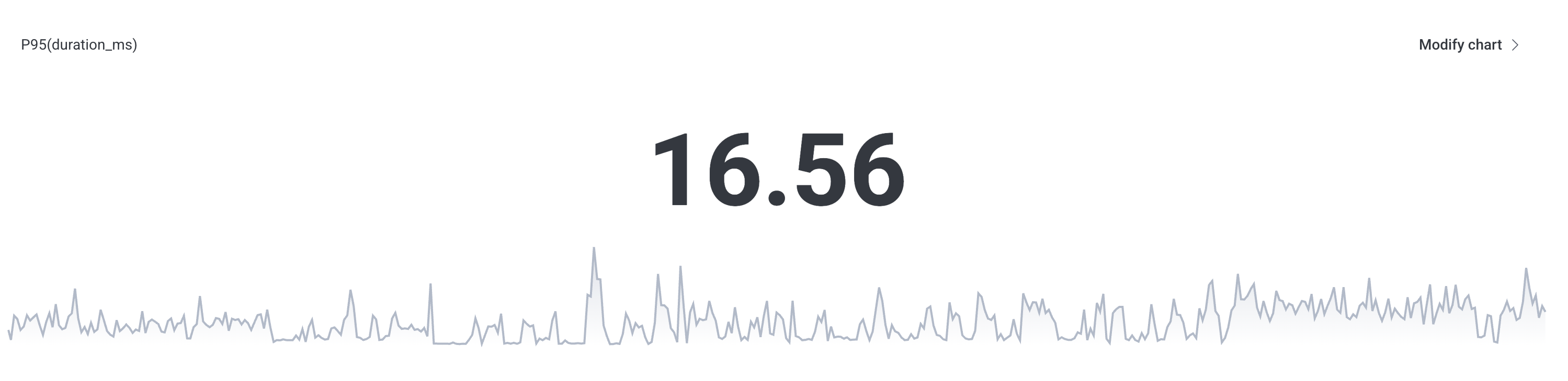
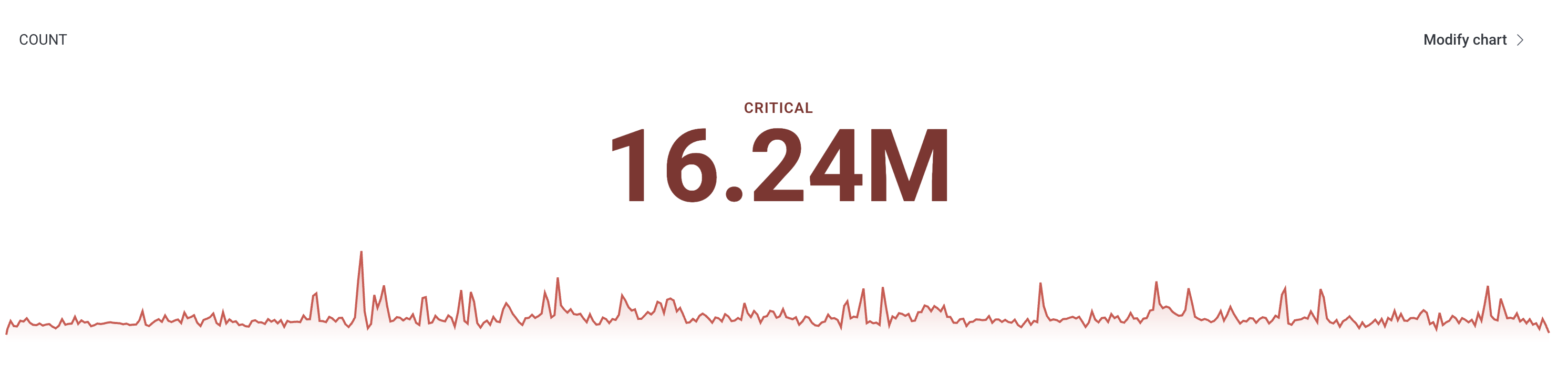
**Stat Chart**
: Displays a single value and graph sparkline.
**Bar Chart (Categorical)**
: Displays each group as a horizontal bar representing a single, non-time-based value.
Each bar corresponds to a unique value of a categorical field.
(For example, endpoint or status code.)
Read the category and value from the label on the right side of the bar.
**Pie Chart (Categorical)**
: Displays each group as a slice of a circle, representing a single, non-time-based value.
Each slice corresponds to a unique value of a categorical field.
(For example, endpoint or status code.)
Read the category and value from the legend or from the hover menu when hovering over a slice.
### Chart Settings
#### Display Log Scale or Linear Scale
Log Scale
: The y-axis of a Log Scale graph increases exponentially.
Each Y value increase represents an order of magnitude (10n) change.
A Log Scale graph is useful for data with an extremely large range of values.
Linear Scale
: \[default] The y-axis of a Linear Scale graph increases by a fixed amount as values increase.
It is useful for data with a limited range of expected values.
#### Omit Missing Values or Fill Missing Values with Zeros
Omit Missing Values
: Interpolates between points when the intervening time buckets have no matching events.
Use to display a continuous line graph with no drops to zero.
Fill Missing Values with Zeros
: \[default] Substitutes zero values for time buckets with no matching events.
#### Other categories
Show other categories
: \[default] Includes a bar or pie slice representing categories beyond the query's limit.
Hide other categories
: Does not display information about categories beyond the query's limit.
### Chart Thresholds
Chart thresholds help you quickly assess system health and identify when your data cross values that require additional attention or action.
Thresholds apply only to time series charts: line, stacked area, bar, and stat charts.
#### Defining a Threshold
Defining a threshold lets you control when a threshold takes effect and how it appears on a chart.
You choose the condition, value, and visual style used to display the threshold.
To add a threshold:
1. Select the **Modify Chart** menu.
2. Toggle on **Set Threshold**.
### Chart Types
Select a chart type to update the corresponding chart.
The following charts are available:
**Line Graph**
: \[default] Displays each group as a line of values over time.
Read the value at a particular time directly from the y-axis on the left side of the graph.
**Bar Chart (Time Series)**
: Displays each group as bars of values over time.
Read the value at a particular time directly from the y-axis on the left side of the graph.
**Stacked Graph**
: Displays groups as stacked colored areas under their line graphs.
Each shows a group’s relative contribution to the total.
The y-axis reflects the sum of all groups.
**Stat Chart**
: Displays a single value and graph sparkline.
**Bar Chart (Categorical)**
: Displays each group as a horizontal bar representing a single, non-time-based value.
Each bar corresponds to a unique value of a categorical field.
(For example, endpoint or status code.)
Read the category and value from the label on the right side of the bar.
**Pie Chart (Categorical)**
: Displays each group as a slice of a circle, representing a single, non-time-based value.
Each slice corresponds to a unique value of a categorical field.
(For example, endpoint or status code.)
Read the category and value from the legend or from the hover menu when hovering over a slice.
### Chart Settings
#### Display Log Scale or Linear Scale
Log Scale
: The y-axis of a Log Scale graph increases exponentially.
Each Y value increase represents an order of magnitude (10n) change.
A Log Scale graph is useful for data with an extremely large range of values.
Linear Scale
: \[default] The y-axis of a Linear Scale graph increases by a fixed amount as values increase.
It is useful for data with a limited range of expected values.
#### Omit Missing Values or Fill Missing Values with Zeros
Omit Missing Values
: Interpolates between points when the intervening time buckets have no matching events.
Use to display a continuous line graph with no drops to zero.
Fill Missing Values with Zeros
: \[default] Substitutes zero values for time buckets with no matching events.
#### Other categories
Show other categories
: \[default] Includes a bar or pie slice representing categories beyond the query's limit.
Hide other categories
: Does not display information about categories beyond the query's limit.
### Chart Thresholds
Chart thresholds help you quickly assess system health and identify when your data cross values that require additional attention or action.
Thresholds apply only to time series charts: line, stacked area, bar, and stat charts.
#### Defining a Threshold
Defining a threshold lets you control when a threshold takes effect and how it appears on a chart.
You choose the condition, value, and visual style used to display the threshold.
To add a threshold:
1. Select the **Modify Chart** menu.
2. Toggle on **Set Threshold**.
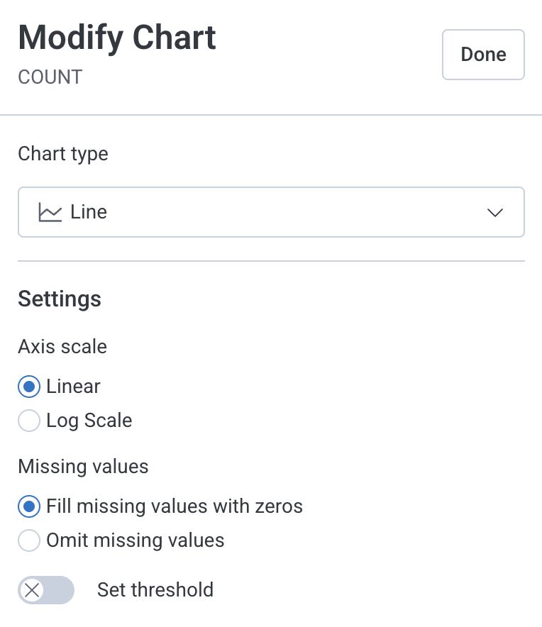 3. Enter the threshold settings:
| Setting | Description |
| ---------------- | -------------------------------------------------------------------------------------------------------------------------- |
| Active condition | Condition that triggers the threshold, based on whether values are greater than (>) or less than (\<) the threshold value. |
| Value | Numeric value that defines when the threshold condition is met. |
| Color | Color used to display the threshold on the chart or indicate a met condition. |
| Label | Text shown on the chart to identify what the threshold represents. |
| Style | Visual style of the threshold line. Available for line, stacked area, and bar charts only. |
3. Enter the threshold settings:
| Setting | Description |
| ---------------- | -------------------------------------------------------------------------------------------------------------------------- |
| Active condition | Condition that triggers the threshold, based on whether values are greater than (>) or less than (\<) the threshold value. |
| Value | Numeric value that defines when the threshold condition is met. |
| Color | Color used to display the threshold on the chart or indicate a met condition. |
| Label | Text shown on the chart to identify what the threshold represents. |
| Style | Visual style of the threshold line. Available for line, stacked area, and bar charts only. |
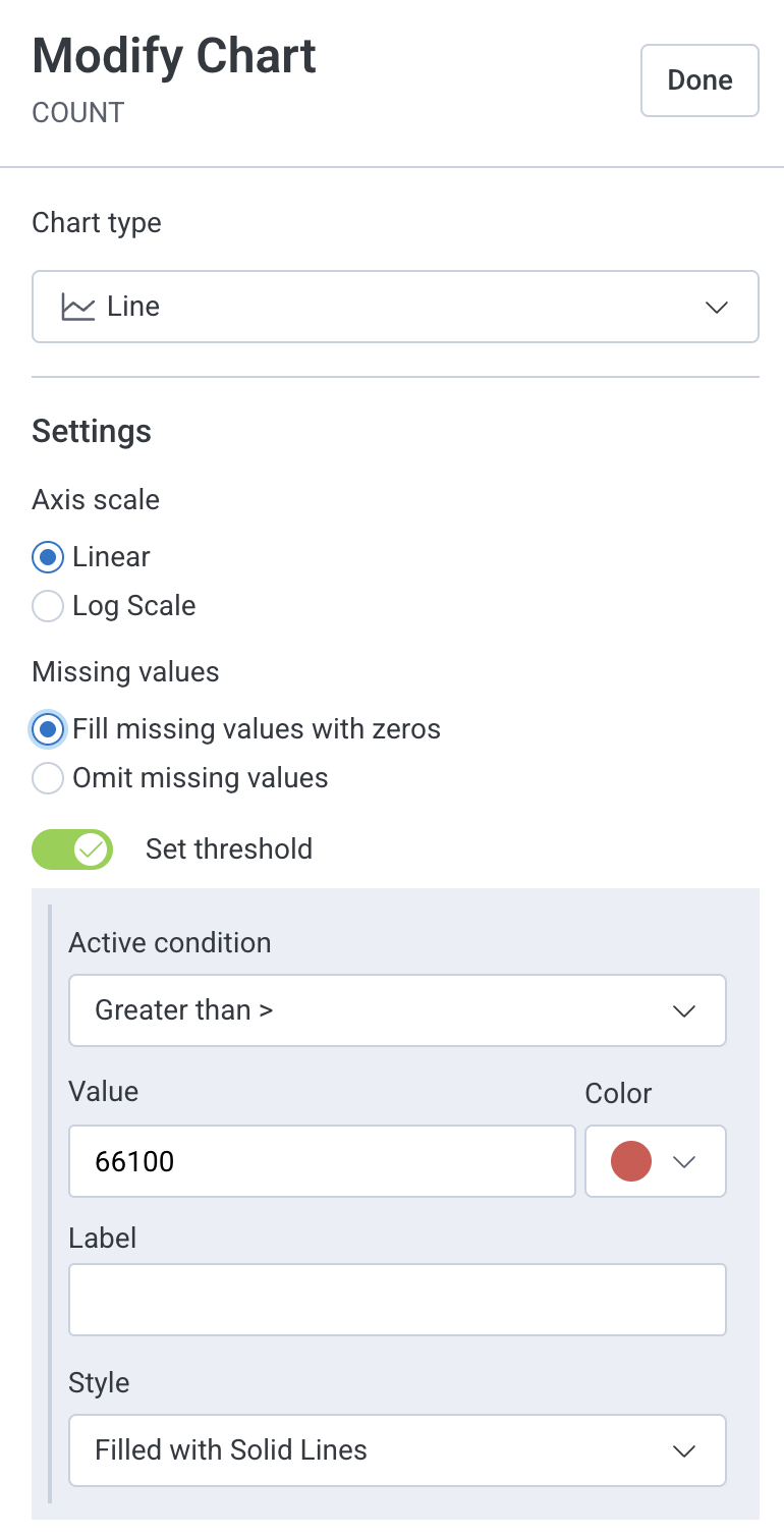 4. Select **Done**.
The **Modify Chart** menu closes, and your changes are saved.
When you save the query to a Board or to **My Saved Queries**, the threshold is saved with it and remains visible.
#### Threshold Displays
For line, stacked area, and bar charts, thresholds appear as lines labeled with the threshold name.
4. Select **Done**.
The **Modify Chart** menu closes, and your changes are saved.
When you save the query to a Board or to **My Saved Queries**, the threshold is saved with it and remains visible.
#### Threshold Displays
For line, stacked area, and bar charts, thresholds appear as lines labeled with the threshold name.
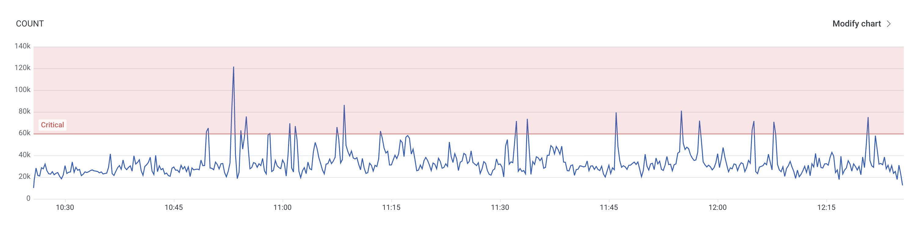 For stat charts, the stat changes color only when the threshold condition is met:
 If the condition is not met, the stat chart remains neutral: