> ## Documentation Index
> Fetch the complete documentation index at: https://docs.honeycomb.io/llms.txt
> Use this file to discover all available pages before exploring further.
# View General Health
> Get a snapshot of your dataset in Honeycomb Home: commonly-used queries, recent traces and events, and key visualizations to orient on system health fast.
export const HnyIcon = ({alias, path, size = 16, iconColor}) => {
const iconMap = {
"home": "house.svg",
"marker": "caretFilledDown.svg",
"show-marker-options": "chatTextLeft.svg",
"download": "arrowLineDown.svg",
"trace-waterfall": "trace.svg",
"show-query-details": "listDashes.svg",
"table": "table.svg",
"log-lines": "logLines.svg",
"chart": "chartLine.svg",
"show-settings": "gear.svg",
"add": "plus.svg",
"remove": "delete.svg",
"persist": "caretDown.svg",
"close": "close.svg",
"copy": "copy.svg",
"zoom-in": "magnifyingGlassPlus.svg",
"zoom-out": "magnifyingGlassMinus.svg",
"color-assignment": "drop.svg",
"drag": "dots-six-vertical.svg",
"drawer": "drawer.svg",
"show-actions": "dotsThree.svg",
"edit": "pencil.svg",
"delete": "trash.svg",
"move": "arrowsOutCardinal.svg",
"show-legend": "circleInfo.svg",
"usage-ok": "usageGood.svg",
"usage-warning": "usageWarning.svg",
"usage-danger": "usageDanger.svg",
"open-query-builder": "query.svg",
"home-menu": "house.svg",
"query-menu": "query.svg",
"boards-menu": "board.svg",
"triggers-menu": "bell.svg",
"slos-menu": "handshake.svg",
"service-map-menu": "serviceMap.svg",
"history-menu": "clockCounterClockwise.svg",
"manage-data-menu": "cube.svg",
"usage-menu": "usageGood.svg",
"canvas-menu": "sparkle.svg",
"anomalies-menu": "anomalies.svg",
"show-details": "dotsThreeVertical.svg",
"resize-handle": "board-panel-resize-handle.png",
"standard-dataset": "cube.svg",
"trace-dataset": "cubeChat.svg",
"all-datasets": "linkedSquares.svg",
"share": "arrowBentRight.svg",
"run-in-query-builder": "arrowSquareUpRight.svg",
"link": "link.svg",
"text": "text.svg",
"receive": "arrowLineDown.svg",
"process": "lightning.svg",
"sample": "drop.svg",
"send": "arrowLineUp.svg",
"submit": "arrowUp.svg",
"canvas-menu": "sparkle.svg",
"canvas": "sparkle.svg",
"chat-about-this-page": "sparkle.svg",
"private": "lockKey.svg",
"shared": "people.svg",
"expand": "caretDown.svg",
"previous": "caretLeft.svg",
"next": "caretRight.svg",
"expand-chat": "caretLeft.svg",
"minimize-chat": "caretRight.svg",
"open-in-canvas": "arrowSquareUpRight.svg"
};
const iconBasePath = "/_assets/icons/";
const iconPath = path || (alias ? `${iconBasePath}${iconMap[alias]}` : undefined);
return ;
};
Honeycomb's Home area provides a snapshot of your dataset.
Home displays visualizations of some commonly-used queries and breakdowns, and an overview of your most recent traces and events.
Both can be used as a jumping-off point to explore your data.
Use this view to become familiar with key system metrics and to check on the health of your systems.
Data visualizations depend on Honeycomb dataset fields being mapped to source fields in your sent data.
To learn how to map your data, visit [Map Your Data](/send-data/standardize/map-data/).
## Visualizations by Data Type
Home lets you visualize the data in your dataset in different ways: as trace-specific or log-specific visualizations, and as events in a table.
### Trace Visualizations
The **Traces** view contains visualizations to help you better understand your trace data and to surface signals in the noise.
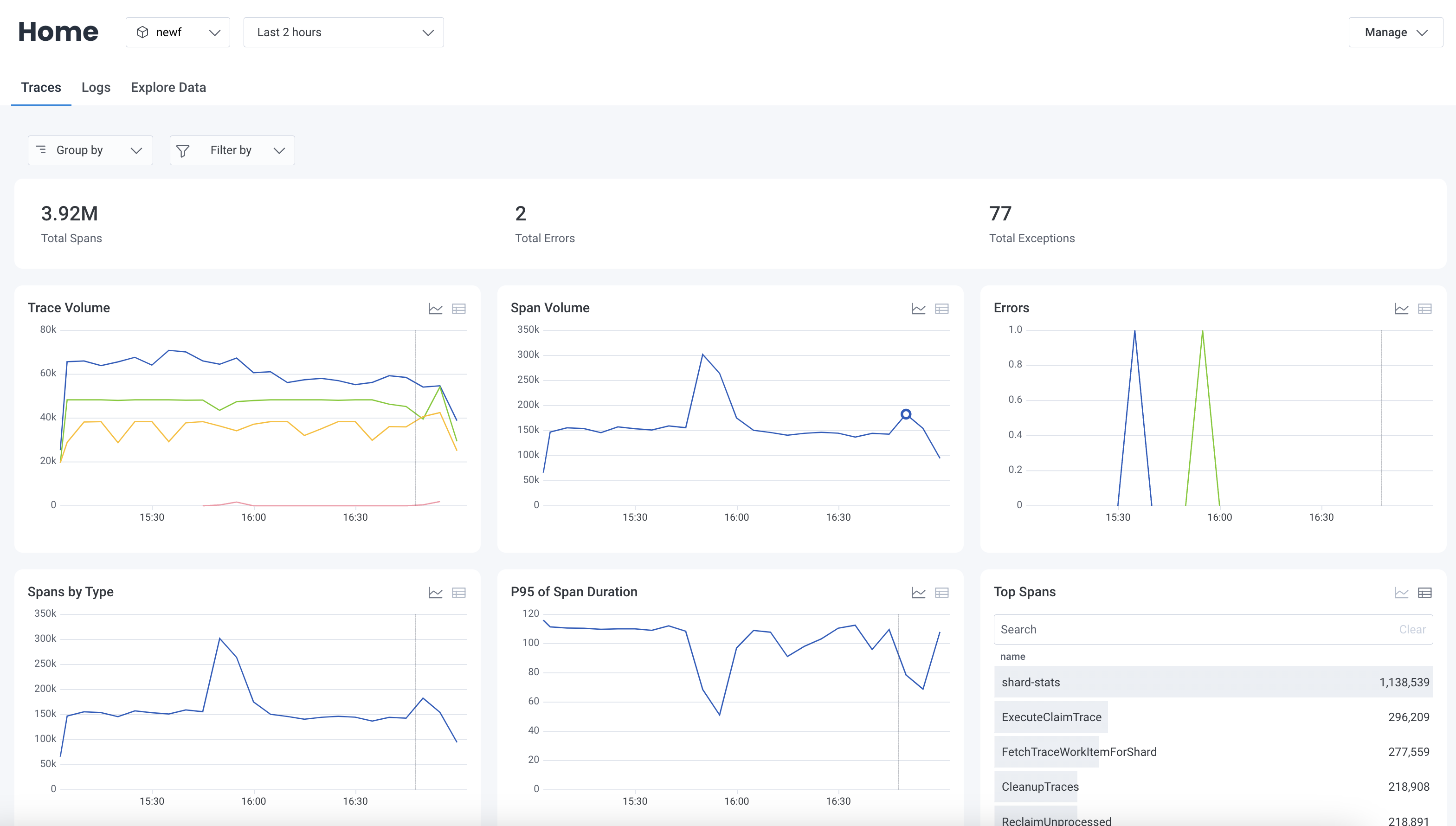 * **Total Spans**
Displays the total number of spans within the selected time range.
* **Total Errors**
Displays the total number of spans that contain `error` within the selected time range.
* **Total Exceptions**
Displays the total number of spans that contain `exception.message` within the selected time range.
* **Trace Volume**
Displays the total number of traces over time grouped by `name` within the selected time range.
* **Span Volume**
Displays the total number of spans over time within the selected time range.
* **Errors**
Displays the total number of errors over time grouped by `error` within the selected time range.
* **Spans by Type**
Displays the total number of spans over time grouped by span type within the selected time range.
* **Top Spans**
Displays the total number of spans grouped by `name` within the selected time range in descending order.
* **P95 of Span Duration**
Displays the 95th duration percentile for spans over time within the selected time range.
* **Exception Volume by Type**
Displays the number of spans that contain `exception.type` grouped by `exception.type` within the selected time range.
* **Top Exceptions**
Displays the total number of spans that contain `exception.message` grouped by `exception.message` within the selected time range in descending order.
**Total Exceptions**, **Exception Volume by Type**, and **Top Exceptions** charts depend on the availability of `exception.type` and `exception.message` fields.
To learn how to record `exception` with OpenTelemetry, visit [OpenTelemetry's documentation on exception spans](https://opentelemetry.io/docs/specs/semconv/exceptions/exceptions-spans/).
### Logs Visualizations
The **Logs** view contains visualizations to help you better understand your log data and to surface signals in the noise.
* **Total Spans**
Displays the total number of spans within the selected time range.
* **Total Errors**
Displays the total number of spans that contain `error` within the selected time range.
* **Total Exceptions**
Displays the total number of spans that contain `exception.message` within the selected time range.
* **Trace Volume**
Displays the total number of traces over time grouped by `name` within the selected time range.
* **Span Volume**
Displays the total number of spans over time within the selected time range.
* **Errors**
Displays the total number of errors over time grouped by `error` within the selected time range.
* **Spans by Type**
Displays the total number of spans over time grouped by span type within the selected time range.
* **Top Spans**
Displays the total number of spans grouped by `name` within the selected time range in descending order.
* **P95 of Span Duration**
Displays the 95th duration percentile for spans over time within the selected time range.
* **Exception Volume by Type**
Displays the number of spans that contain `exception.type` grouped by `exception.type` within the selected time range.
* **Top Exceptions**
Displays the total number of spans that contain `exception.message` grouped by `exception.message` within the selected time range in descending order.
**Total Exceptions**, **Exception Volume by Type**, and **Top Exceptions** charts depend on the availability of `exception.type` and `exception.message` fields.
To learn how to record `exception` with OpenTelemetry, visit [OpenTelemetry's documentation on exception spans](https://opentelemetry.io/docs/specs/semconv/exceptions/exceptions-spans/).
### Logs Visualizations
The **Logs** view contains visualizations to help you better understand your log data and to surface signals in the noise.
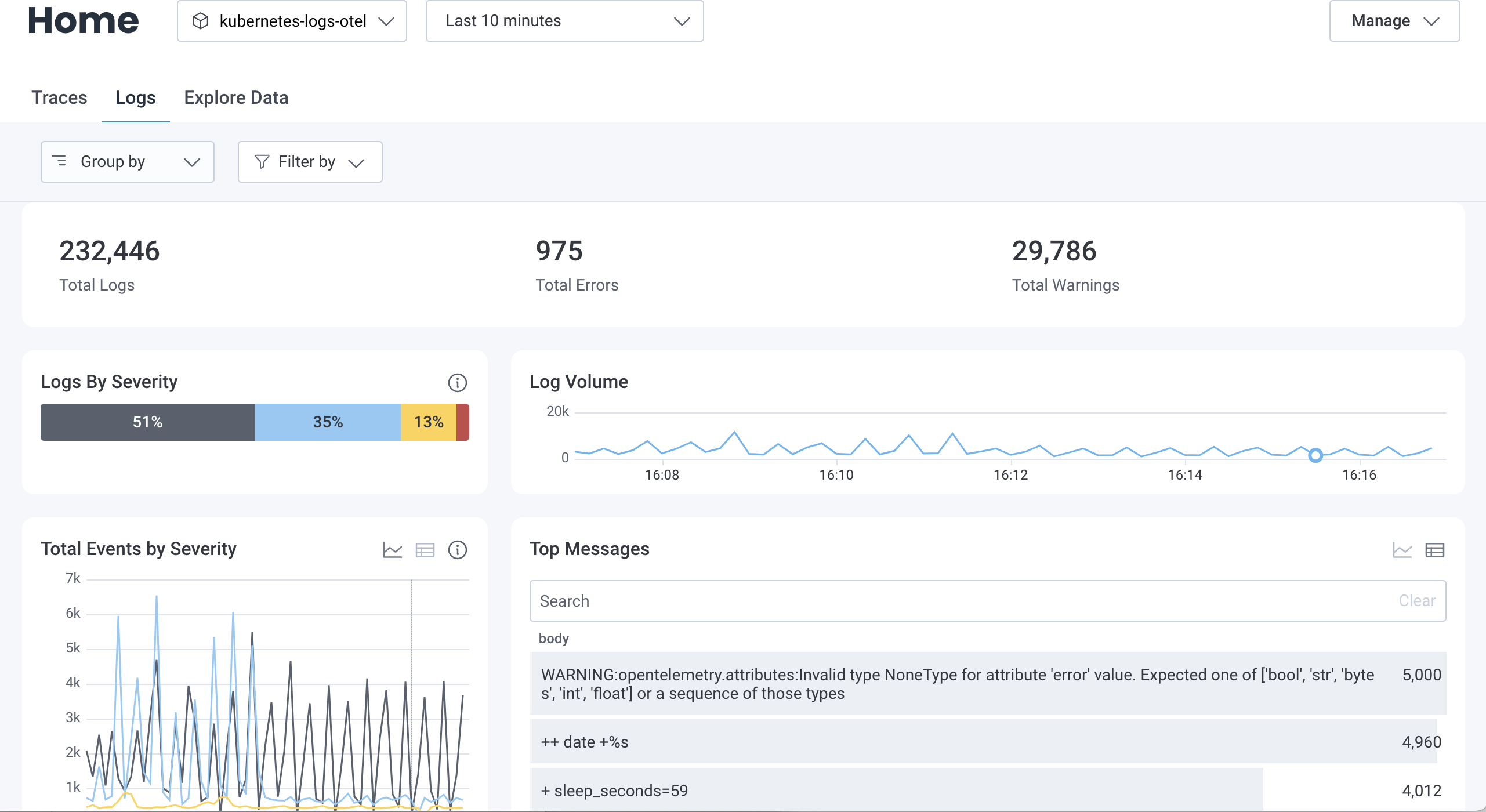 * **Total Logs:**
Displays the total number of logs received within the selected time range.
* **Total Errors:**
Displays the total number of logs that contain `error` or `fatal` severities within the selected time range.
* **Total Warnings:**
Displays the total number of logs with `warn` severities within the selected time range.
* **Logs by Severity:**
Displays the percent of logs by severity levels within the selected time range.
Only standard severities, which include `fatal`, `error`, `warn`, `info`, `trace`, `debug`, and `unspecified`, are distinctly represented.
Other, non-standard severities are bucketed into an `Other` group.
For more insights using BubbleUp, [parse your severities into Honeycomb standard severities](/send-data/standardize/transform-data/#transform-source-severities-into-honeycomb-standard-severities).
* **Log Volume:**
Displays a line graph of the log volume within the selected time range.
* **Total Events by Severity:**
Displays the volume of logs, grouped by severity, within the selected time range.
Select the Show table () or Show chart () icon to switch between displaying this data as a table or line graph.
Non-standard severities are also displayed in this chart.
* **Top Messages:**
Displays the most frequently occurring log messages within the selected time range.
Select the Show table icon () or Show chart icon () to switch between displaying this data as a table or line graph.
Enter a string in the search box to filter the **body** by that string.
* **Total Errors by Severity:**
Displays the volume of logs where severity is `error` or `fatal`, grouped by severity, for the selected time range.
Select the Show table icon () or Show chart icon () to switch between displaying this data as a table or line graph.
* **Top Errors:**
Displays the most frequently occurring errors within the selected time range.
Select the Show table icon () or Show chart icon () to switch between displaying this data as a table or line graph.
Enter a string in the search box to filter the **body** by that string.
### Grouping & Filtering
You can slice and dice visualizations in the **Traces** or **Logs** views by selecting options within the **Group by** and **Filter by** dropdowns.
#### Group By
Use the **Group by** dropdown to group all logs visualizations by additional fields.
* **Total Logs:**
Displays the total number of logs received within the selected time range.
* **Total Errors:**
Displays the total number of logs that contain `error` or `fatal` severities within the selected time range.
* **Total Warnings:**
Displays the total number of logs with `warn` severities within the selected time range.
* **Logs by Severity:**
Displays the percent of logs by severity levels within the selected time range.
Only standard severities, which include `fatal`, `error`, `warn`, `info`, `trace`, `debug`, and `unspecified`, are distinctly represented.
Other, non-standard severities are bucketed into an `Other` group.
For more insights using BubbleUp, [parse your severities into Honeycomb standard severities](/send-data/standardize/transform-data/#transform-source-severities-into-honeycomb-standard-severities).
* **Log Volume:**
Displays a line graph of the log volume within the selected time range.
* **Total Events by Severity:**
Displays the volume of logs, grouped by severity, within the selected time range.
Select the Show table () or Show chart () icon to switch between displaying this data as a table or line graph.
Non-standard severities are also displayed in this chart.
* **Top Messages:**
Displays the most frequently occurring log messages within the selected time range.
Select the Show table icon () or Show chart icon () to switch between displaying this data as a table or line graph.
Enter a string in the search box to filter the **body** by that string.
* **Total Errors by Severity:**
Displays the volume of logs where severity is `error` or `fatal`, grouped by severity, for the selected time range.
Select the Show table icon () or Show chart icon () to switch between displaying this data as a table or line graph.
* **Top Errors:**
Displays the most frequently occurring errors within the selected time range.
Select the Show table icon () or Show chart icon () to switch between displaying this data as a table or line graph.
Enter a string in the search box to filter the **body** by that string.
### Grouping & Filtering
You can slice and dice visualizations in the **Traces** or **Logs** views by selecting options within the **Group by** and **Filter by** dropdowns.
#### Group By
Use the **Group by** dropdown to group all logs visualizations by additional fields.
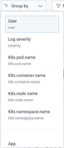 To create a group:
1. From the **Group by** dropdown, select **Customize Groups**.
2. In the modal, for **Property**, select the field you want to be able to group your data by.
3. Enter a **Display Name**, and select **Add Field**.
Your named group will appear as an option in both the **Group by** and **Filter by** dropdowns.
To delete a group:
1. From the **Group by** dropdown, select **Customize Groups**.
2. In the modal, locate the **Existing Fields** section.
3. Locate the group that you want to delete, and select the Delete icon ().
4. Close the modal.
Your group will no longer appear as an option in the **Group by** and **Filter by** dropdowns.
#### Filter By
Use the **Filter by** dropdown to filter all logs visualizations by additional fields.
To create a group:
1. From the **Group by** dropdown, select **Customize Groups**.
2. In the modal, for **Property**, select the field you want to be able to group your data by.
3. Enter a **Display Name**, and select **Add Field**.
Your named group will appear as an option in both the **Group by** and **Filter by** dropdowns.
To delete a group:
1. From the **Group by** dropdown, select **Customize Groups**.
2. In the modal, locate the **Existing Fields** section.
3. Locate the group that you want to delete, and select the Delete icon ().
4. Close the modal.
Your group will no longer appear as an option in the **Group by** and **Filter by** dropdowns.
#### Filter By
Use the **Filter by** dropdown to filter all logs visualizations by additional fields.
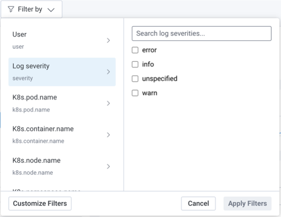 To create a filter:
1. From the **Filter by** dropdown, select **Customize Filters**.
2. In the modal, for **Property**, select the field you want to be able to filter your data by.
3. Enter a **Display Name**, and select **Add Field**.
Your named filter will appear as an option in the **Filter by** and **Group by** dropdowns.
To delete a filter:
1. From the **Filter by** dropdown, select **Customize Filters**.
2. In the modal, locate the **Existing Fields** section.
3. Locate the filter that you want to delete, and select its Delete icon ().
4. Close the modal.
Your filter will no longer appear as an option in the **Filter by** and **Group by** dropdowns.
To filter by multiple values:
1. From the **Filter by** dropdown, select a field you would like to filter by.
2. Select the values you would like to include for the field.
3. Repeat for any other fields you would like to filter by.
4. Select **Apply Filters**.
Your visualizations will update and will now be restricted by your applied filters.
### Chart Actions
Use chart actions to dig deeper into the insights displayed on Honeycomb Home.
Select any point on a line graph or any values in a table to open the action menu.
To create a filter:
1. From the **Filter by** dropdown, select **Customize Filters**.
2. In the modal, for **Property**, select the field you want to be able to filter your data by.
3. Enter a **Display Name**, and select **Add Field**.
Your named filter will appear as an option in the **Filter by** and **Group by** dropdowns.
To delete a filter:
1. From the **Filter by** dropdown, select **Customize Filters**.
2. In the modal, locate the **Existing Fields** section.
3. Locate the filter that you want to delete, and select its Delete icon ().
4. Close the modal.
Your filter will no longer appear as an option in the **Filter by** and **Group by** dropdowns.
To filter by multiple values:
1. From the **Filter by** dropdown, select a field you would like to filter by.
2. Select the values you would like to include for the field.
3. Repeat for any other fields you would like to filter by.
4. Select **Apply Filters**.
Your visualizations will update and will now be restricted by your applied filters.
### Chart Actions
Use chart actions to dig deeper into the insights displayed on Honeycomb Home.
Select any point on a line graph or any values in a table to open the action menu.
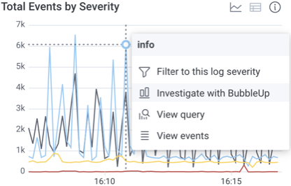 #### View Query
Each visualization lets you navigate directly to the **Query Results** page for the underlying query.
To explore a visualization's underlying query:
1. Select a point on a chart or a cell in a table.
2. From the context menu, select **View Query**.
You will be redirected to the **Overview** view on the **Query Results** page for the underlying query.
#### Identify Outliers
Visualizations that are grouped by fields will let you use BubbleUp to explore differences between groups:
1. On a grouped visualization, select a point on a chart or a cell in a table.
2. From the context menu, select **BubbleUp Outliers**.
You will be redirected to the **BubbleUp** view on the **Query Results** page for the underlying query.
If **BubbleUp Outliers** does not appear in the context menu, make sure that:
* you are selecting from a grouped visualization
* the visualization contains more than one group
* you are not selecting the `Other` group in the "Logs by Severity" chart
#### Filter
Visualizations that are grouped by fields will let you filter directly by a severity or log message group.
To filter directly by a group:
1. Select a point on a chart or a cell in a table.
2. From the context menu, select **Filter to this...**.
Your visualizations will update and will now be restricted by your applied filter.
#### View Events
Each visualization lets you navigate directly to selected events.
To explore events:
1. Select a point on a chart or a cell in a table.
2. From the context menu, select **View Events**.
You will be redirected to the **Explore Data** view on the **Query Results** page for the selected point.
## Explore Data
The **Explore Data** view lets you [explore all of the events](/investigate/analyze/explore-events/) in the dataset.
You can access the **Explore Data** view through either Honeycomb Home or the Query Builder.
In either case, the functionality remains the same--only the scope of the data changes.
Accessing **Explore Data** through the Query Builder returns all events matching the entered query, whereas accessing it through Honeycomb Home returns all events contained in the selected dataset that occurred during the defined time window.
## Troubleshooting
To explore common issues when working with Honeycomb Home visualizations, visit [Common Issues with Visualization: Home](/troubleshoot/common-issues/visualization/#home).
#### View Query
Each visualization lets you navigate directly to the **Query Results** page for the underlying query.
To explore a visualization's underlying query:
1. Select a point on a chart or a cell in a table.
2. From the context menu, select **View Query**.
You will be redirected to the **Overview** view on the **Query Results** page for the underlying query.
#### Identify Outliers
Visualizations that are grouped by fields will let you use BubbleUp to explore differences between groups:
1. On a grouped visualization, select a point on a chart or a cell in a table.
2. From the context menu, select **BubbleUp Outliers**.
You will be redirected to the **BubbleUp** view on the **Query Results** page for the underlying query.
If **BubbleUp Outliers** does not appear in the context menu, make sure that:
* you are selecting from a grouped visualization
* the visualization contains more than one group
* you are not selecting the `Other` group in the "Logs by Severity" chart
#### Filter
Visualizations that are grouped by fields will let you filter directly by a severity or log message group.
To filter directly by a group:
1. Select a point on a chart or a cell in a table.
2. From the context menu, select **Filter to this...**.
Your visualizations will update and will now be restricted by your applied filter.
#### View Events
Each visualization lets you navigate directly to selected events.
To explore events:
1. Select a point on a chart or a cell in a table.
2. From the context menu, select **View Events**.
You will be redirected to the **Explore Data** view on the **Query Results** page for the selected point.
## Explore Data
The **Explore Data** view lets you [explore all of the events](/investigate/analyze/explore-events/) in the dataset.
You can access the **Explore Data** view through either Honeycomb Home or the Query Builder.
In either case, the functionality remains the same--only the scope of the data changes.
Accessing **Explore Data** through the Query Builder returns all events matching the entered query, whereas accessing it through Honeycomb Home returns all events contained in the selected dataset that occurred during the defined time window.
## Troubleshooting
To explore common issues when working with Honeycomb Home visualizations, visit [Common Issues with Visualization: Home](/troubleshoot/common-issues/visualization/#home).