> ## Documentation Index
> Fetch the complete documentation index at: https://docs.honeycomb.io/llms.txt
> Use this file to discover all available pages before exploring further.
# Investigate Application Data in Honeycomb
> Analyze application telemetry in Honeycomb to monitor overall health, spot anomalies, and troubleshoot performance problems as they arise.
export const HnyIcon = ({alias, path, size = 16, iconColor}) => {
const iconMap = {
"home": "house.svg",
"marker": "caretFilledDown.svg",
"show-marker-options": "chatTextLeft.svg",
"download": "arrowLineDown.svg",
"trace-waterfall": "trace.svg",
"show-query-details": "listDashes.svg",
"table": "table.svg",
"log-lines": "logLines.svg",
"chart": "chartLine.svg",
"show-settings": "gear.svg",
"add": "plus.svg",
"remove": "delete.svg",
"persist": "caretDown.svg",
"close": "close.svg",
"copy": "copy.svg",
"zoom-in": "magnifyingGlassPlus.svg",
"zoom-out": "magnifyingGlassMinus.svg",
"color-assignment": "drop.svg",
"drag": "dots-six-vertical.svg",
"drawer": "drawer.svg",
"show-actions": "dotsThree.svg",
"edit": "pencil.svg",
"delete": "trash.svg",
"move": "arrowsOutCardinal.svg",
"show-legend": "circleInfo.svg",
"usage-ok": "usageGood.svg",
"usage-warning": "usageWarning.svg",
"usage-danger": "usageDanger.svg",
"open-query-builder": "query.svg",
"home-menu": "house.svg",
"query-menu": "query.svg",
"boards-menu": "board.svg",
"triggers-menu": "bell.svg",
"slos-menu": "handshake.svg",
"service-map-menu": "serviceMap.svg",
"history-menu": "clockCounterClockwise.svg",
"manage-data-menu": "cube.svg",
"usage-menu": "usageGood.svg",
"canvas-menu": "sparkle.svg",
"anomalies-menu": "anomalies.svg",
"show-details": "dotsThreeVertical.svg",
"resize-handle": "board-panel-resize-handle.png",
"standard-dataset": "cube.svg",
"trace-dataset": "cubeChat.svg",
"all-datasets": "linkedSquares.svg",
"share": "arrowBentRight.svg",
"run-in-query-builder": "arrowSquareUpRight.svg",
"link": "link.svg",
"text": "text.svg",
"receive": "arrowLineDown.svg",
"process": "lightning.svg",
"sample": "drop.svg",
"send": "arrowLineUp.svg",
"submit": "arrowUp.svg",
"canvas-menu": "sparkle.svg",
"canvas": "sparkle.svg",
"chat-about-this-page": "sparkle.svg",
"private": "lockKey.svg",
"shared": "people.svg",
"expand": "caretDown.svg",
"previous": "caretLeft.svg",
"next": "caretRight.svg",
"expand-chat": "caretLeft.svg",
"minimize-chat": "caretRight.svg",
"open-in-canvas": "arrowSquareUpRight.svg"
};
const iconBasePath = "/_assets/icons/";
const iconPath = path || (alias ? `${iconBasePath}${iconMap[alias]}` : undefined);
return ;
};
Honeycomb is designed to let you explore your systems in novel ways and find problems faster. Here's a quick overview of ways to learn about and explore your data.
## Before You Begin
Before you can explore your data, you should have already [added instrumentation to your application](/get-started/start-building/application/), run it, and interacted with it by making a few requests.
Making requests to your service will generate telemetry data and send it to Honeycomb where it will appear in the Honeycomb UI within seconds.
## View Events
Start by exploring with the raw data from your applications [in Honeycomb](https://ui.honeycomb.io/).
1. From the left sidebar, go to **New Query**.
2. Select **Run Query** to run an empty query.
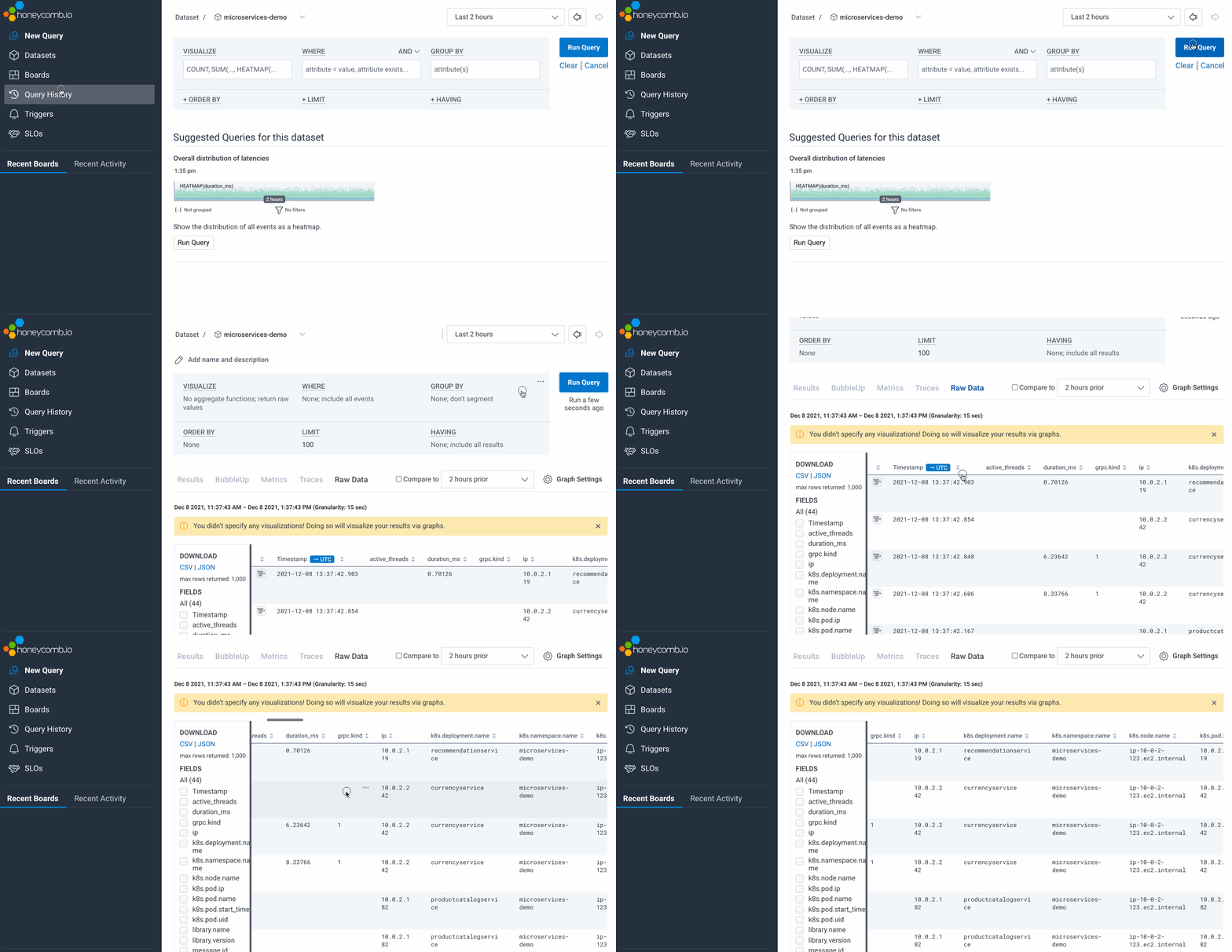 Events data from your application is displayed in a table.
Take a moment to notice the fields that are included and how events are laid out.
## Group By and Filter
Choose a field and group by it to get a more granular view.
In this example, we will use `http.status_code`.
1. In **GROUP BY**, enter `http.status_code`. Select **Run Query**.
You will see events grouped by codes like `200` or `404`, depending on your application.
2. Next to one of the rows, select the Show Actions icon (), then select **Show only events in this group**.
You will see all events that contain that value, charted over time.
Events data from your application is displayed in a table.
Take a moment to notice the fields that are included and how events are laid out.
## Group By and Filter
Choose a field and group by it to get a more granular view.
In this example, we will use `http.status_code`.
1. In **GROUP BY**, enter `http.status_code`. Select **Run Query**.
You will see events grouped by codes like `200` or `404`, depending on your application.
2. Next to one of the rows, select the Show Actions icon (), then select **Show only events in this group**.
You will see all events that contain that value, charted over time.
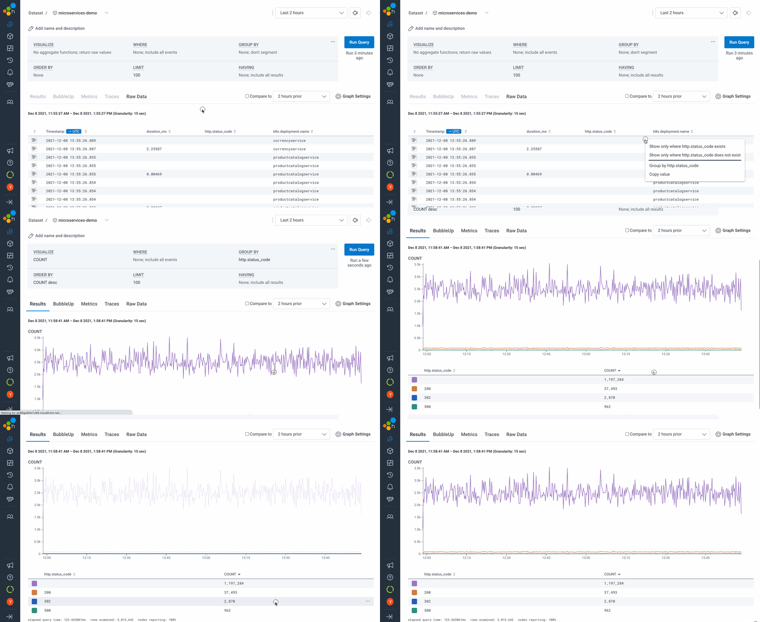 View, group by, and filter your Events to highlight the basic shape of your data and the fields available for analysis.
To see a richer view, make sure you [customize your instrumentation](/send-data/standardize/add-custom-instrumentation/).
## View a Sample Trace
Traces are visual diagrams of all the events that occur in a single operation as it traverses an application.
They are made up of the structured events (seen above) that you send, and tied together by a Trace ID.
Traces help you find the source of errors in a system, identify the slowest processes, and break down the user experience in great detail.
1. Select the **Traces** tab.
Below the chart, you will see up to 10 of the slowest traces.
2. Select the **Trace ID** to view that trace.
View, group by, and filter your Events to highlight the basic shape of your data and the fields available for analysis.
To see a richer view, make sure you [customize your instrumentation](/send-data/standardize/add-custom-instrumentation/).
## View a Sample Trace
Traces are visual diagrams of all the events that occur in a single operation as it traverses an application.
They are made up of the structured events (seen above) that you send, and tied together by a Trace ID.
Traces help you find the source of errors in a system, identify the slowest processes, and break down the user experience in great detail.
1. Select the **Traces** tab.
Below the chart, you will see up to 10 of the slowest traces.
2. Select the **Trace ID** to view that trace.
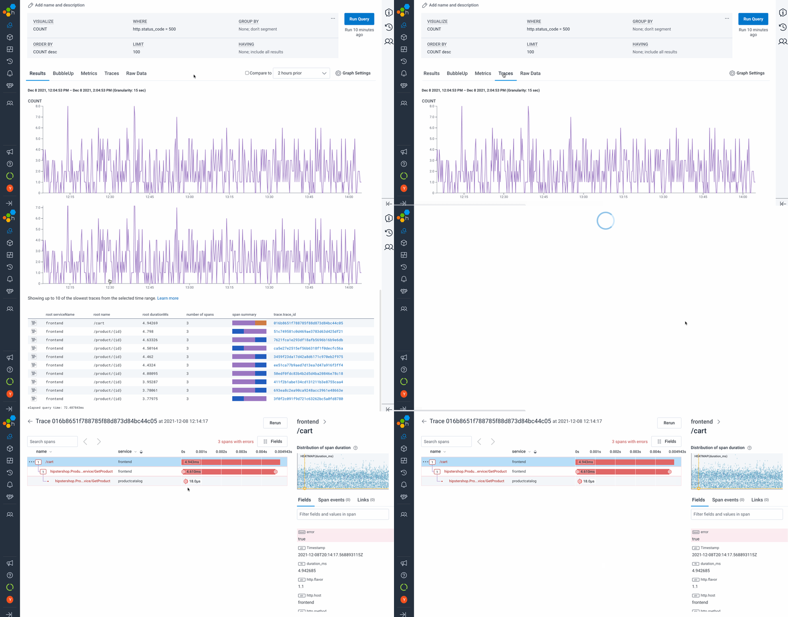 This view is called the trace waterfall.
It shows the spans within the trace, how long each one took, which contain errors, and additional metadata.
Tracing is a powerful way to find performance problems and understand how data flows through a large system.
[Learn more about traces](/get-started/basics/observability/concepts/distributed-tracing/).
## Query and Visualize
Now that you have taken a tour of your data, query it to answer a question about your system.
For example: How many events contain a certain error?
What is the average latency and distribution of those events?
1. From the left sidebar, navigate to **New Query**.
2. In the **SELECT** clause, add:
`COUNT`
`AVG(duration_ms)`
`HEATMAP(duration_ms)`
3. Select **Run Query**.
This view is called the trace waterfall.
It shows the spans within the trace, how long each one took, which contain errors, and additional metadata.
Tracing is a powerful way to find performance problems and understand how data flows through a large system.
[Learn more about traces](/get-started/basics/observability/concepts/distributed-tracing/).
## Query and Visualize
Now that you have taken a tour of your data, query it to answer a question about your system.
For example: How many events contain a certain error?
What is the average latency and distribution of those events?
1. From the left sidebar, navigate to **New Query**.
2. In the **SELECT** clause, add:
`COUNT`
`AVG(duration_ms)`
`HEATMAP(duration_ms)`
3. Select **Run Query**.
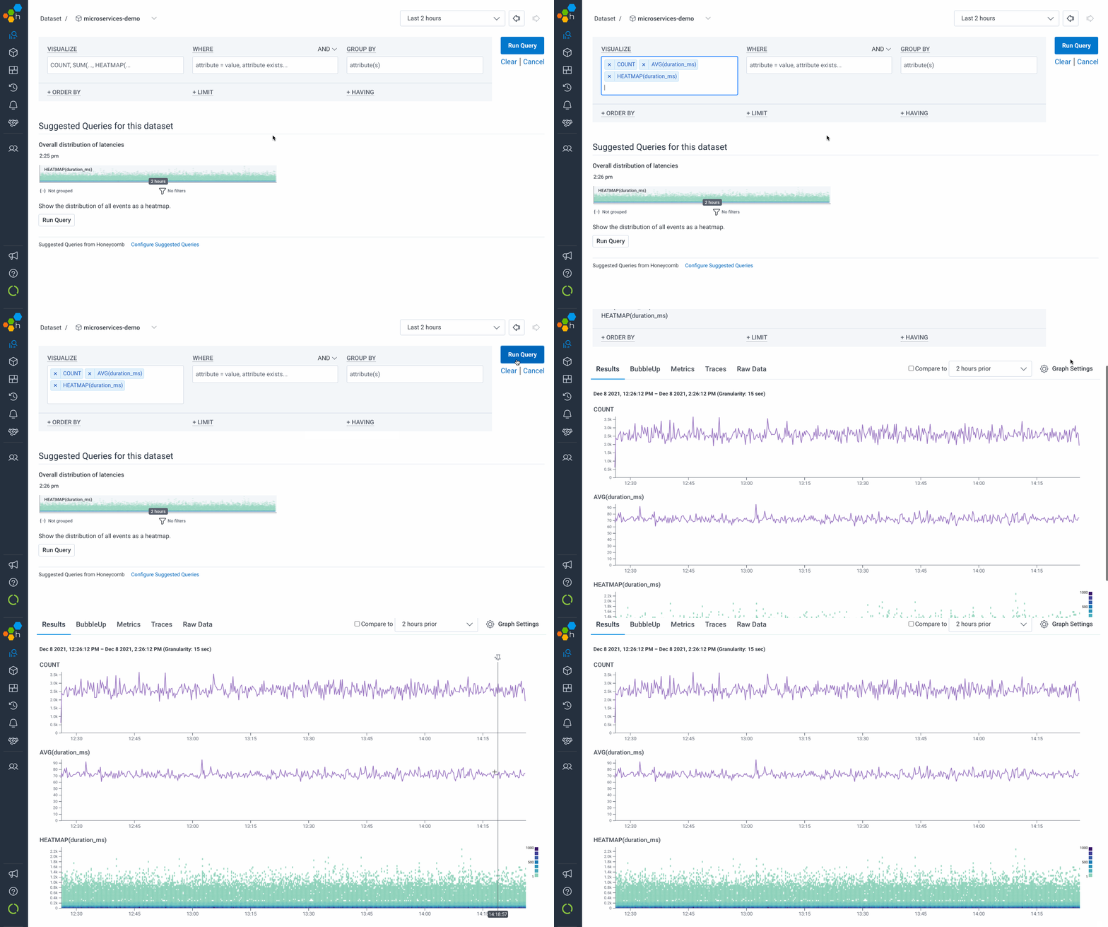 You will see a stack of charts: a count of events, an average latency for those events, and a heatmap of latency.
Zoom into the chart.
Click and drag around an area you would like to see.
Click the Zoom In icon () to zoom.
Look for patterns and outliers.
As you add instrumentation, your charts get enriched with more data.
Querying and visualizing your data is a core practice for flexible exploration in Honeycomb.
Many developers investigate using an iterative process called the [core analysis loop](/get-started/honeycomb/core-analysis-loop/).
## Investigate Outliers
Using the heatmap of `duration_ms`, analyze outliers in your data with the [BubbleUp](/investigate/analyze/identify-outliers/) feature.
1. Drag to select an area on the heatmap with some data that looks a little different from the rest.
2. Choose **BubbleUp Outliers**.
You will see a stack of charts: a count of events, an average latency for those events, and a heatmap of latency.
Zoom into the chart.
Click and drag around an area you would like to see.
Click the Zoom In icon () to zoom.
Look for patterns and outliers.
As you add instrumentation, your charts get enriched with more data.
Querying and visualizing your data is a core practice for flexible exploration in Honeycomb.
Many developers investigate using an iterative process called the [core analysis loop](/get-started/honeycomb/core-analysis-loop/).
## Investigate Outliers
Using the heatmap of `duration_ms`, analyze outliers in your data with the [BubbleUp](/investigate/analyze/identify-outliers/) feature.
1. Drag to select an area on the heatmap with some data that looks a little different from the rest.
2. Choose **BubbleUp Outliers**.
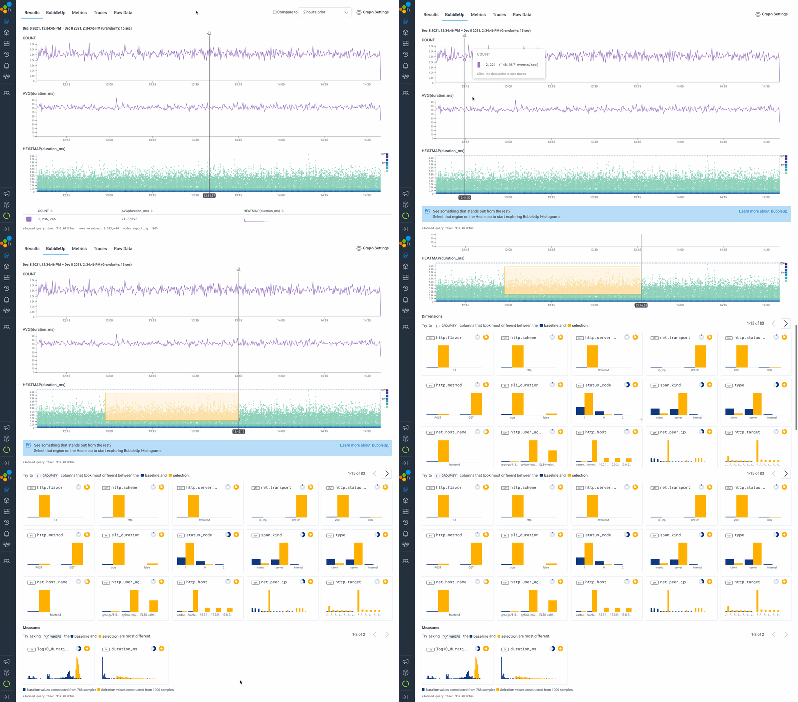 The small charts that appear below analyze your selected events by each available dimension and measure.
[BubbleUp](/investigate/analyze/identify-outliers/) is a unique Honeycomb approach that intelligently surfaces useful signals in your data.
Visually identify what stands out and deep dive into your data.
BubbleUp enables you to quickly drill into high-cardinality data like userID, loan type, system request--any attribute that is important to your business.
The small charts that appear below analyze your selected events by each available dimension and measure.
[BubbleUp](/investigate/analyze/identify-outliers/) is a unique Honeycomb approach that intelligently surfaces useful signals in your data.
Visually identify what stands out and deep dive into your data.
BubbleUp enables you to quickly drill into high-cardinality data like userID, loan type, system request--any attribute that is important to your business.