> ## Documentation Index
> Fetch the complete documentation index at: https://docs.honeycomb.io/llms.txt
> Use this file to discover all available pages before exploring further.
# Visualize Events Over Time
> Use heatmaps to plot the statistical distribution of a field's values over time and spot patterns, outliers, and latency spikes in your telemetry data.
New to running queries in Honeycomb?
Check out the [introduction to building queries](/investigate/query/build/)!
Heatmaps show the statistical distribution of the values in a dataset field over time.
The example graph below shows **SELECT** `HEATMAP(duration_ms)`, or the statistical distribution of `duration_ms`, over the selected time period:
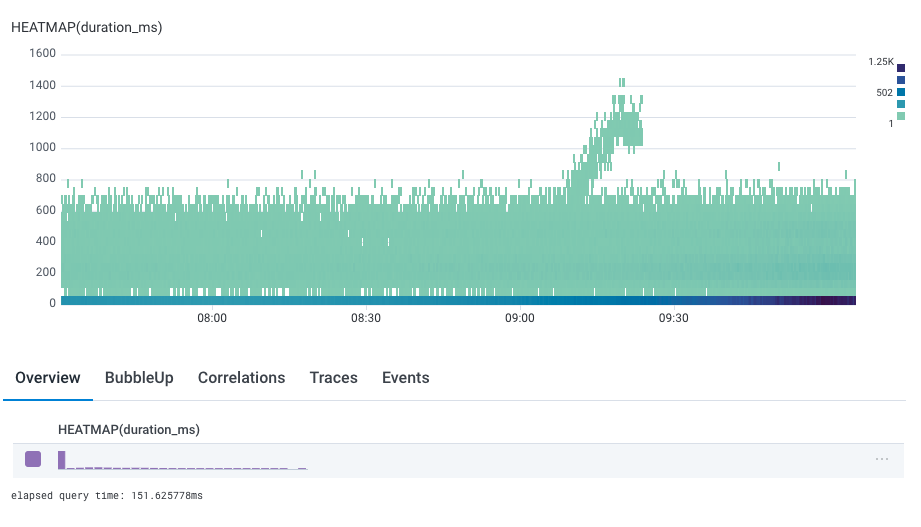 Each of the vertical columns in that graph is a histogram for that time bucket.
The color indicates the number of events that fall into that time and value with pale teal at the low end and dark blue at the high end.
A heatmap shows a histogram as its summary row.
The histogram shows the distribution of the values across all the data.
## Create a Heatmap
To add a heatmap to a query:
1. In [Query Builder](/investigate/query/build/), select the field within the **SELECT** clause.
2. Enter `HEATMAP` and the field you want visualized within parentheses. Alternatively, begin typing `HEATMAP` and select query components from the autocomplete prompts that Honeycomb provides.
3. Execute the query by selecting **Run Query** or pressing Shift + Enter on the keyboard.
Each of the vertical columns in that graph is a histogram for that time bucket.
The color indicates the number of events that fall into that time and value with pale teal at the low end and dark blue at the high end.
A heatmap shows a histogram as its summary row.
The histogram shows the distribution of the values across all the data.
## Create a Heatmap
To add a heatmap to a query:
1. In [Query Builder](/investigate/query/build/), select the field within the **SELECT** clause.
2. Enter `HEATMAP` and the field you want visualized within parentheses. Alternatively, begin typing `HEATMAP` and select query components from the autocomplete prompts that Honeycomb provides.
3. Execute the query by selecting **Run Query** or pressing Shift + Enter on the keyboard.
 ## When to Use
Heatmaps look best when you have a lot of events to visualize, and where the spread of values is wide enough to see some differentiation, but not complete noise.
Any column representing a duration or size is a perfect fit, but any column you might run a percentile or average calculation on may benefit from being rendered as a heatmap as well.
## Interact with Heatmaps
### The Rollover
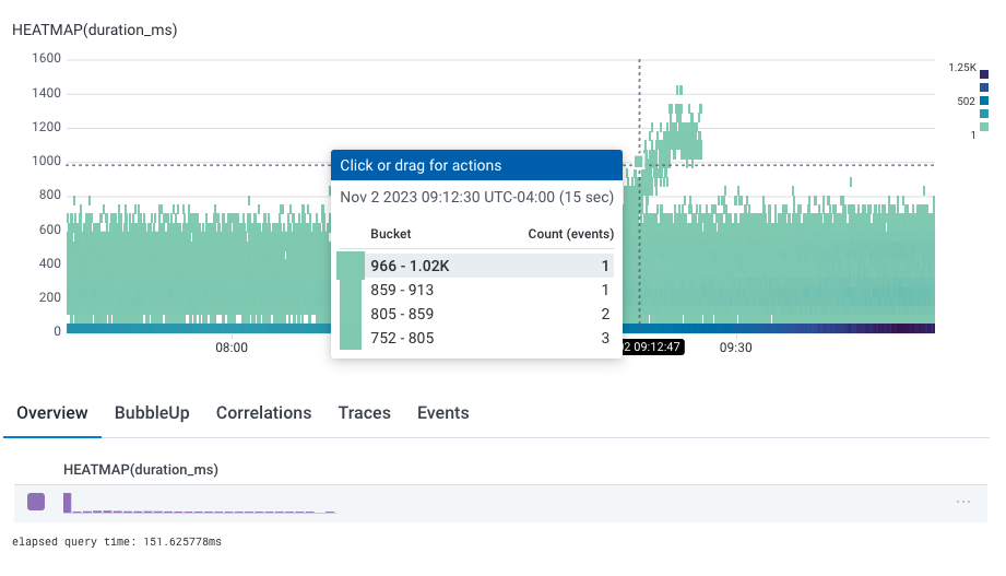
The rollover for heatmaps shows a "bucket", its range of values, and its count of events.
## When to Use
Heatmaps look best when you have a lot of events to visualize, and where the spread of values is wide enough to see some differentiation, but not complete noise.
Any column representing a duration or size is a perfect fit, but any column you might run a percentile or average calculation on may benefit from being rendered as a heatmap as well.
## Interact with Heatmaps
### The Rollover
The rollover for heatmaps shows a "bucket", its range of values, and its count of events.
 ## Use Heatmaps with Other Features
### Group By
One of the most powerful features of Honeycomb is Query Builder's **GROUP BY** clause, which groups results based on field values.
Heatmaps work well with **GROUP BY** clauses.
Take the query below, where we have grouped by status code, or `app.status_code`.
By default, the heatmap of all status codes appears.
## Use Heatmaps with Other Features
### Group By
One of the most powerful features of Honeycomb is Query Builder's **GROUP BY** clause, which groups results based on field values.
Heatmaps work well with **GROUP BY** clauses.
Take the query below, where we have grouped by status code, or `app.status_code`.
By default, the heatmap of all status codes appears.
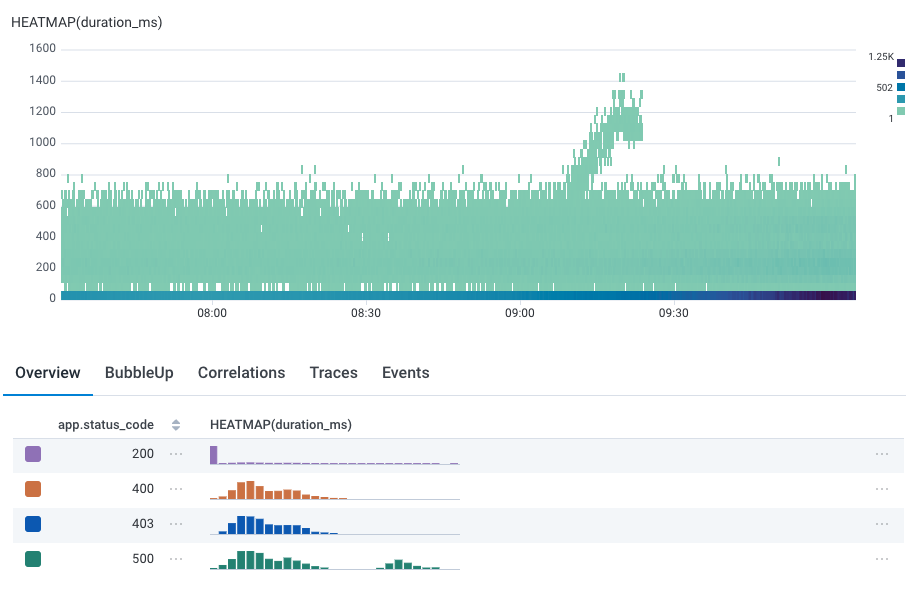 Note that the summary table below display independent histograms for each field value.
This makes it especially easy to see the reason for the bimodal distribution: while all status codes are in the lower-valued duration, only `200` and `500` status codes are in the higher.
Just as we highlight the corresponding line in line graphs as you mouse over the summary table, we also show the heatmap corresponding to that group:
Note that the summary table below display independent histograms for each field value.
This makes it especially easy to see the reason for the bimodal distribution: while all status codes are in the lower-valued duration, only `200` and `500` status codes are in the higher.
Just as we highlight the corresponding line in line graphs as you mouse over the summary table, we also show the heatmap corresponding to that group:
 You can see the difference between the top two status codes and the others: those status codes have higher durations, near the upper part of the heatmap, while the other status codes are closer to 600 ms.
### Tracing
For tracing-enabled datasets, selecting a cell in the histogram will choose an arbitrary trace that corresponds to the cell: that is, it has a span that fulfills the `WHERE` clause, started at that time, and has that value.
For example, if the user were to click in the group by image above, they would see a trace at 08:20 with a span of 1200 ms duration.
### Identify Outliers
Once you have a Heatmap, you can use it to identify how values differ.
Learn more about using [BubbleUp](/investigate/analyze/identify-outliers/).
You can see the difference between the top two status codes and the others: those status codes have higher durations, near the upper part of the heatmap, while the other status codes are closer to 600 ms.
### Tracing
For tracing-enabled datasets, selecting a cell in the histogram will choose an arbitrary trace that corresponds to the cell: that is, it has a span that fulfills the `WHERE` clause, started at that time, and has that value.
For example, if the user were to click in the group by image above, they would see a trace at 08:20 with a span of 1200 ms duration.
### Identify Outliers
Once you have a Heatmap, you can use it to identify how values differ.
Learn more about using [BubbleUp](/investigate/analyze/identify-outliers/).